What's new

A Few Words About A few words about...™ The Myth of Dye Transfer Printing (1 Viewer)

haineshisway

Senior HTF Member
Joined
Oct 26, 2011
Messages
5,570
Location
Los Angeles
Real Name
Bruce
The muted timing for three-strip Tech in the 30s sounds absolutely right to me. It's later, especially in the 50s when color got accurate to what was being shot. I've had many IB prints from the 50s and the colors are always quite true.
 

Bob Furmanek

Insider
Senior HTF Member
Joined
Dec 10, 2001
Messages
6,724
Real Name
Bob
That's been my experience as well. I've handled a lot of early 1950's 35mm dye-transfer (Thunder Bay, Second Chance, Money from Home, Quo Vadis, Tumbleweed, Ivanhoe, etc) and they've looked very accurate.
 

Jack Theakston

Supporting Actor
Joined
Aug 3, 2003
Messages
935
Location
New York
Real Name
Jack Theakston
The sepia-ish quality of Technicolor prints from the '30s was certainly more than just a technical overcompensation, but an artistic decision, largely controlled then by Natalie Kalmus. For example, Technicolor had no problem accurately representing colorful animation, as seen in this scan from a nitrate print of THE HOUND AND THE RABBIT, an MGM cartoon from the same year as SNOW WHITE:
cartoon2.jpg


The reason I'm adding soundtrack/perf information is so that you can get a sense of how neutral the B&W stock this is printed on is in comparison. Yet what we're looking at in the scan that I posted from SNOW WHITE is important to put in context—it's an interior night scene lit by candlelight. Doesn't it occur to anyone that, like day-for-night scenes, this heavy amber is the antithesis of a blue timing for outdoor shots? Indeed, the rest of SNOW WHITE is quite sepia, but not this distinct yellow cast.

By 1939-1942, naturalistic color started to become the norm. I've seen nitrate dye-transfer prints of 3-Color features such as THE MIKADO (natural hues, but pastel), PHANTOM OF THE OPERA (a bit more saturated color, but still using the key layer), WHITE SAVAGE (a late '40s re-issue that was not well-printed and was too red), THE RED SHOES, THE JOLSON STORY ( both "eye-popping" Technicolor), and it's clear that by the early '40s, when Technicolor dropped their key layer and Natalie Kalmus was starting to be kicked to the sidelines that the "Glorious Technicolor" look was being embraced.
 

notmicro

Stunt Coordinator
Joined
May 2, 2014
Messages
61
Real Name
Mark M
Does anyone know if the early Technicolor cartoons from MGM / Warners / et al were photographed in what was effectively "RGB Sequential", similar to what Disney was doing with their Multiplane camera system?
 

Robert Harris

Archivist
Reviewer
Senior HTF Member
Joined
Feb 8, 1999
Messages
18,437
Real Name
Robert Harris
notmicro said:
Does anyone know if the early Technicolor cartoons from MGM / Warners / et al were photographed in what was effectively "RGB Sequential", similar to what Disney was doing with their Multiplane camera system?
I believe SE was the norm for animation after a certain point.RAH
 

bigshot

Senior HTF Member
Joined
Jan 30, 2008
Messages
2,933
Real Name
Stephen
Jack Theakston said:
Doesn't it occur to anyone that, like day-for-night scenes, this heavy amber is the antithesis of a blue timing for outdoor shots? Indeed, the rest of SNOW WHITE is quite sepia, but not this distinct yellow cast.
So the frame we saw wasn't typical of the color timing of the film, it's a special lighting effect accomplished in the timing?

I would bet that the color stylists and background painters would have complained bitterly about adjustments for effects like this. They would have already created a color scheme in the artwork to create the mood they wanted. Slapping colored filters over the top like this would ruin what they had created. I bet those scenes got retimed in later releases deliberately.

That MGM grab is extremely accurate. Just by looking at that, I know exactly what pigment they used for the blue paint on the rabbit's shirt.
 

Jack Theakston

Supporting Actor
Joined
Aug 3, 2003
Messages
935
Location
New York
Real Name
Jack Theakston
I would bet that the color stylists and background painters would have complained bitterly about adjustments for effects like this. They would have already created a color scheme in the artwork to create the mood they wanted. Slapping colored filters over the top like this would ruin what they had created. I bet those scenes got retimed in later releases deliberately.
Why would you think that? Wouldn't it simply be easier (and more economical) to use the paints they'd been using all throughout the rest of the production, and time it differently in order to achieve an effect? It's obvious that Disney did this on more than one occasion (ALICE IN WONDERLAND comes to mind.)
 

bigshot

Senior HTF Member
Joined
Jan 30, 2008
Messages
2,933
Real Name
Stephen
I interviewed some of Disney's color people. They went to great effort to get exactly the colors on the screen that they saw on the artwork. In some cases each scene in a sequence had its own color palettes. For instance Captain Hook transitions through about five or six different sets of colors, from red to purple as the intensity of the scene increases. Each of the colors on each of the characters was related to the colors in the backgrounds in perfect harmony. Night scenes would have night palettes, indoor scenes would have indoor palettes, daylight would have another palette. The underwater colors in Pinocchio were all "keyed", meaning they didn't use filters or effects to create the color palette, the artwork was painted that way. Alice had one of the most complex set of palettes of any Disney cartoon. There would be different paint palettes from shot to shot in some sequences.

These artists were very particular about the way their work appeared on the screen. They would shoot wedge tests to make sure that Technicolor could accurately reproduce the hues and shades they were using. If they found that it couldn't, they would modify the pigments in the paint so Technicolor could reproduce it properly. Disney would do dye transfer hard copy paper prints of cel setups for use by publicity and to give away as gifts to visitors to the studio. The color department was very proud of these dye transfer stills because they represented exactly what their work looked like in the film.

Snow White was produced at the Hyperion Studio, and things got a lot more structured after they moved to the Burbank lot. I bet that when they started instituting the new procedures at Burbank, they went back and corrected mistakes that had slipped by in the earlier days.

From what I'm hearing here, the 1937 prints look very different from any subsequent release of Snow White, and different than any of the video releases too. I'm betting that was because they were refining things about the color timing even after the film had been released, probably to make it more accurately reflect the artwork. I do know that Pinocchio had a sequence (Gepetto's workshop) that was timed for a lighting effect, but I can't think of any other sequences where the artwork doesn't match the colors on the screen.
 

Stephen_J_H

All Things Film Junkie
Senior HTF Member
Joined
Jul 30, 2003
Messages
7,899
Location
North of the 49th
Real Name
Stephen J. Hill

bigshot

Senior HTF Member
Joined
Jan 30, 2008
Messages
2,933
Real Name
Stephen
There are some interesting camera errors in the bipack shots in Lonesome Ghosts. Supposedly the exposure sheets were so complicated that the camera department couldn't get perfect takes on film, so a couple of messed up shots ended up in the picture.
 

ThadK

Second Unit
Joined
Oct 25, 2003
Messages
306
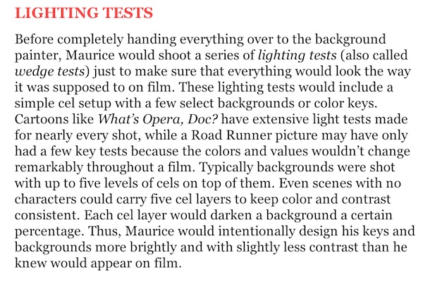
Just to prolong this... Regarding the comments about color timing in animation, paint accuracy, etcetera... I can't think of a better, more concise explanation than in Tod Polson's The Noble Approach, which is based on designer Maurice Noble's lessons, lectures and draft for his own book that he never got around to writing. Noble actually worked on Snow White, and dozens of the best Warner cartoons.


Noble-Color-Timing.jpg


On another note, I can't recommend The Noble Approach highly enough for anyone interested in the history and mechanics behind some of the most important animation ever made.
 

Will Krupp

Senior HTF Member
Joined
Oct 2, 2003
Messages
4,033
Location
PA
Real Name
Will
WOW!! It looks gorgeous! Thanks Mr Furmanek. How does it stuck up against the Basten book? The illustrations are certainly more plentiful and look very well reproduced (the picture portion of the Basten book was its downfall IMO) so I 'm hoping the text is at least as good.
 

Will Krupp

Senior HTF Member
Joined
Oct 2, 2003
Messages
4,033
Location
PA
Real Name
Will

Users who are viewing this thread

Sign up for our newsletter

and receive essential news, curated deals, and much more


You will only receive emails from us. We will never sell or distribute your email address to third party companies at any time.

Latest Articles

Forum statistics

Threads
357,086
Messages
5,130,442
Members
144,285
Latest member
foster2292
Recent bookmarks
0
Top