Vahan_Nisanain
Supporting Actor
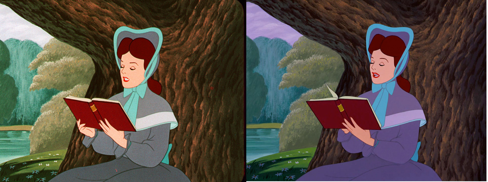
Konstantinos said:I'd like to bump this thread to show a comparison between an exquisite HDTV version of Lady and the Tramp and the Bluray.
Well, unfortunately the HDTV is cropped, but you can see the extensive changes made on the Bluray.
Even lines are disappearing (notice the lines in Lady's legs) or others are accented (Tramp's lines)!
How natural does the HDTV look and how in harmony seem the characters with the background without standing out as on the Bluray.
http://screenshotcomparison.com/comparison/109823
Even with the cropping, the HDTV version IS how the film should look like.
Shame on you, Disney!