MattHR
Screenwriter
- Joined
- Mar 9, 2001
- Messages
- 1,664
http://tvshowsondvd.com/news/Incredible-Hulk-The-Complete-Series/23624
It's releases like this that make me scratch my head. The five individual season sets have been available for several years (both original lenticular-cover and more-recent slimcase versions) for less than $10. Now this repackaged Complete Series set is coming, priced at $125!!! That would be more than a blu-ray set would cost if released by Mill Creek! Perhaps Universal is making one last effort to squeeze out any potential DVD revenue from this title before releasing a blu version (since HD masters already exist and were used for last year's UK blu release by Fabulous Films.)
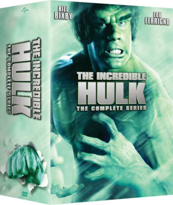
The packaging sure looks bad. Why no Bill Bixby on the cover? Why use a PR shot of Lou without the white contact lenses? There were a few shots taken during that photo shot without the lenses, but why use one of them? There are plenty of iconic PR shots featuring both Bixby and Ferrigno that could be used. What's with the pale, mint-green color scheme? It should be a vibrant and "glowing" green like their previous covers. And why use a limp version of the title treatment on the wide spine, leaving all that dead space? Why not use the same, bold version of the title as used on the front cover? I know it could be temp art, but still.


I have an original 4x5 transparency of the shot used for the cover, with Lou not wearing the white contacts. A few minutes in Photoshop restores it to how he should look on the cover:

It's releases like this that make me scratch my head. The five individual season sets have been available for several years (both original lenticular-cover and more-recent slimcase versions) for less than $10. Now this repackaged Complete Series set is coming, priced at $125!!! That would be more than a blu-ray set would cost if released by Mill Creek! Perhaps Universal is making one last effort to squeeze out any potential DVD revenue from this title before releasing a blu version (since HD masters already exist and were used for last year's UK blu release by Fabulous Films.)
The packaging sure looks bad. Why no Bill Bixby on the cover? Why use a PR shot of Lou without the white contact lenses? There were a few shots taken during that photo shot without the lenses, but why use one of them? There are plenty of iconic PR shots featuring both Bixby and Ferrigno that could be used. What's with the pale, mint-green color scheme? It should be a vibrant and "glowing" green like their previous covers. And why use a limp version of the title treatment on the wide spine, leaving all that dead space? Why not use the same, bold version of the title as used on the front cover? I know it could be temp art, but still.


I have an original 4x5 transparency of the shot used for the cover, with Lou not wearing the white contacts. A few minutes in Photoshop restores it to how he should look on the cover:


