What's new

Dick Van Dyke Show - 2 Colorized Episodes Coming to CBS 12/11 (1 Viewer)

Paul D G

Screenwriter
Joined
Dec 25, 2001
Messages
1,914
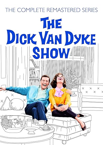
I'm really looking forward to the Dick Van Dyke Show (DVDS) episodes. Last year they did Andy Griffith and it sort of turned my then 11 year old into a fan. I've caught him watching it a few times on his own.

I really wish DVDS was airing now. I loved this show when it was airing in the 80s and I know it's something my kids would enjoy. They already love I Love Lucy.

While I roll my eyes on the colorization, it ultimately isn't going to take away from my enjoyment of watching these.

And thanks for the heads up on the football overrun. I wouldn't have considered this.
 

Tony Bensley

Senior HTF Member
Joined
Apr 9, 2013
Messages
7,319
Location
Somewhere in Canada
Real Name
Anthony
Yes when they are doing something in black and white, everything is different. Lighting is different. Lighting a black and white film is different than a color one. So you can never truly convert a black and white show to color. It's like dubbing. You can dub a movie from Chinese to english but it will never truly look like an english speaking movie.
ADVENTURES OF SUPERMAN is probably the earliest example of a TV series transitioning from Black & White to Color, although they weren't broadcast that way until 1965. For the show's first two 26 episode seasons, the Superman suit/s used was a brownish color. For visual reference to how different the Color episodes Superman suit appeared in Black & White, we have the Season 6, 1957 I LOVE LUCY episode, titled LUCY AND SUPERMAN.

From a season 2 ADVENTURES OF SUPERMAN episode:
359bac7343abbdcffcd818cca80afaa9.png


From the 1957 LUCY AND SUPERMAN episode. Note the differences in the shades of Superman's suit, which was designed with Color filming in mind:
lucy superman 2.png


If I recall correctly, the I LOVE LUCY apartment sets were painted in grayish shades as they were found to photograph better in Black & White.

CHEERS! :)
 

Garysb

Senior HTF Member
Joined
Jul 31, 2003
Messages
5,899
NY Times Review:
On Sunday colorization is coming to one of TV's greatest comedies, The Dick Van Dyke Show.
” and perhaps grousing will be heard in some quarters from holdouts who still object to mucking with black-and-white classics. Me, I’m looking forward to it. I’ve seen these episodes many times before, but the color — at least based on the excerpts I’ve seen — wakes them up.

CBS is devoting an hour of prime time to two of the series’s finest installments, and it would be hard to come up with a better pair of episodes from any 1960s sitcom. “That’s My Boy??,” the Season 3 premiere in September 1963, is a tour de force for Mr. Van Dyke, whose Rob Petrie character relates a story about the time he convinced himself that he and Laura — Mary Tyler Moore’s character — had brought the wrong baby home from the hospital. “Coast to Coast Big Mouth,” the Season 5 opener two years later, gives Ms. Moore the spotlight: Laura, appearing on a nationally televised quiz show, is tricked into revealing that Rob’s boss, the vain Alan Brady (star of the fictional “Alan Brady Show”), wears a toupee.

The epic comic confrontation in “Coast to Coast Big Mouth” — in which Ms. Moore tries to stammer out an apology as Carl Reiner’s Alan Brady, surrounded by his now useless toupees, rages — simply looks more alive when Laura’s hat and dress are deep red. Both episodes were written by Bill Persky and Sam Denoff, and their scripts have a timelessness that colorization complements. That, said Mr. Reiner, who created the series, was by design.

“Assiduously when doing that show, I stayed away from slang,” he said. “I had a feeling this show was going to last a long time. I didn’t want to hear anything that dates it.”

It also helps that colorization is much more sophisticated than it once was. When the technique first came into wide use in the 1980s, the results were often hard to look at — unnatural and distracting — and the outrage was loud and widespread. By the time CBS began applying colorization to “I Love Lucy” a few years ago, the complaints had faded considerably, though purists still voice their displeasure occasionally under YouTube excerpts. Stanton Rutledge, who oversaw the colorization for the “Dick Van Dyke” episodes, said digital tools and other improvements have made a big difference in quality and thus in acceptance.

For this project, he said he began by listening for any color references in the dialogue — when Alan mocked Rob’s striped tie in the toupee episode, did he mention a color? (He didn’t.) He then developed concepts for the various scenes — that quiz show is loud; Alan’s office, subdued — and then ran them by the ultimate authorities, Mr. Reiner and Mr. Van Dyke.

“When I’d send them color stills of the design I was working on, they were like, ‘Yes; that’s exactly what it looked like,’” he said. Then a team of artists would apply those color schemes to high-definition versions of the source film.

“I spent more time on Mary’s outfits because I grew up being in love with her as a kid,” Mr. Rutledge confessed. In that apology scene, he was unable to determine the original color of Laura’s dress, so he could have made it navy blue, or deep green, or purple. “The red dress just popped out to me more than some of the others,” he said. “Not a cherry red, but it was — I can’t even put a name to it, but it looked good on her.”

The dress is indeed striking, but not too striking. The ultimate goal, Mr. Rutledge said, is “that you can watch the show and not even think about it being colorized.”

Colorization was once so inflammatory a subject that Congress addressed it in the National Film Preservation Act of 1988. There are still vigorous discussions, especially on social media, but they are less about putting the genie back in the bottle and more about the hows and whys.

“It is becoming more accepted in a lot of applications,” said Dana Keller, who has a business colorizing still photographs, History in Color. The tools are better, and so are the artists, he said.

“They are using their skills to eliminate the distraction of colorization as being an obvious alteration,” he said in an email interview, “and as a result, bring these historical scenes to life with a natural realism that hopefully connects the viewer to the past in a new way.”

He also suggested that while tinkering with film or photography in which an artist chose to work in black and white is understandably a sensitive issue, colorizing something that was black and white out of practical necessity (like a rapidly produced sitcom) is less of a flash point.

“I think the risk of ‘offending’ is a bit lower,” he said. “On the other hand, depending on who you ask, some people can view a colorized historical photo as a blatant misrepresentation of history or deliberate violation of a historical record. But, clearly, you can’t please everybody, no matter how well done a colorization is.”

Mr. Reiner said it actually became possible for “The Dick Van Dyke Show” to switch to color during its five-season run, but he stuck with black and white for that most basic of reasons.

“We realized it would cost like $16,000 a show,” he said, “and we would never have gotten profits from the series.”

600x338


From Vanity Fair

When Bill Persky learned that two classic Dick Van Dyke Show episodes he co-wrote with his partner, Sam Denoff, would be broadcast in prime time on CBS this month—in newly colorized editions, no less—he contacted series creator Carl Reiner to see if his worst fear would be realized. Alas, the answer was yes: true to the show’s actual set, the living-room couch at 148 Bonnie Meadow Rd. in New Rochelle NY, would be same hideous yellow-orange on-screen that it was in real life. So don’t blame the colorization team.

“God, I hated that couch,” Persky recalled with a rueful laugh. “It was ugly. Those two people would never have bought that couch.”

“Those two people,” of course, are Rob and Laura Petrie, the heart and the heat of Dick Van Dyke. The comedy ran on CBS from 1961 to 1966, breaking sitcom convention by focusing on a married couple whose lives were infinitely more interesting than the kid in the house. Rob was the head writer for The Alan Brady Show. Laura, a former dancer, became his nutty muse as the series evolved.

The series was born of Reiner’s own experience balancing his suburban home life with his glamorous career as a member of the dream team of writers and performers of Sid Caesar’s seminal variety/sketch series, Your Show of Shows. Reiner was offered several sitcom opportunities once that series ended, but none excited him. “On what piece of ground do I stand on that nobody else stands on?” he asked himself at the time. “Well, I work in the afternoon on Your Show of Shows, and at night I go home to New Rochelle to my wife and kids. I’ll write about that.”

The rest is one of TV’s most famous failure-to-success stories. A pilot episode, “Head of the Family,” starring Reiner as Rob, did not catch on, but producer Sheldon Leonard (you know him as the bartender in It’s a Wonderful Life who threatens to throw George Bailey and his guardian angel “through the door or out the window”) liked the 13 scripts Reiner had written. He went to bat for the series, famously telling Reiner, “I’ll get a better actor to play you.”

Enter Tony Award-winner Dick Van Dyke, along with vaudeville veterans Rose Marie and Morey Amsterdam as co-writers Sally Rogers and Buddy Sorrell, Reiner as the egomaniacal and tyrannical Alan Brady, Larry Matthews as son Ritchie, and __Mary Tyler Moore __as Laura, a.k.a. “October Eve,” a.k.a. Lolac from Twilo, a.k.a. “the personification of all the beauty, grace, and mystery that is woman.” (Way to go, Roger—the lovestruck teenager who penned that ode to Laura in the Season 4 episode “The Lady and the Babysitter”).

Even so, the show was nearly cancelled after its first season. A new time slot following “The Beverly Hillbillies, coupled with an ottoman-tripping opening that perfectly communicated the show’s blend of sophistication and slapstick, helped land the show on its feet.

The episodes that will air on CBS, “That’s My Boy??” and “Coast to Coast Big Mouth,” are more than a half century old—but they’ll still probably be the funniest thing on TV on Dec. 11. That was by design. “When I wrote the show,” Reiner said, “I knew the one thing that was absolutely necessary was to not use slang of the day. Because I knew this would have lasting value.” (Indeed, the show is currently being re-run on the Cozi television network; you can also find it streaming on Netflix, Hulu, and Amazon.)

Reiner reiterates that The Dick Van Dyke Show is “hands down” the thing he is most proud of in his career. Not because of its 15 Emmy awards, or because it’s frequently cited as one of the best TV series of all time—it’s because Dick Van Dyke inspired generations of comedy writers. “I’ve heard it hundreds of times from people who tell me that as kids they didn’t know that writers wrote comedians’ lines,” Reiner said. “I told that story on Conan, and he said, ‘I was one of those kids.”

So was Ken Levine, who, with partner David Isaacs penned classic episodes for such gold standard series as M*A*S*H, Cheers, and Frasier. As a kid, he leaned on comedy: “I couldn’t throw a football,” he joked in an e-mail exchange. “Humor was my only way to impress girls.” The Dick Van Dyke Show gave him an epiphany: “You mean you mean you could get a girl like Laura Petrie by being a comedy writer? There is a God!”

Last year, as an experiment for his blog, By Ken Levine, Levine decided to write his own “spec” script for “The Dick Van Dyke Show.” “I always wanted to write an episode of The Dick Van Dyke Show,” he explained. “So what if I’m 50 years too late?”
 
Last edited:

Steve...O

Senior HTF Member
Joined
Dec 31, 2003
Messages
4,376
Real Name
Steve
Decent job on the color but to be honest I was laughing so hard that I didn't stop to look at the details. Coast to Coast is a laugh riot.
 

Stan

Senior HTF Member
Joined
May 18, 1999
Messages
5,177
They are broadcasting this on a Sunday evening at 8 PM. Anyone DVRing it remember football can delay start time in Eastern and Central time zones.

Good thing to warn people about. If a show is something I'm really looking forward to, I always add an extra 30 minutes or more to the ending time. Sports over-runs have messed up many shows.

The networks are getting better about starting the show from the beginning, but still occasionally run into that "We join the Dick Van Dyke show now in progress". Not sure if it's the network or the local station, but really ticks me off and I'm one of those whiners who will call the station or email them to complain.
 

Stan

Senior HTF Member
Joined
May 18, 1999
Messages
5,177
Decent job on the color but to be honest I was laughing so hard that I didn't stop to look at the details. Coast to Coast is a laugh riot.

The time zone thing is so unfair. On the west coast and we don't get it for almost another two hours :blush:
 

Garysb

Senior HTF Member
Joined
Jul 31, 2003
Messages
5,899
They gave everyone an unnatural tan but otherwise it looked OK. The colors of the backgrounds seemed mostly brown and green. They cut the tag scene on Coast to Coast Big Mouth where Laura and Millie split the prizes Laura won. They also cut the beginning of the episode where Laura and Millie are sitting in the audience. It originally was longer. I thought perhaps because they only have to run the opening and closing credits once for two episodes the shows themselves could run uncut. I think 'That My Boy???" did run uncut. The colorization was done with the permission of Dick Van Dyke and Carl Reiner who I believe still own the show, not CBS. That was Dick Van Dyke's voice introducing the second episode, "Coast To Coast Big Mouth" where I guess he made an error and added "Laura Petrie" to the end of the title. Interesting that they added the 1960's CBS Presents this Program in color which would not obviously had been used when the show was broadcast in B&W. Wish the tag scene from Coast to Coast Big Mouth had been included instead.
Also the term , "Living Color" was an expression used by RCA and NBC not CBS back in the 1950's and 1960's.
 
Last edited:

Bob_S.

Screenwriter
Joined
Mar 4, 2004
Messages
1,205
My thoughts exactly Tony. Also, I find myself wondering if the colors are really accurate. Like it was mentioned in the article, they didn't know what color Laura's dress was in Alan's office. I think it would be very difficult to get every color right, so because of that I'd rather watch black and white. Good point about using certain colors that looked better in black and white. These set colors may be accurate but are very drab looking. Appreciate the try but I'll stick to black and white.
 

Matt Hough

Reviewer
Senior HTF Member
Joined
Apr 24, 2006
Messages
26,200
Location
Charlotte, NC
Real Name
Matt Hough
I've watched both episodes. There are tiny little cuts in each in order to run more commercials (like they did in the Andy Griffith and Lucy shows that were colorized).

The colorization to me looked very natural and most appealing, and I' loved the little touch of preceding the special with the old CBS color logo. Brought back lots of memories from long, long ago. To my eyes, the color resembled the real color filming that was being done at the time with The WIld WIld West - very tan skin and reds and greens very deeply saturated.

The shows themselves are as wonderfully funny as they have always been. Among the best that TV has ever presented.
 

Rob W

Screenwriter
Joined
May 23, 1999
Messages
1,236
Real Name
Robert
I've watched both episodes. There are tiny little cuts in each in order to run more commercials (like they did in the Andy Griffith and Lucy shows that were colorized)

Which brings up a question - did they color the complete uncut episodes and then trim them for broadcast, or edit them first ? Just wondering if the upcoming Blu will feature the uncut or 2016 broadcast versions.
 

Garysb

Senior HTF Member
Joined
Jul 31, 2003
Messages
5,899
I think Mary Tyler Moore's hair was darker at the time then was shown in the colorization. My problem with the tan skin is that everyone seems to be the same shade. As for the sets, they may have recreated how they originally looked but as we have discussed, they weren't originally made to be seen in color. A better guide might have been using the recreation of the Petrie living room used in the "Dick Van Dyke Show Revisited" a clip of which I included on page 1 of this thread.
 

Matt Hough

Reviewer
Senior HTF Member
Joined
Apr 24, 2006
Messages
26,200
Location
Charlotte, NC
Real Name
Matt Hough
I've watched both episodes. There are tiny little cuts in each in order to run more commercials (like they did in the Andy Griffith and Lucy shows that were colorized).

The colorization to me looked very natural and most appealing, and I' loved the little touch of preceding the special with the old CBS color logo. Brought back lots of memories from long, long ago.

The shows themselves are as wonderfully funny as they have always been. Among the best that TV has ever presented.
Which brings up a question - did they color the complete uncut episodes and then trim them for broadcast, or edit them first ? Just wondering if the upcoming Blu will feature the uncut or 2016 broadcast versions.
If the DVD releases of Lucy and Andy are any indication, they run the show in color as it was presented on TV with the commercial breaks and also offer the complete black and white ones as bonuses. I can't remember now if they offer the color ones individually. I know the black and white episodes are offered individually and complete.
 

The Obsolete Man

Senior HTF Member
Joined
Apr 4, 2008
Messages
3,811
Location
Truth or Consequences, New Mexico
Real Name
Robert
About the skin color being "off"...

The make-up of the time was very heavy and reddish to make skin tones appear normal for B&W, wasn't it?

That could explain why skin color seems off in colorization. They're colorizing an unnatural red skintone to begin with. And if they're using photos from the time as a guide, they'd be working off of the heavy red makeup, not the natural skintone of the actors.
 

Stan

Senior HTF Member
Joined
May 18, 1999
Messages
5,177
About the skin color being "off"...

The make-up of the time was very heavy and reddish to make skin tones appear normal for B&W, wasn't it?

That could explain why skin color seems off in colorization. They're colorizing an unnatural red skintone to begin with. And if they're using photos from the time as a guide, they'd be working off of the heavy red makeup, not the natural skintone of the actors.

I did enjoy the episodes, but another vote for the "off skin tones". Regardless of the make-up from that time, why would that affect the colorization process? With the coloring, they could have chosen purple aliens, didn't matter what make-up was underneath, they should have colored it properly.

Everybody seemed to have the same over-tanned look, nothing subtle about it, just pick out the faces and hands, repaint with color #1, no shading, no attempt at a realistic skin-tone.

I guess it did give it that older, pastel colored look from the time period. I've got glam photos of my mother from the late '50s, early '60s that were taken in B&W then hand-painted that look very similar.
 

Hollywoodaholic

Edge of Glory?
Senior HTF Member
Joined
Nov 8, 2007
Messages
3,287
Location
Somewhere in Florida
Real Name
Wayne
About the skin color being "off"...

The make-up of the time was very heavy and reddish to make skin tones appear normal for B&W, wasn't it?

That could explain why skin color seems off in colorization. They're colorizing an unnatural red skintone to begin with. And if they're using photos from the time as a guide, they'd be working off of the heavy red makeup, not the natural skintone of the actors.

Yeah, I doubt they had a way to accurately match the skin tones when the makeup of the day was heavy powder, one color fits all.

I enjoyed the colorized versions of the episode though and particularly how amazingly sharp they were with the color, even though I have Season Two on blu-ray, as well. You could see single strands in MTM's hair.

And there probably isn't a much funnier scene in the history of television than Alan Brady talking to his various toupees. It doesn't get more brilliant than that.
 

Garysb

Senior HTF Member
Joined
Jul 31, 2003
Messages
5,899
Just from the nature of his character, I would expect Mel Cooley ( Richard Deacon ) to have much paler skin than the others. I wouldn't expect him to get much sun . They could have left him in black and white and I think I would find it less distracting.

One thing missing from both episodes were Laura's Capri slacks.

On another topic I love the cover of the DVD re release of the show and wish they had used the same for the blu ray. This picture was presumably colorized with less tanned skin.
91s6YKUaWbL._SY550_.jpg
 
Last edited:

Stan

Senior HTF Member
Joined
May 18, 1999
Messages
5,177
Just from the nature of his character, I would expect Mel Cooley ( Richard Deacon ) to have much paler skin than the others. I wouldn't expect him to get much sun . They could have left him in black and white and I think I would find it less distracting.

One thing missing from both episodes were Laura's Capri slacks.

On another topic I love the cover of the DVD re release of the show and wish they had used the same for the blu ray. This picture was presumably colorized with less tanned skin.
91s6YKUaWbL._SY550_.jpg

That's a great picture. The skin-tones look so much more natural, with light/dark areas and not the overly tanned, orange look of the two episode broadcast.
 

Users who are viewing this thread

Sign up for our newsletter

and receive essential news, curated deals, and much more


You will only receive emails from us. We will never sell or distribute your email address to third party companies at any time.

Latest Articles

Forum statistics

Threads
357,071
Messages
5,130,076
Members
144,283
Latest member
Nielmb
Recent bookmarks
0
Top