The Star Trek movies set is very nicely done (love the Bob Peak artwork; good call on that one Ric), but I LOVE your Twilight Zone covers 100%. That is just outstanding work! I actually get the chills looking at that artwork and can hear the theme music, just by looking at your covers. That's GOOOOOOOOOD, my friend.
Your Star Trek series covers are really quite stupendous as well. I actually think yours are superior to the official versions (they did a good job but I like your design concepts more).
Ric, I know you said you didn't want to do a slim-double version, but I'd like to put in a request anyway, since I'm going to be moving to slim doubles for all 2-disc sets.
Pretty please!!!!!!!!
Also, I'm doing ThinPak conversions for most of my single DVDs. Do you have a list of titles you have redone for ThinPaks? I'll be glad to request the ones I need on DVDCoverArt so that they can be uploaded there.
I already redid all the Kubrick titles I have to a ThinPak Stanley Kubrik collection design.
One of the folks over at DVDCA has a bunch of my files to try and do this very thing. He said he would either try the single size doubles or the thinpak doubles.
Let's give him a month or so and see what he comes up with... I'll keep you guys informed.
As for thinpak covers. I haven't saved them all, but still have quite a few. Trouble is, some of them I took from other folks original art and just shrunk the spines, so I would not feel good about submitting them. Other covers were scanned, but probably not "cleaned up" enough for DVDCA's strict standards.
Anyway, I'll see if I come up with a list later and maybe something can be worked out. I'll probably post it in the Thinpak thread. And by later, I mean a day or so...
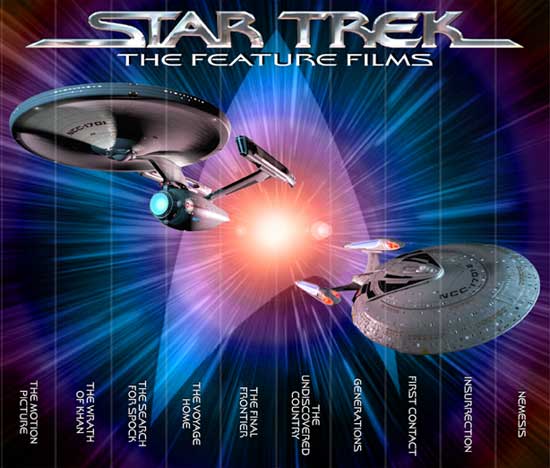
Jupiter Prime over at DVDCA has been working on the single width doubles. He has gotten ahold of some nice 3D meshes of the ships, and has done some wonderful lighting on them. I expect he'll be uploading them soon to DVDCA. He made some other changes too, most notably including the Enterprise-D and he changed the logo. If you are interested you can check out the thread and previews right here.
Anyway, he sent me the ships and I want to update my covers with them. The only question is, I'm not sure whether to include all 3 ships or just the two. After all, as much as I like the Enterprise-D, it was only in one movie!
Another thing about omitting the middle ship is that I can make those other two ships a tad bigger.
So if you don't mind, I'd like to here from you folks. Please tell me which version you like better. 2 ships or 3? Thanks for your time!
Three? There were more than that. They used the original in the first 2 movies, and the B was briefly seen at the beginning of Generations. Let's get covers with all five.
Ulp, I had to open the can of worms! I don't think all those ships is gonna happen! First The Ent-A looks Identical to the one before it ('cept for the A) and B only appeared in the first 15 mins of Generations.
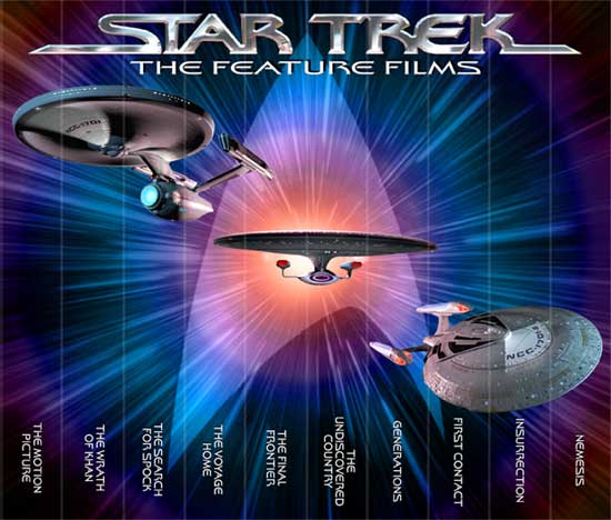
So, I'm guessing you prefer 3 ships to two? I like the two, because it shows the first and last ships in the movie series.
What I mean is with the Enterprise-A and the Excelsior you have a transition throughout all 10 films. OR what you COULD do is do a silhouette in white outlining the main starship for each movie above the 'subtitle'.
I think two ships is the way to go. One ship should represent each "Generation". Three ships looks too cluttered and also gives "Next Generation" an unfair advantage...taking up more space on the set with it's 4 films to the original's 6.


")