I think much of what you're seeing flawed in the new transfer is related to the alternate color scheme and much of what you seem to be pointing out is in fact, an illusion.
It's not that the tower has blurred edges, it's just more defined due to a much stronger boost in color temp, and the lack of contrast with the background horizon gives the feeling that the tower is actually sharper when it's not.
The new transfer appropriately transitions the towers into the background by balancing the oversaturated colors of the first transfer in the foreground with the smoother colors that makeup the horizon in the background.
Remember that this is a matte painting and if you approach it from an artistic standpoint, it becomes clear to me that the color palette of the sky meeting the landscape in the new transfer is much more true to life and aesthetically pleasing. There is less contrast but the layers of washed blues into smoke grey not only give the appearance of depth and perceived distance on a flat one-dimensional background drawing in ctonrast to the straight blue background behind a stark teal tower of the old transfer, but also appear more filmic and less "fake" than what was previously seen. The old transfer appears much more flat. Just look at the two images and I'm sure you'll agree.
Not only that, but if you look at the ringing around the tower construct and think in terms of light reflection, the new transfer also make a lot more sense. Again the old transfer has that false looking dated production effect that I don't believe was ever intended and could have easily been minimized by the palette used in the matte background. It almost seems like one of those copyrighted watermarks seen on website galleries selling artwork. With the new transfer, the light ringing is much more effective. The transition from the painted reflection of light surrounding the tower into the sky as it sort of fades into the horizon is much more realistic and pleasing to look at from an artistic eye.
Keep in mind that this film is over half a century old, and that you cannot reasonably compare color tones and contrast from such a transfer in the same way you would modern day productions like Fight Club and Batman. The washed blue in the sky that you claim to be seeing is actually much truer representation of a matted sky. Just look at the old and new transfer and think in terms of paint, color and the age of the film. Which honestly looks like it would better reflect the original shot? It's a much smoother and realistic transition from the deep hues of the sky at the top of the frame, to the washed blend of lighter ethereal tones as it meets the horizon. The same is true for the greens int he grass mid-frame.
As for the tinman's back, the only thing that you're seeing is the warmer color temperature giving off the illusion of lack of definition, when in fact, the cooler tones from the original transfer mistakably boost contrast which lkends to the perception that there is more detail when if you zoom in and look carefully, it's clear that there is no more or less detail. Just a stronger and more pronounced hue. In my opinion, it's wrong.
Think about this from the stance of the effects crew and makeup, lighting and warddrobe. The tinman's face against the cold gray suit would strike much more of a contrast, especially when considering lighting correction for the two tones. Flesh color is warmer and deeper, wheras the gray suit is much further down the color spectrum. It would make much more sense for the filmmaker's to shoot from a point much closer to the colors on the new transfer. Nevermind that the tinman is supposed to have been rusted and incapacitated for some time until Dorothy oiled him up, to me the colors of the new transfer better represent this and seem more true to what would have been shot decades ago. The transition is much more stable and fluid than the contrast in colors on the old disc. It just looks more aesthetically pleasing to me, and truer to what would have assumably been chosen from a filmmakers technical and stylized perspective when working with 3-strip Technicolor stock so many years ago. It seems like this transfer has got it right. Perhaps it's not what you're all used to, but I like a couple others will stand behinf Mr. Harris and hsi team who obviously have much more insight into any of this than those of you comparing these captions on the internet.
And I've seen Dorothy's actual shoes from the movie in person displayed at the National Museum Of American History, and I can attest to the fact that they were NOT a shiny light cardinal color but a much deeper sparkly crimson and from a distant long shot, especially from behind, the picture above on the new transfer seems much more accurate and better representated. I'm sure that this would have been one of the easiest aspects to research however. Also, one only needs to look at the tones of the lion in the pictures displayed above to determine which would seem more correct. No filmmaker in their right mind, for such a bright fantastical technicolor epic as such, would use that faded dirty looking lion suit in contrast to the more real-to-life and warm suit as depicted in the new transfer. The same goes for the scarecrow's jacket and pants. They both seem much more true to what most would assume their wardrobe would have consisted of in the new transfer over the muted tones and off-hues of the old disc.
Interesting Joe. I first had my doubts about this new edition when I saw the shots on page one of this thread. I've since downgraded my Oz order from 3-disc to 2-disc now I may have to go with no-disc. But still there are people who prefer this new copy. It's all in the eyes of the beholder, some people prefer the look of this copy. In my humble opinion from looking at various comparison shots the previous copy looks far better. I can't believe for a second this is the way it was supposed to look back in 1939, who was around then, and who would remember it?
The ultimate test is to see it playing on your screen with your own eyes, but I don't know if I'll even bother now, the extras look very tempting though...
Regardless of what I may find "pleasing" in the screen caps, I have to actually SEE this new transfer before I can make a true judgment on whether I like it or not. Static screen captures do not represent moving film.....then again neither does DVD but..ah, you know what I mean.
Come on Steve...You know you want it. Give in to your temptation. Go for broke. You only live once. I tell ya, looking at the pics right above. I thought the rock mountain on the right of the frame looked better, and was sharper in the NEW version. I guess you see what you want to see.
After seeing the DVD beaver comparison, I'm convinced that the new release is worlds above the old one and definitely more film like. I've seen a lot of older films on film, including several IB Tech prints and the new one looks more appropriate. Remember also that the warmth of the screencaps placed here on HTF is exacerbated by the cool white/grey/blue of the HTF b/g compared to the matte black b/g on DVD beaver.
The eye of the beholder, like I said. Nothing wrong with liking either version. Good to have a choice. It's up to the technicians who restore these classic films whether it gets more color, more red, blue, white, whether to crop or stretch the picture, reduce some of the grain etc All we plebs can do is accept the finished product, or not. Eye of the beholder, Rock, eye of the beholder.
I remember a few years ago, a classic film was being restored and they decided the color pallete should be muted rather than go with the original bright bold colors of it's era, so as to be more acceptable to todays audiences. Can't remember which film, Adventures of Robin Hood? Snow White? Both those films had incredible restoration work done, but could have done with the more dazzling color of the period. Color so vibrant that some film critics couldn't handle it, as in this quote from the original 1939 NY Times review of Gone With The Wind"...we still feel that color is hard on the eyes for so long a picture...", wow!
After Kevin noticed that I wasn't using a standard video capture, Herb's shot of Dorothy's dress color more closely matches mine now although his image is 'brigher.' There still is more detail in my capture, notice the stripes on her dress. PowerDVD was used with a 'normal' mode capture for all of my captures shown.
The dress color does differ depending on closeness of shot and light.
Having now seen the film, I think the Emerald City scenes are the biggest difference. The green is really noticably different. What one prefers is probably based on personal preference. First the older disc then the new one:
However, the cooler colors of the older disc may just make this look sharper as opposed to really being sharper. Don't know.
Some things look better on the new disc. An example would be that the Scarecrow colors don't look as good on him on the older disc. The lion on the other hand looks better on the old disc. I guess what I'm saying is that I think there is a happy medium they could have hit between the two releases. So whether you are happy is your subjective appreciation of the new colors.
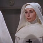
There is also some noticeable improvement in detail in the new disc in some scenes. As they are running through the poppies, the background matte work is clearer. Scarecrow's face show much more detail as well. I also think the Tin Man color is not much of a problem later on in the film, so the forest scene is not representative of his color elsewhere. Other's have already covered other improvements and loss of registration problems etc. so to bring some balance, those things should be understood.
Joe,
Your observations around the detail around the process shot of Oz seems valid. However, color is another thing. I pulled out my matte shot of the scene and you can see that from matte painting to final shot other tricks are at play. So the blue of the sky may be a deeper blue but that doesn't mean it's a truer blue. Notice also the sparkles on Oz itself was not part of the matte work.
Many of us are passionate about films and perhaps even more passionate about the great and impactful films. Certainly the Wizard of Oz is one of those. I would have liked to see a bit more balance on the color. That idea should be balance with the obvious, if you don't notice this stuff it won't bother you.
I don't believe this shit... Warner actually splashed French text all over the deluxe 3-disc edition!!!
I was lucky enough to grab an English only cover, but there were only 3 on shelf and to my dismay, I just got home to find that the back of the box is damaged and one of the discs is scratched so now I need to return it and hope I can find another English version.
This is absolutely ridiculous, this means that from now on... every WB release I want to buy will have to be bought on release day before the English covers get phased out. It's almost like these normal DVD's are suddenly limited collector's editions... what the hell is that about!
Even the Looney Tunes Golden Collections were in French and there were like 1 English version to every 5 French.
None of these screen caps do the new transfer any justice. All of the caps look pretty inaccurate compared to how my copy looks on my set. I too was skeptical but I'm convinced now its a great improvement.
I'll certainly find out how the in-motion image compares in a detailed A/B this Friday. We already have a few HTF members joining in. email me if interested.
Not on purpose, but you are correct. I've revised my last post with new scans. PowerDVD was set for some CLEV-2 setup and I changed it to their "original" setup. Thus it would appear that PowerDVD is as vanilla as it gets. Still seeing more detail than in Herb's scans ... don't know why. The CLEV-2 setup seems too hot. Shows the danger in that if we all aren't using the same setups it becomes even less apples to apples.


")


