What's new

A Few Words About While we wait for A few words about...™ The Rodgers & Hammerstein Collection -- in Blu-ray (1 Viewer)

Mark Booth

Senior HTF Member
Joined
Aug 25, 1999
Messages
3,580
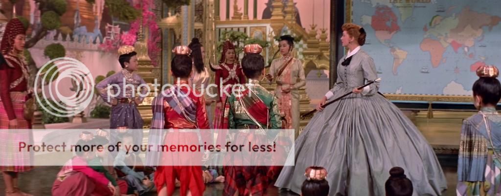
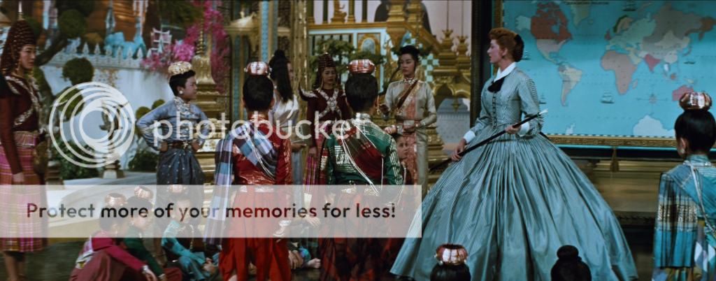
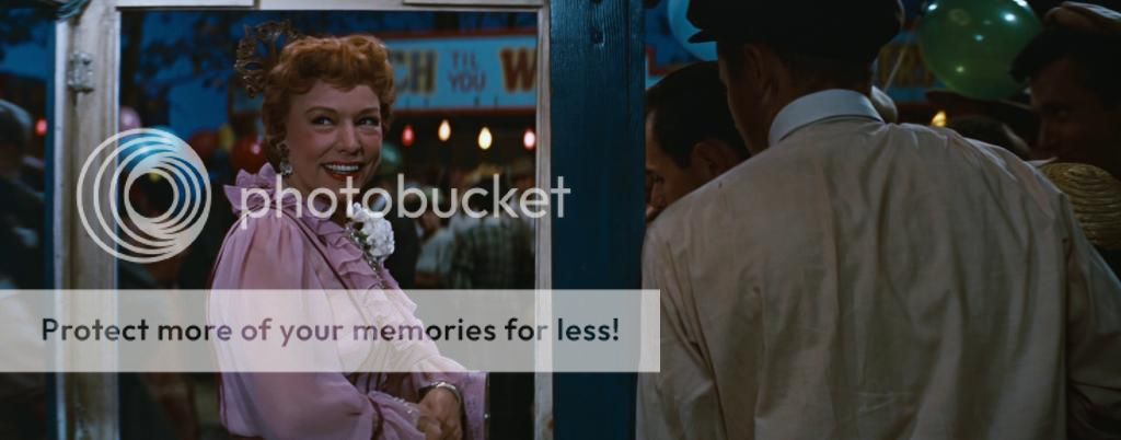
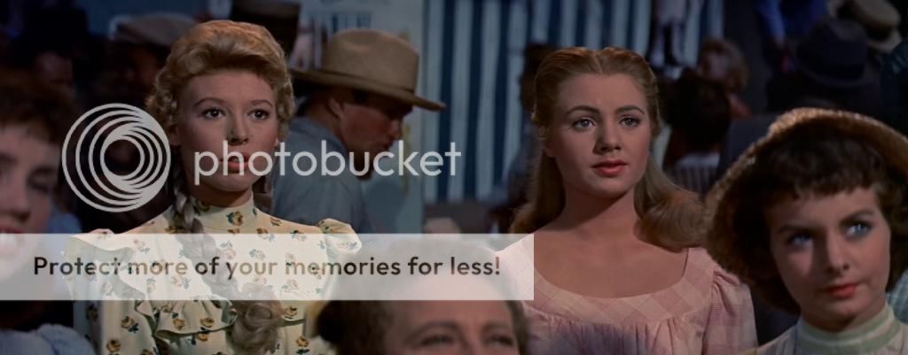
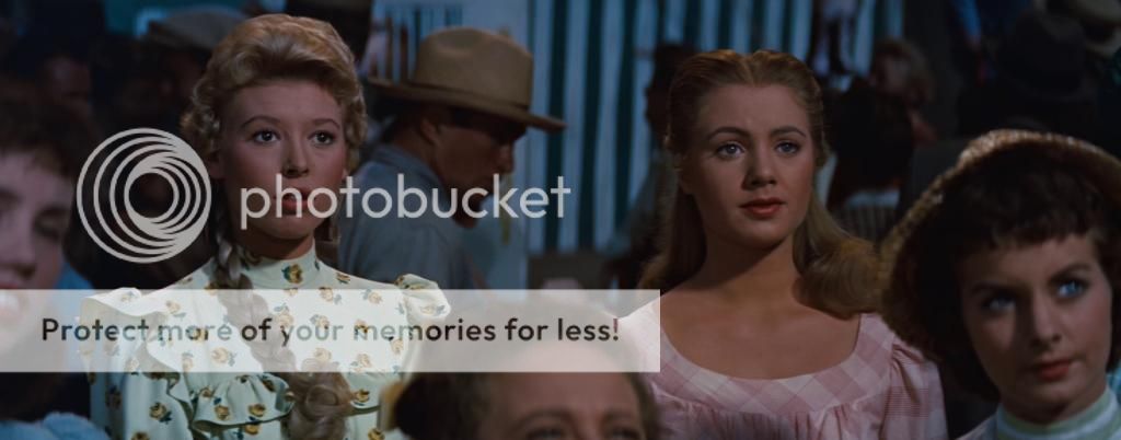
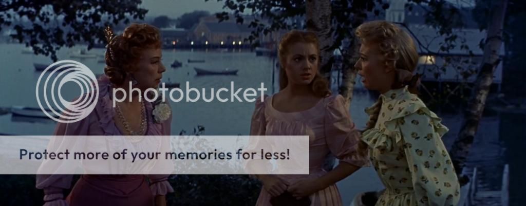
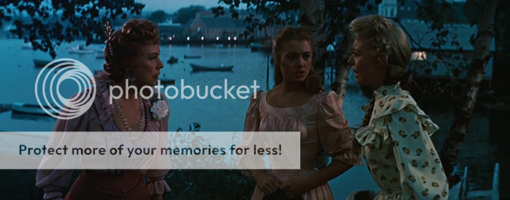
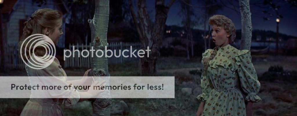
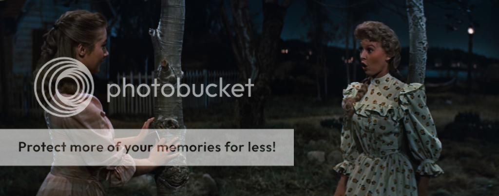
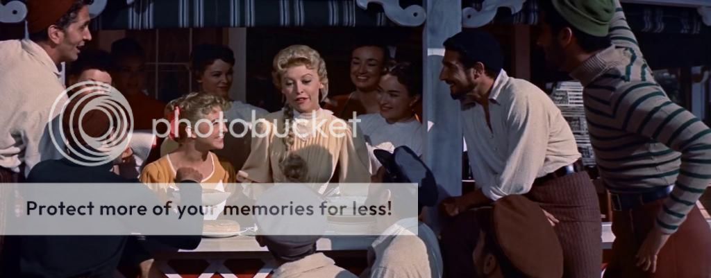
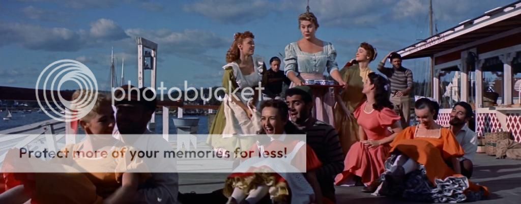
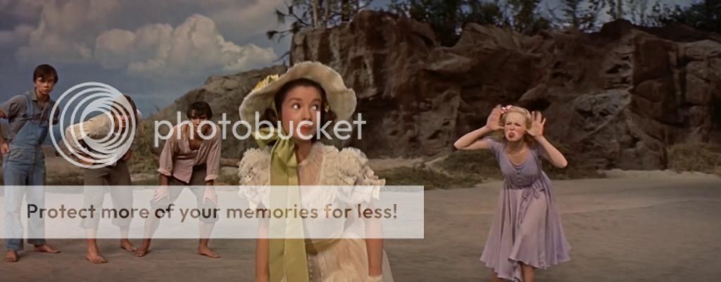
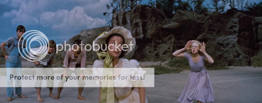
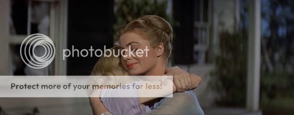
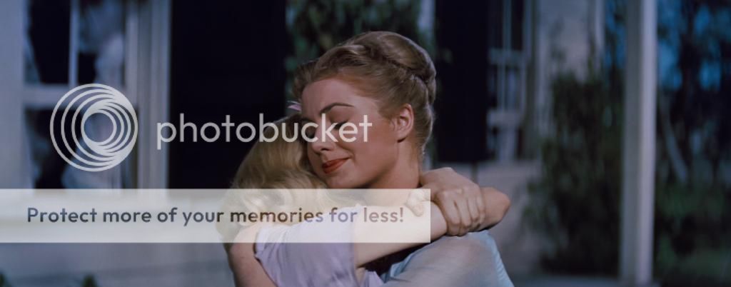
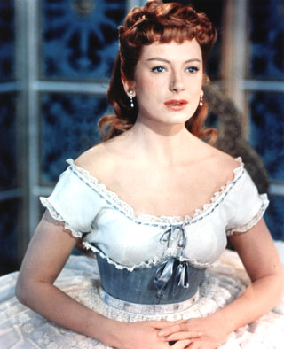
Thanks, Chuck! I don't see how anyone can look at those comparisons and suggest the Blu-ray looks correct. Her dress is supposed to be GRAY, not Blue! Her hair supposed to be red, not brown. Look at this publicity photo of Deborah Kerr from 'The King and I'.

Deborah_Kerr.jpg


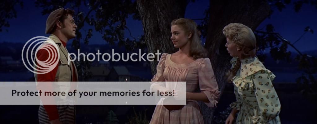
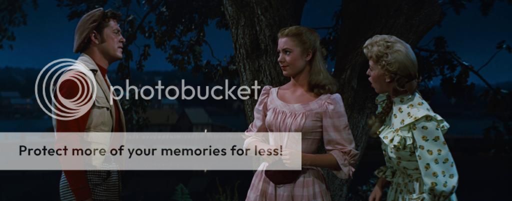
Here hair is noticeably red, like the DVD presentation and decidedly NOT like the Blu-ray presentation!

I am truly saddened that the powers that be at Fox seem to care so little about such matters. I mean, BRAVO for the incredible restoration of the Todd-AO 'Oklahoma!' High fives and kudos all around! Thank you, Fox! But how can you allow something as important as proper color balance get so totally screwed up for the 'The King and I'? Quality and paying attention to details matters for EVERY film. Why bother to be in the film business if you're not going to care?

Mark
 

Jim*Tod

Supporting Actor
Joined
Jan 5, 2006
Messages
871
Location
Richmond, VA
Real Name
Jim
Got my set tonight. KING AND I essentially is a mess which seems to change image quality shot to shot, not sure what happened, the problems are not just in bits that are opticals but it almost looks like it was cobbled together from different sources . CAROUSEL while not perfect is significantly better and is at least pretty consistent in terms of image quality. OKLAHOMA! (Todd Ao) is simply amazing. Knowing what we know about Fox's decision to junk their three strip Technicolor negatives STATE FAIR looks pretty good. Aside from some distortion here and there on KING AND I and CAROUSEL, the sound quality is excellent on all the new transfers.... loss less does make a difference. Hope they can come up with a solution for KING AND I someday.... I am wondering if given the budget they just didn't have the resources to fix it properly. Sadly we do have to realize that there is a limited market for sixty year old films, no matter how much we love them.

Looking forward to Mr. Harris's comments which I hope will arrive soon.
 

Noel Aguirre

Supporter
Joined
Nov 28, 2011
Messages
1,591
Location
New York City
Real Name
noel
Thanks Chuck- Those screen caps make me want to but the K&I HD iTunes version now.

Also I had the original album cover and her hair was most definitely red and not with blue icicles.


Robert Harris- we beg of you!
 

Joel Arndt

Senior HTF Member
Joined
Jul 2, 2009
Messages
4,107
Location
The Western Reserve, Cleveland, OH
Real Name
Joel Arndt
I received my set Tuesday and just had a brief look tonight finally after a busy week. What a disappointment. Even with my limited equipment Deborah Kerr's dress in the opening scenes in The King and I keeps changing from gray to blue and back again and the image became soft in her apartment in the King's palace. Did anyone notice that? As others have pointed out, the sound in the Todd-AO version of Oklahoma! is soft compared to the others (the image is beautiful) and State Fair has a brown cast, etc. etc. etc. as the King would say. I'll have to review the SD versions, but they seem to be better with the exceptions of South Pacific and The Sound of Music. Is Fox "Cinema" Archives responsible for this mess?
 

KPmusmag

Screenwriter
Joined
Sep 9, 2011
Messages
1,644
Location
Henderson, NV
Real Name
Kevin Parcher
Here is one last entry, and will be my last. Hopefully Mr. Harris will chime in soon.

This is a comparison of the color palette; all the boosting and edge enhancement tricks that they do for SD DVD doesn't change that. In the SD capture, look particularly at the exquisite violet of Chulalongkorn's tunic. Then, see that color is a bland gray in the BR capture. Anna's skin tone is very natural looking in the SD DVD capture and her hair is red. The reds and oranges in the other costumes are vivid and lush. Irene Sharaff was a great designer and chose both colors and fabrics with precision and intent. Surely, as part of the creative team, she would not have worked so hard if she knew everything would turn out just another shad of gray. To quote Mr. Harris from his "Few Words" about "There's No Business Like Show Business" (IMO a beautiful blu-ray): "Proves that Eastman Color, properly handled, can give Technicolor a challenge." I have seen several pristine prints of K&I over the years; at the Plitt Century and The Hollywood Bowl. I will not claim a perfect memory, but what I recall about both is that the colors were so vivid and lovely. I am not claiming the SD reflects what it looked like in 1956, only that it has a broader color palette than the BR. Again, look at the color palette (especially Chulalongkorn's tunic and Anna's skin tone and hair color) and how the SD DVD has a greater range than the BR.

SD DVD:
KING_fin.JPG


BR:
KING_finBR.jpg
 

bryan4999

Supporting Actor
Joined
Jun 7, 2012
Messages
555
Real Name
Bryan Forbes
KPmusmag said:
Here is one last entry, and will be my last. Hopefully Mr. Harris will chime in soon.

This is a comparison of the color palette; all the boosting and edge enhancement tricks that they do for SD DVD doesn't change that. In the SD capture, look particularly at the exquisite violet of Chulalongkorn's tunic. Then, see that color is a bland gray in the BR capture. Anna's skin tone is very natural looking in the SD DVD capture and her hair is red. The reds and oranges in the other costumes are vivid and lush. Irene Sharaff was a great designer and chose both colors and fabrics with precision and intent. Surely, as part of the creative team, she would not have worked so hard if she knew everything would turn out just another shad of gray. To quote Mr. Harris from his "Few Words" about "There's No Business Like Show Business" (IMO a beautiful blu-ray): "Proves that Eastman Color, properly handled, can give Technicolor a challenge." I have seen several pristine prints of K&I over the years; at the Plitt Century and The Hollywood Bowl. I will not claim a perfect memory, but what I recall about both is that the colors were so vivid and lovely. I am not claiming the SD reflects what it looked like in 1956, only that it has a broader color palette than the BR. Again, look at the color palette (especially Chulalongkorn's tunic and Anna's skin tone and hair color) and how the SD DVD has a greater range than the BR.

SD DVD:
attachicon.gif
KING_fin.JPG

BR:
attachicon.gif
KING_finBR.jpg
Even just looking at Africa on the map, it tells the story. No red.
 

Chuck Pennington

Screenwriter
Joined
May 11, 2001
Messages
1,048
Did you just take a picture of your display with a digital camera for that last Blu-ray capture? It appears so.

Mine are made direct from the Blu-ray using VLC.
 

Chuck Pennington

Screenwriter
Joined
May 11, 2001
Messages
1,048
I did the best I could on these before bedtime. Again, not always the exact frame.

iTunes HD (2005 Master)
CAROUSEL00001A.jpeg

2014 Blu-Ray
CAROUSEL00001B.jpeg


iTunes HD (2005 Master)
CAROUSEL00002A.jpeg

2014 Blu-Ray
CAROUSEL00002B.jpeg


iTunes HD (2005 Master)
CAROUSEL00003A.jpeg

2014 Blu-Ray
CAROUSEL00003B.jpeg


iTunes HD (2005 Master)
CAROUSEL00004A.jpeg

2014 Blu-Ray
CAROUSEL00004B.jpeg


iTunes HD (2005 Master)
CAROUSEL00005A.jpeg

2014 Blu-Ray
CAROUSEL00005B.jpeg


iTunes HD (2005 Master)
CAROUSEL00006A.jpeg

2014 Blu-Ray
CAROUSEL00006B.jpeg


iTunes HD (2005 Master)
CAROUSEL00007A.jpeg

2014 Blu-Ray
CAROUSEL00007B.jpeg


iTunes HD (2005 Master)
CAROUSEL00008A.jpeg

2014 Blu-Ray
CAROUSEL00008B.jpeg


iTunes HD (2005 Master)
CAROUSEL00009A.jpeg

2014 Blu-Ray
CAROUSEL00009B.jpeg


iTunes HD (2005 Master)
CAROUSEL00010A.jpeg

2014 Blu-Ray
CAROUSEL00010B.jpeg


iTunes HD (2005 Master)
CAROUSEL00011A.jpeg

2014 Blu-Ray
CAROUSEL00011B.jpeg


iTunes HD (2005 Master)
CAROUSEL00012A.jpeg

2014 Blu-Ray
CAROUSEL00012B.jpeg


iTunes HD (2005 Master)
CAROUSEL00013A.jpeg

2014 Blu-Ray
CAROUSEL00013B.jpeg


iTunes HD (2005 Master)
CAROUSEL00014A.jpeg

2014 Blu-Ray
CAROUSEL00014B.jpeg


iTunes HD (2005 Master)
CAROUSEL00015A.jpeg

2014 Blu-Ray
CAROUSEL00015B.jpeg


iTunes HD (2005 Master)
CAROUSEL00016A.jpeg

2014 Blu-Ray
CAROUSEL00016B.jpeg


iTunes HD (2005 Master)
CAROUSEL00017A.jpeg

2014 Blu-Ray
CAROUSEL00017B.jpeg


iTunes HD (2005 Master)
CAROUSEL00018A.jpeg

2014 Blu-Ray
CAROUSEL00018B.jpeg
 

KPmusmag

Screenwriter
Joined
Sep 9, 2011
Messages
1,644
Location
Henderson, NV
Real Name
Kevin Parcher
Chuck Pennington said:
Did you just take a picture of your display with a digital camera for that last Blu-ray capture? It appears so.

Mine are made direct from the Blu-ray using VLC.
No, it's a computer capture, but, nonetheless, the differences in color are about the same, particularly Chula's tunic. Mine has a higher brightness level apparently, but the differences in color appear to me the same.
 

AnthonyClarke

Senior HTF Member
Deceased Member
Joined
Aug 13, 2010
Messages
2,767
Location
Woodend Victoria Australia
Real Name
Anthony
Well Doug, looks like a draw.
It's now just past 4 pm on Friday and I've just got back from an overnight stay in Melbourne seeing a very forgettable opera (rossini's Turk in Italy) and an unforgettable five month old grandson Oscar, and found this message: May 2, 2014, 10:50 am, Victoria State Outlying Areas AU Transfer to local carrier for final delivery.

So we should both get our parcels on Monday for sure! Mine will be sighing and saying 'We'll meet again/Don't know where, don't know when/But I know we'll meet again some sunny day"... that will probably be on the day we ship Anna and the King of Siam back for replacement!

In the meantime, thanks Mark for those Carousel stills. I have a feeling that when I project it up on my new 150 inch projector screen (being installed tomorrow), I'm going to be pleasantly surprised.

But what a TRAVESTY Anna is. How could they do it? Does no-one check the results of these transfers, or seek expert evaluation before issue? This does look an unmitigated disaster .. fortunately, it's my least favourite of all these musicals so I can wait till a better effort is made. But then, I thought they'd be sure to issue a new My Fair Lady but that's never happened either .......
 

haineshisway

Senior HTF Member
Joined
Oct 26, 2011
Messages
5,570
Location
Los Angeles
Real Name
Bruce
What are those Carousel caps supposed to prove? If it's that the color is more accurate on the iTunes version, forget it - it's not and it's obvious it's not. But it's especially obvious because I've been up close and personal with Mr. McCrae's red sweater and it looks nothing like the iTunes version and everything like the Blu-ray. Skin tones are also much better on the Blu-ray - in fact everything is better on the Blu-ray of that film.

I will give you a little more rope on the King and I but what would really tell the tale is if someone had access to the king's top - the one where it's burgundy in the iTunes and almost black in the Blu-ray. But what does give away that there's a problem IF the caps are to be trusted, which, for me, they are not, is that Louis's hair is red like Miss Kerr's - a horrible dye job. As I mentioned much earlier, I'd only spot-checked the film, so I want to see how these shots look on my TV.
 

Chuck Pennington

Screenwriter
Joined
May 11, 2001
Messages
1,048
haineshisway said:
What are those Carousel caps supposed to prove? If it's that the color is more accurate on the iTunes version, forget it - it's not and it's obvious it's not. But it's especially obvious because I've been up close and personal with Mr. McCrae's red sweater and it looks nothing like the iTunes version and everything like the Blu-ray. Skin tones are also much better on the Blu-ray - in fact everything is better on the Blu-ray of that film.I will give you a little more rope on the King and I but what would really tell the tale is if someone had access to the king's top
I didn't say that the CAROUSEL caps are to prove anything. I posted them for people to see if they were interested. But now that you bring it up...It's very kind of you to give "a little more rope" on criticism of THE KING AND I on Blu-ray on this forum, as without it I'm not sure any of us could sleep nights.The 2005 HD transfers that I have posted images from, and which were used for the DVD releases that year, were derived from restorations done at that time photochemically. There is obviously no way they could be anything but completely inaccurate, a relic of technology from nine years ago. Digital restorations performed in 2013-2014 would definitely be superior and more accurate than anything done then, because at that time people didn't have eyes like they do now.Some reference material:http://www.theasc.com/magazine/june05/postfocus/page1.htmlhttp://cineric.com/films/restoration-showcase/#3http://cineric.com/films/restoration-showcase/#7You are right to insist that the HD master from the 2005 restoration on either film is grossly inferior to the sharp, pristine, and accurately-colored and saturated Blu-ray releases we are so fortunate to have had released.Your comment about being "up close and personal with Mr. McCrae's red sweater" is both hilarious and ridiculous at the same time. Congratulations. Was it in 1956, or at some other time? Was the lighting similar to how it was when originally photographed? The color on the sweater couldn't possibly have altered over time, could it? Oh, no, that never happens, so nevermind.I hope people review all that has been posted - or even compare the HD versions of the films available - and make up their own minds. I also hope someone at Fox looks into things.
 

haineshisway

Senior HTF Member
Joined
Oct 26, 2011
Messages
5,570
Location
Los Angeles
Real Name
Bruce
Chuck Pennington said:
I didn't say that the CAROUSEL caps are to prove anything. I posted them for people to see if they were interested. But now that you bring it up...It's very kind of you to give "a little more rope" on criticism of THE KING AND I on Blu-ray on this forum, as without it I'm not sure any of us could sleep nights.The 2005 HD transfers that I have posted images from, and which were used for the DVD releases that year, were derived from restorations done at that time photochemically. There is obviously no way they could be anything but completely inaccurate, a relic of technology from nine years ago. Digital restorations performed in 2013-2014 would definitely be superior and more accurate than anything done then, because at that time people didn't have eyes like they do now.Some reference material:http://www.theasc.com/magazine/june05/postfocus/page1.htmlhttp://cineric.com/films/restoration-showcase/#3http://cineric.com/films/restoration-showcase/#7You are right to insist that the HD master from the 2005 restoration on either film is grossly inferior to the sharp, pristine, and accurately-colored and saturated Blu-ray releases we are so fortunate to have had released.Your comment about being "up close and personal with Mr. McCrae's red sweater" is both hilarious and ridiculous at the same time. Congratulations. Was it in 1956, or at some other time? Was the lighting similar to how it was when originally photographed? The color on the sweater couldn't possibly have altered over time, could it? Oh, no, that never happens, so nevermind.I hope people review all that has been posted - or even compare the HD versions of the films available - and make up their own minds. I also hope someone at Fox looks into things.
Well, Chuck, if you want to get nasty do it with someone else. I don't need your sarcasm. I gave none to you, certainly. No, I did not see the sweater in 1956 and you well know it. And you can go on with all your little feints until the cows come home, but I held the sweater and know what it's color was. And it was not that garish red of the 2005 DVD. I haven't insisted on anything, but then you apparently enjoy putting words into people's mouths. I have said clearly that I - let me say it again - I think the Blu-ray of Carousel has much more accurate color than your screen caps of the DVD. You don't think so? Wonderful. Go have a cookie. You certainly have offered your opinion of things, and I see no reason I cannot offer mine. So, why don't you just knock it off with the smarmy little comments.

As to The King and I, I think the color lies somewhere in between the DVD and the Blu-ray - neither seem to be right.
 

OliverK

Senior HTF Member
Joined
Feb 1, 2000
Messages
5,760
CMNash said:
Quite possible. I tweaked one the images to see if I can get a better idea of what's happening. Magenta and red were kind of low.
The layers are yellow, cyan and magenta so it is not exactly like that.If you try to get Carousel closer to the previous version you will notice that you will need more than just additional red - you will need yellow which is red and green and looking it up you will find about something called yellow layer failure, RAH has written about it.It has been said before that scanning something that is as close as possible to the original elements will yield better detail and textures but with classics from the 50ies and 60ies the work is done with stock that is/was around 5 to 6 decades old for these movies and prone to fading and more difficult to get a proper balance from than intermediate film stocks from photochemical restorations that may have been used in the past.Still there are digital tools to compensate for these issues to a degree and a studio should be using them.
 

OliverK

Senior HTF Member
Joined
Feb 1, 2000
Messages
5,760
Mark B said:
Indeed, something needs to change at Fox. One or two misfires is one thing, but at this point the revisionist color timing has affected BUS STOP, DESK SET, HOW TO MARRY A MILLIONAIRE, RIVER OF NO RETURN, THE INN OF THE SIXTH HAPPINESS, and VOYAGE TO THE BOTTOM OF THE SEA (maybe more...these are the titles I am familiar with) I don't buy the "DeLuxe color always had that look" argument. When viewing the Blu-Ray transfers of THE ROBE, THE SEVEN YEAR ITCH, THERE'S NO BUSINESS LIKE SHOW BUSINESS and FANTASTIC VOYAGE none of the color manipulation is present.
You can add Cleopatra to that and I really hope that things will change at Fox very soon. Many of us may have thought at some point that it is only one or two movies but it isn't - it is like an epidemic that spreads to more and more Fox movies especially from the 50ies.Do I sound overly dramatic? Given the low probability that most of these movies will not be redone I dont think I am!
 

Users who are viewing this thread

Sign up for our newsletter

and receive essential news, curated deals, and much more


You will only receive emails from us. We will never sell or distribute your email address to third party companies at any time.

Latest Articles

Forum statistics

Threads
357,085
Messages
5,130,391
Members
144,285
Latest member
foster2292
Recent bookmarks
0
Top