What's new

HURRY SUNDOWN - distorted DVD image (1 Viewer)

Chuck Pennington

Screenwriter
Joined
May 11, 2001
Messages
1,048
I'm so glad that an anamorphic widescreen HURRY SUNDOWN has been released so that I could retire my awful pan/scan copy recorded off of Encore from 15 years ago. However, it sure seems someone dropped the ball on the mastering.


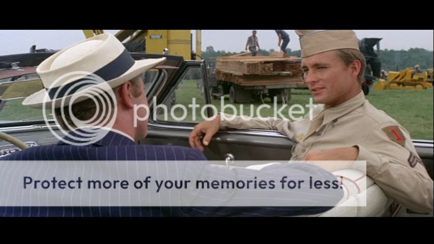
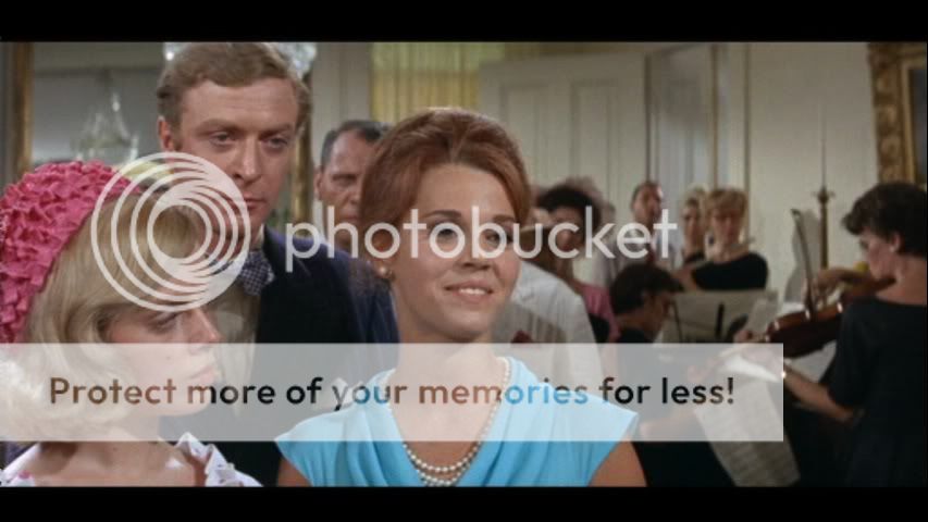
The print used has some problems, including some color fringing usually seen when Technicolor matricies don't line up. It only affects some individual scenes and sometimes just a few shots here and there. Below are some examples.


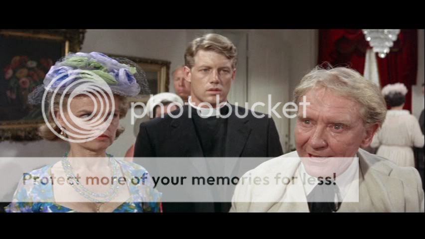
And then the image suddenly cuts to this:


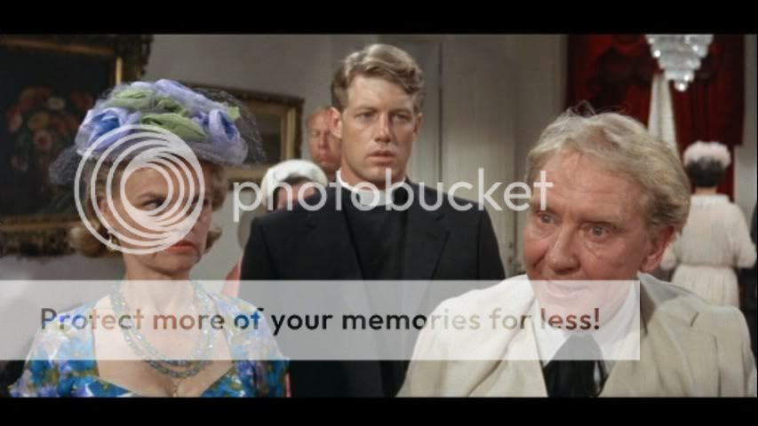
And do the images above look "squished" to you? They certainly do to me, as if the transfer provided wasn't in the 2.35:1 ratio and it was distorted so that the aspect ratio would be more mathematically correct even if the image is now wrecked. I don't remember this distortion in the pan/scan master, and I now wish I hadn't thrown it out so I could post comparison pics.


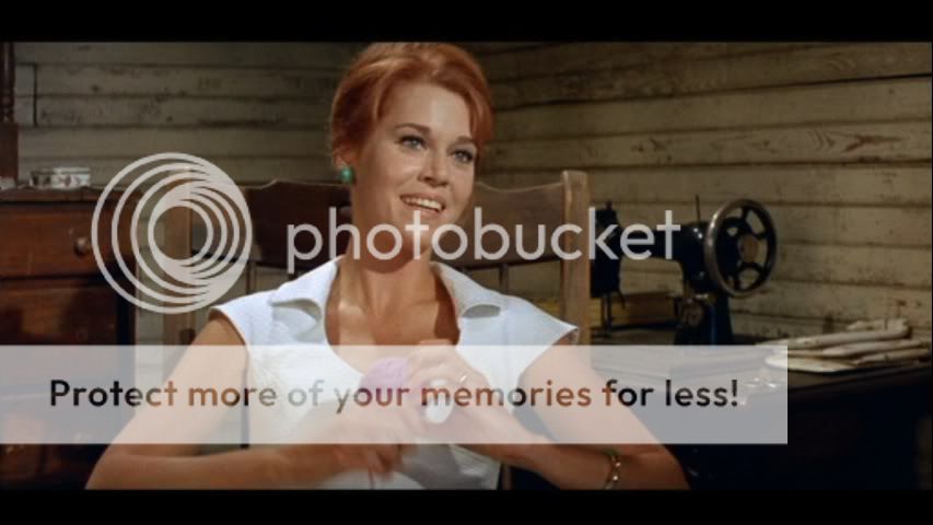
I took it upon myself to make a correction to crop 24 lines above and below the image to get an image that appears far more correct when displayed in 16x9 format. Below are comparison pics. You be the judge - Olive Films DVD is first, followed by my alteration. I got as close to the exact frame as I could in this comparison. Again, I'm not saying mine is optimal or correct - I didn't want to go too far and have everyone appear squeezed - but I feel certain that the Olive Films DVD release is certainly NOT correct.


HURRYSUNDOWN00001A.jpg

HURRYSUNDOWN00001B.jpg

HURRYSUNDOWN00002A.jpg

HURRYSUNDOWN00002B.jpg

HURRYSUNDOWN00003A.jpg

HURRYSUNDOWN00003B.jpg

HURRYSUNDOWN00004A.jpg

HURRYSUNDOWN00004B.jpg

HURRYSUNDOWN00005A.jpg

HURRYSUNDOWN00005B.jpg

HURRYSUNDOWN00006A.jpg

HURRYSUNDOWN00006B.jpg

HURRYSUNDOWN00007A.jpg

HURRYSUNDOWN00007B.jpg

HURRYSUNDOWN00008A.jpg

HURRYSUNDOWN00008B.jpg
 

ShowsOn

Second Unit
Joined
Mar 21, 2011
Messages
253
Real Name
Simon Howson
Thanks very much for this; you've just saved me a bunch of money. To me your 'corrected' versions look much better. The actors' faces look seriously fattened in the uncorrected versions. This is a Panavision film, so there is no reason why actor's faces should be so distorted like they were in 1950s CinemaScope films. The shot with Burgess Meredith looks particularly bad.


Keep in mind that it isn't uncommon for the background in Panavision films to appear squeezed, because the lenses worked by accurately squeezing the plane that is sharply focused (usually an actor who is closer to the foreground), but your images show that even sharply focused planes look stretched.


If you are able to find a scene with a circular object, such as a wheel or perhaps a circular clock, that is positioned directly in front of the camera you may be able to provide a more definitive comparison, but from what you have shown me this is a bad transfer, so I won't buy this disc. Hopefully Skidoo isn't stuffed up in this way.
 

Thomas T

Senior HTF Member
Joined
Sep 30, 2001
Messages
10,303
I'll have to disagree with Simon. The Olive version looks much better. In the shots provided by Chuck, everyone's faces looks unnaturally elongated as if there were an invisible wire attached to the top of their heads and someone was pulling hard thus stretching their faces vertically. Plus the color looks more vibrant in the Olive screen shots.
 

Chuck Pennington

Screenwriter
Joined
May 11, 2001
Messages
1,048
Ignore the slight difference in color, density and sharpness - do you seriously not see how the imagine is squished on the Olive Films DVD? Regardless of the source Paramount provided, this is something they could've corrected. Even the DVDBeaver.com review picked up on it:


"There is some horizontal stretching on the 2.35:1 Panavision aspect ratio."


I'd love some explanation from Olive Films. I'll keep searching for my pan/scan copy - and yes, I know it isn't definitive, but if people don't look squished on it, well that means something, wouldn't it?

Originally Posted by Thomas T

I'll have to disagree with Simon. The Olive version looks much better. In the shots provided by Chuck, everyone's faces looks unnaturally elongated as if there were an invisible wire attached to the top of their heads and someone was pulling hard thus stretching their faces vertically. Plus the color looks more vibrant in the Olive screen shots.
 

kagemusha98

Second Unit
Joined
Sep 12, 2009
Messages
267
Real Name
Ken Koc
Wow! Thanks...I was wondering why the faces are all distorted and fatter. It does look awful.....and I sure wish Olive could correct the probelm!
 

Richard--W

BANNED
Senior HTF Member
Joined
Jun 20, 2004
Messages
3,527
Real Name
Richard W
It looks like something Alpha or VCI would have done because they don't know any better. Sometimes. Has Olive or Paramount taken any action to correct the problem? Issued a public statement, perhaps? I'd rather buy my copy from Chuck Pennington.
 

Users who are viewing this thread

Sign up for our newsletter

and receive essential news, curated deals, and much more


You will only receive emails from us. We will never sell or distribute your email address to third party companies at any time.

Latest Articles

Forum statistics

Threads
357,070
Messages
5,130,029
Members
144,283
Latest member
Nielmb
Recent bookmarks
0
Top