What's new

UHD Review A Few Words About A few words about...™ - Blue White Red - Three Colors -- in 4k UHD (1 Viewer)

OliverK

Senior HTF Member
Joined
Feb 1, 2000
Messages
5,760
Was Kline not involved with the prior Criterion Blu-rays that weren't tinted yellow?

Forgive my skepticism, but I'm growing incredibly tired of being gaslit by studios completely changing the colors of famous movies and insisting, "This is the way it was always supposed to be and anything you ever saw before was wrong."

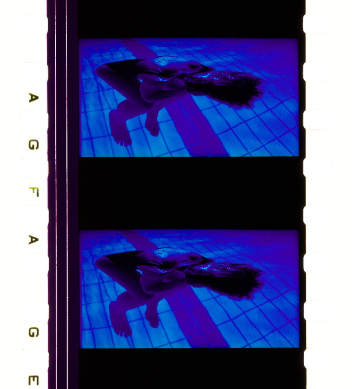
When a movie is called "Blue," and it's famous for being photographed with blue in every shot, is it wrong to expect the supposedly definitive home video edition of the movie to maybe look more blue than yellow? That doesn't seem unreasonable to me.

When the DOP is still alive and when there is also a print that apparently looks very much like the 4K disc with regard to colors then it is at least not a case of Ritrovata soaking everything in yellow no matter what. Still all three movies having a yellow tint is strange. Over the years when going to the movie theater in the analog days I remember very few movies leaning towards yellow or other colors for that matter yet in my home theater that is a much more predominant thing with many movies leaning strongly toward one color - very strange and something I would probably remember from a theatrical viewing as it would have been considered unusual.

So I would be very interested in hearing feedback about theatrical prints of these movies. For these movies they should have been produced on LPP stock so they would still give a pretty good representation of how these movies looked. The reviewer over at blu-ray.com says that when he saw it theatrically Blue did NOT look yellow which I believe as a movie that is called Blue looking yellow would probably be something one remembers if it is a favorite movie.
 
Last edited:

Robert Harris

Archivist
Reviewer
Senior HTF Member
Joined
Feb 8, 1999
Messages
18,438
Real Name
Robert Harris
When the DOP is still alive and when there is also a print that apparently looks very much like the 4K disc with regard to colors then it is at least not a case of Ritrovata soaking everything in yellow no matter what. Still all three movies having a yellow tint is strange. Over the years when giing to the movie theater in the analog days I remember very few movies leaning towards yellow or other colors for that matter yet in my home theater that is a much more predominant thing with many movies leaning strongly toward one color - very strange and something I would probably remember from a theatrical viewing as it would have been considered unusual.

So I would be very interested in hearing feedback about theatrical prints of these movies. For these movies they should have been produced on LPP stock so they would still give a pretty good representation of how these movies looked. The reviewer over at blu-ray.com says that when he saw it theatrically Blue did NOT look yellow which I believe as a movie that is called Blue looking yellow would probably be something one remembers if it is a favorite movie.
There are numerous questions that can come into play. And for the record I’m not taking a position, as I don’t have the requisite background with the films - either negatives or prints - to do so.

If I were asking questions, these would be some of them.

What are the “reference” print(s) and what is their history? Are they accurate prints for which someone on the production signed off or approved at the time of release?

We’re the original prints timed to arc or xenon?

Was everything through the entire process properly set at the 4k lab, inclusive of LUTs? One would presume so.

Was anyone doing color timing wearing tinted lenses during their work?

There are so many different things that can go wrong, every factor must be triple checked.

If everything was done properly, the new 4k should result in an image desired by the owner of the IP.

Either real or re-imagined.
 

Bartman

Supporting Actor
Joined
Aug 5, 2017
Messages
763
Real Name
Trevor Bartram
When these were announced I rewatched my Miramax DVDs. Simply great story telling and movie making. And it prompted me to seek out The Double Life of Veronique, another Kieslowski masterpiece, enjoy!
 

OliverK

Senior HTF Member
Joined
Feb 1, 2000
Messages
5,760
There are numerous questions that can come into play. And for the record I’m not taking a position, as I don’t have the requisite background with the films - either negatives or prints - to do so.

If I were asking questions, these would be some of them.

What are the “reference” print(s) and what is their history? Are they accurate prints for which someone on the production signed off or approved at the time of release?

We’re the original prints timed to arc or xenon?

Was everything through the entire process properly set at the 4k lab, inclusive of LUTs? One would presume so.

Was anyone doing color timing wearing tinted lenses during their work?

There are so many different things that can go wrong, every factor must be triple checked.

If everything was done properly, the new 4k should result in an image desired by the owner of the IP.

Either real or re-imagined.

I would not be surprised if we had some kind of print and/or light source issue here which is why I asked our members here for their theatrical experiences with these movies.
 

ManW_TheUncool

His Own Fool
Premium
Senior HTF Member
Joined
Aug 18, 2001
Messages
11,969
Location
The BK
Real Name
ManW
What do you mean "get sorted out"?
I don't think those 4K blu-rays would be any different color wise.
The new 4k restoration is with the yellow cast baked in, and couldn't change.
Unless a company did a color regrade correction, as did Arrow with The Tree of wooden Clogs, or Camera Obscura with Fantastic Planet.

You're probably right... in which case, I'm hoping for some real clarity on why they look this way and whether they really should look this way or not.

I already have the old Criterion BD set. It's not perfect, but I'm also not gonna buy a new 4K set just because it's 4K w/ moderately better details (and grain) and presumably better encodes if that yellow wash is not what Kieslowski actually intended -- and I do mean wash (or even soaking/drowning really), not mere cast.

That yellow wash seems so severe compared to what these films had always looked on physical media and compared to what they should reasonably look unless Kieslowski really intended such extremes (for all 3)... that I need more definitive answer/explanation before I'm willing to accept them and pay good $$$ for them. Part of the problem is this kind of revisionism, if that's indeed what this is, seems to have become quite commonplace nowadays from those quarters doing such "restorations".

I refused to buy the recent Wong Kar Wai BD set as well as The Godfather Trilogy 4K set for similar reasons -- and the latter set was far less severe/extreme than this in terms of the color grading change -- and I'll refuse to buy this set too. Granted, we have RAH speaking up authoritatively against The Godfather Trilogy 4K set, but don't have the same (so far) for the WKW BD set nor this new Kieslowski 4K set... yet, these 2 are definitely far more extreme in their changes.

As I said, I already paid good $$$ for the Criterion BDs. I'm not going to spend this much on new discs that are very suspect in their fidelity to Kieslowski's original intent.

_Man_
 

JoshZ

Senior HTF Member
Joined
May 26, 2012
Messages
2,306
Location
Boston
Real Name
Joshua Zyber
When the DOP is still alive and when there is also a print that apparently looks very much like the 4K disc with regard to colors then it is at least not a case of Ritrovata soaking everything in yellow no matter what.

Unfortunately, we've seen too many instances of DPs happy to re-grade their old work to however they feel it should look today, regardless of how it may have looked originally. Of course, Dean Cundey is the most notorious (though certainly not the only) example of this. No two video masters of Halloween or The Thing he supervised and approved over the years look remotely like one another, even when he worked on two versions back-to-back within months of each other (as he did with the Shout Factory and Arrow editions of The Thing).

I'll also note that the Three Colors are a trilogy of films that were each shot by a different DP:

Blue - Slawomir Idziak
White - Edward Klosinski
Red - Piotr Sobocinski

Which of these reviewed the 4K mastering? Did any of them sign off on the prior Criterion Blu-rays that weren't tinted yellow?

For a print, as RAH says, I would like to know the history of that print. I can't help thinking of how Francis Coppola made drastic color and contrast changes to the first Blu-ray edition of Bram Stoker's Dracula, claiming that it was based on a reference print that had never seen the light of day before and that only he seemed to know existed. Funny how the later remastered Blu-ray and 4K editions undid all those changes.

I saw all of the Three Colors films theatrically. I won't pretend to remember exactly how the prints looked 30 years ago, but it's absolutely safe to say that the central premise of this trilogy is that each film was primarily photographed in its title color. That's the gimmick the entire project revolves upon.

The movies are called Blue, White, and Red - not Green, Yellow, and Orange.
 

ManW_TheUncool

His Own Fool
Premium
Senior HTF Member
Joined
Aug 18, 2001
Messages
11,969
Location
The BK
Real Name
ManW

Let's throw in more complications. Printed on Fuji stock.


And on Agfa...


Yeah, I find that review excerpt(?) does not jive at all w/ how those prints (and various screencaps) largely look, except for a very few/select frames/scenes. And given the extreme prominence of the yellow wash, I would've expected that reviewer to mention something about that vs all the supposed blue she saw and wrote of... that seems largely missing w/ this 4K release near as I can tell (w/out actually owning the discs)...

_Man_
 

JoshZ

Senior HTF Member
Joined
May 26, 2012
Messages
2,306
Location
Boston
Real Name
Joshua Zyber
Let's throw in more complications. Printed on Fuji stock.


And on Agfa...


I don't know anything about this site or how they get their stills. It seems to be an academic resource with little concern for writing or organizing content in ways a reader can make sense of. The site is very confusing and I can't make heads or tails of what their methology is.

It looks like they're putting frames from a print onto a scanner bed. What kind of light does that use? Its it calibrated to match a projection lamp? Both sets of stills here are heavily drowned in yellow. I think that definitely would have stood out if it looked that way projected.
 

Robert Harris

Archivist
Reviewer
Senior HTF Member
Joined
Feb 8, 1999
Messages
18,438
Real Name
Robert Harris
And one set is way off as heavily contrasty. The point that I’m making is what may have been a difficulty finding/selecting any sort of true reference.

What film stock was used for timing?

Agfa? Eastman? Fuji?

Totally different looks
 

JoshZ

Senior HTF Member
Joined
May 26, 2012
Messages
2,306
Location
Boston
Real Name
Joshua Zyber
And one set is way off as heavily contrasty. The point that I’m making is what may have been a difficulty finding/selecting any sort of true reference.

You'd think the movie's title might be one such reference.

I can't wait until some label releases Derek Jarman's "Blue" with a new 4K HDR master totally recolored green from start to finish.
 

JoshZ

Senior HTF Member
Joined
May 26, 2012
Messages
2,306
Location
Boston
Real Name
Joshua Zyber
You might, but the word "blue" doesn't represent exactly one hue. Both the sky and a blueberry are "blue", but don't look the same.

Applying a yellow tint over everything flattens out such distinctions.
 

ManW_TheUncool

His Own Fool
Premium
Senior HTF Member
Joined
Aug 18, 2001
Messages
11,969
Location
The BK
Real Name
ManW
You might, but the word "blue" doesn't represent exactly one hue. Both the sky and a blueberry are "blue", but don't look the same.

Applying a yellow tint over everything flattens out such distinctions.

Again, calling it just a "yellow tint" feels very much an understatement of quite how yellowed it looks (at least based on screencaps anyway).

Nearly all screencaps (and those supposed film scans) look like they've been completely drowned in severe yellow wash.

_Man_
 

Users who are viewing this thread

Sign up for our newsletter

and receive essential news, curated deals, and much more


You will only receive emails from us. We will never sell or distribute your email address to third party companies at any time.

Latest Articles

Forum statistics

Threads
357,087
Messages
5,130,492
Members
144,286
Latest member
annefnlys01
Recent bookmarks
0
Top