These screen caps don't mean anything if you don't put them side by side with the previous version for comparison purposes. Sure, the Chief has three shades of red and Peter has four shades of green but they're all several shades yellower than the original colours. Besides, Peter's garb is at its "yellowest" in the battle on the ship.
That offers nothing conclusive. Who scanned the original artwork for that image... did you? Do you have access to the original painted cel to compare to all digital scans/electronic captures? In addition to the hand-painted cell, did you have access to the original technicolor negatives and film prints? What if the Disney animation team adjusted color timing intentionally so that the look of the projected film had a different color balance than the painted cel-work? Why should the digital scan from the cel above be considered any more trustworthy than LDI's care to maintain faithfulness?
My point is that there was NO care to maintain faithfulness. It's quite easy to see with your own eyes, unless you can't see the forest for the trees. This $ 1,750 original, 55-year old cel still maintains its original, brilliant colours and this is what was intended as a colour scheme for this character. In the original concept, the "Red Man" really was red. This, coincidentally, is the way, he appears in the 2002 edition and this is the way I remember him from the big screen. The PE colours are obviously doctored. You decide why that was...
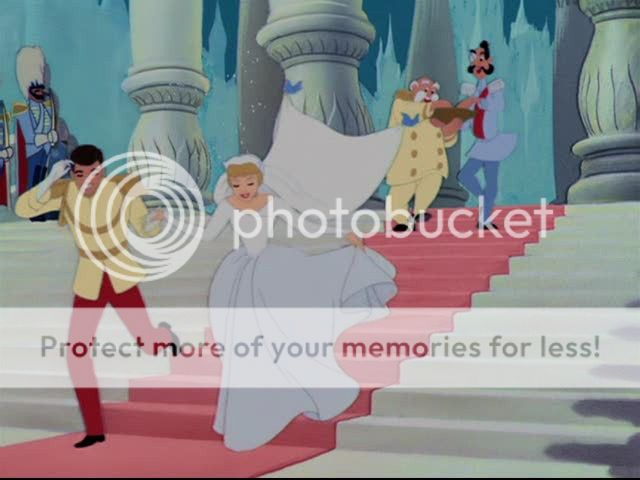
David, I disagree that Lowry is the patron saint of digital film restoration. And as far as their meticulous color-correcting, I direct you to CINDERELLA. Check out the white wedding dress at the end. It's gray on the DVD. You can ridicule the old Laserdiscs all you want, but isn't it odd that the 1988 and 1995 (which was restored on film) Laserdiscs - and the trailers on the 1995 set - don't look anything like the Lowry-restored CINDERELLA DVD?
I'd like to hear your argument on why the 2005 CINDERELLA DVD is the way to go here.
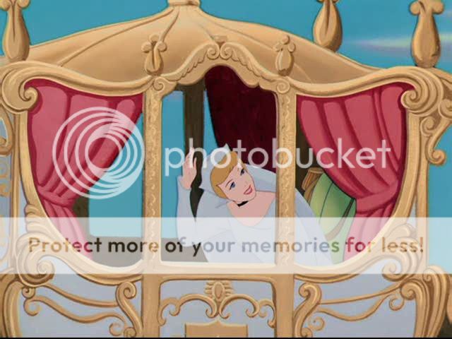
1995 Laserdisc
2005 DVD
And if you question my captures, put in the CINDERELLA DVD yourself. Tell me I'm wrong and that her dress is supposed to be gray AT HER WEDDING. I mean, of all times....
So I think these color changes were intentionally made my Disney's Animation team (DisneyToon Studios?). That would make more sense than DTS taking it upon themselves to make these changes from the material Disney gave them to use.
Cinderella's dress is not supposed to be all white. Look at the top of the dress, it is supposed to be a different shade than the bottom. Also, the shot of the carriage in the other thread from the PE matches that of a frame in the Cinderella book that was included with the PE.
Of course it matches the book included with the PE. The book included with the 1995 edition matches the image transfer of that film too.
I read somewhere that pure white was not wise to photograph in Technicolor because it would bloom. I think on the BLACK NARCISSUS commentary, Scorsese or Powell said that the nun's habits were dyed to be off-white partly due to this issue. Perhaps the production cels were painted paler than they would have appeared when printed and projected in Technicolor, which brings us back to the color chart used when the original cels were painted to show what the colors would look like when printed. If this is the case, then Lowry's restoration may have returned the image to look just like the original cels, but it ignores completely the intent of the filmmakers and how they thought the colors would be presented in the projected film.
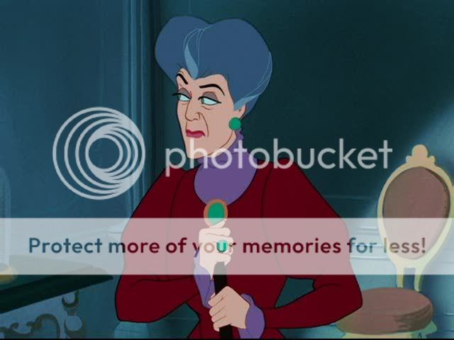
Still, I can't believe the whites of the stepmother's eyes were supposed to be blue in some shots as they are on the PE DVD. The two previous video releases had the whites of her eyes the appropriate white. Is it an example of a mistake my Lowry or Disney in re-coloring the film, or does it replicate the original cel pre-photography? Bottom line is it doesn't look right, and it doesn't appear it ever intended for this strange color fluctuation to be present.
Again, I'm not saying we all need to track down the old Laserdiscs to watch these films. I'm just stating my case that the DVD editions have been overhauled to such an extent that they aren't the same films anymore. They look like they were made-for-video. Why not just offer clean, bright transfers from restored film elements using the advances in telecine technology in the past 10-15 years and leave it at that? I love how bright and saturated the Silly Symphonies and Mickey Mouse cartoons look from the 1930's & 40's - the way Technicolor is supposed to look.
BTW - I need to re-do many of these captures from the Laserdiscs as the method I was using introduces some macroblocking and other artifacts into the image, so bear that in mind.
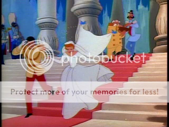
1988
1995
2005
And as far as her dress supposed to be various shades of gray, do you really think the following show was supposed to look this way on the DVD?
Oh, here an image from the 1988 release - oversaturated slightly, but that release was all over the place. Sometimes it looked wonderful, sometimes the color I even question.
You guys are in a complete state of denial and I respect that. You must feel like medical students who have just given a clean bill of health to a patient but have failed to notice the man has turned a perfectly lovely shade of yellow...
I' m sorry but your hypothesis doesn't make sense. The whole film was planned for years of committee meetings and collegial decisions. Its look was set. The colours were chosen. Its animation work was painted and then preserved for posterity. They were vibrant, hyperluscious colours (like the cel shows) with lots of blue. The film was photographed. It came out. I saw it and these are the colours I saw. It was restored and put on DVD twice and those are the colours I saw. Then, DTS Images screwed the pooch to drain the film of its blue and green and create this abomination that has nothing whatsoever to do with the artists's original intentions or the Technicolor film.
The question is WHY? Was it ONLY to make the red men beige or was there another aesthetic choice that I fail to understand?
Never said anything about the planning of or creation on original cells, look of theatrical release or anything to do with Peter Pan pre 1990's. I'm saying Disney's animation studio present times most likey alterted the color timing before giving DTS the material to work with. Disney definately had to approve DTS's work. If Disney wanted it one way and DTS wanted it another I doubt Disney would aprove it. Disney's writing their check. Even if it wasn't Disney intention, their the blame for letting DTS get by with it.
I'm sorry but when you mentioned the "animation team" I naturally assumed you were going over to DaVID's position that this decision was taken when the film came out in theatres, 55 years ago. I'm sure DTS Images wouldn't have the gumption, let alone the imagination, to think up this desacration of a perennial classic on their own, without Disney's blessing.
it's been my understanding that Disney supplies them with reference material from the vault so they can make sure that the final result matches what was intended.
Not that a process like this is free from subjective criteria or differing opinions about what was "intended".
DTS IMages, by definition, only work in the digital domain. They can do anything they please with the colours by just pushing the right, shiny buttons. They have probably never seen a piece of celluloid, let alone a cel.
2002 SE Edition 2007 PE Edition a.k.a. The Beige Edition
The 2002 is junk and isn't worth any sort of reference. You can't make out the shade of red around the Chief's eyes, the white levels are greyish, and the sky looks too brownish-green. The majority of the Chief's face on the 2002 is closer to pink than the 2007.
Also, this post indicates that Tinkerbell is color timed properly, with muted colors.
In that article that was just linked, the poster mentioned that Snow White's reel changes were too quick...is this was I have been talking about where the fade outs happen too quickly, eliminating seconds of footage? This happens several times throughout the film, and if true, is much more a travesty than the subject we are talking about here.
You're not very good at naming colours, are you, Patrick? The important thing about the red in the Chief's face is that it is red and not brown and that it is closest to the animation cel I posted. And you complain about a brownish-green sky when the 2007 sky is all brown? You're getting desperate!


")