What's new

Pre-Order Under Capricorn (1949)(Blu-ray) Available for Preorder (1 Viewer)

david hare

Supporting Actor
Joined
Aug 10, 2014
Messages
683
Real Name
david hare
I don't agree. The transfer does not look anything like what I was expecting but I have to say I didn't really know what to expect as I have never seen a decent 35mm print. I give this restoration (which is more or less what it is) full marks for doing the previously impossible, scanning the three strips with very, very little three strip fringing (contrary to opinions posted here based on a couple of caps from Beaver) and almost totally cleaned up for emulsion damage. BIggest surprise is the brightness of the image but I put this down to the scanning at BFI. The color has been very carefully graded to meet the skin tones, which are excellent but it may seem "pale" to some tastes. Not to me. THe naysaying on this board, usually based on caps alone, really is something to wonder at.
 

Robert Harris

Archivist
Reviewer
Senior HTF Member
Joined
Feb 8, 1999
Messages
18,438
Real Name
Robert Harris
I don't agree. The transfer does not look anything like what I was expecting but I have to say I didn't really know what to expect as I have never seen a decent 35mm print. I give this restoration (which is more or less what it is) full marks for doing the previously impossible, scanning the three strips with very, very little three strip fringing (contrary to opinions posted here based on a couple of caps from Beaver) and almost totally cleaned up for emulsion damage. BIggest surprise is the brightness of the image but I put this down to the scanning at BFI. The color has been very carefully graded to meet the skin tones, which are excellent but it may seem "pale" to some tastes. Not to me. THe naysaying on this board, usually based on caps alone, really is something to wonder at.

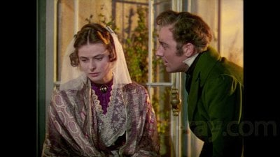
There should be very little wear or damage to the originals. I doubt that they were run a dozen times.

As to fringing digital recombines should be very precise, inclusive of dupes.
 

lark144

Senior HTF Member
Joined
Feb 22, 2012
Messages
2,110
Real Name
mark gross
I don't agree. The transfer does not look anything like what I was expecting but I have to say I didn't really know what to expect as I have never seen a decent 35mm print. I give this restoration (which is more or less what it is) full marks for doing the previously impossible, scanning the three strips with very, very little three strip fringing (contrary to opinions posted here based on a couple of caps from Beaver) and almost totally cleaned up for emulsion damage. BIggest surprise is the brightness of the image but I put this down to the scanning at BFI. The color has been very carefully graded to meet the skin tones, which are excellent but it may seem "pale" to some tastes. Not to me. THe naysaying on this board, usually based on caps alone, really is something to wonder at.
David, I saw a 35mm print of UNDER CAPRICORN at the New Yorker Theater--on a double bill with DESTINATION MOON!--in 1971. I was completely blown away by the quality of the color and the detail of the production to the extent that even though I saw the film nearly 50 years ago, many of the images are still fresh in my mind. In any case, what you describe in terms of the color on the Blu-Ray, is fairly close to what I remember. I was on the fence about this, but now I'm going to order the Blu-Ray.
 

Trancas

Second Unit
Joined
Feb 28, 2012
Messages
347
Real Name
Eric
The color has been very carefully graded to meet the skin tones, which are excellent but it may seem "pale" to some tastes.

Screencap from Blu-ray.com:
CapricornScreencap.jpg


A non-professional's Photoshop attempt to make the screenshot less insipid, hopefully better balanced:
View attachment 47345

I'm sure a professional grade could bring the original negatives' scans to a much richer, more satisfying state. I'm sorry but Kino's (and BFI's) efforts don't cut it.
 

Attachments

  • 17179_6899.568_1080p-3.jpg
    17179_6899.568_1080p-3.jpg
    1.1 MB · Views: 29
Last edited:

Robert Harris

Archivist
Reviewer
Senior HTF Member
Joined
Feb 8, 1999
Messages
18,438
Real Name
Robert Harris
I used to own a 35mm dye transfer print, produced sometime between 1968 and 1971.

Perfect registration and magnificent color.

The Blu-ray isn’t being even in the ballpark.
 

Trancas

Second Unit
Joined
Feb 28, 2012
Messages
347
Real Name
Eric
Technicolor screenshots from Blu-ray.com reviews:

Red Shoes (1948) digitally restored from 4k Technicolor camera negatives in 2009. Jack Cardiff lensed this film.
3023_9_1080p.jpg


3023_2_1080p.jpg


3023_8_1080p.jpg


Under Capricorn (1949) restored digitally in 4k from Technicolor "negatives"(?) in 2017. Jack Cardiff lensed this film too.
17179_4_1080p.jpg


17179_10_1080p.jpg


17179_9_1080p.jpg


I've watched Criterion's blu-ray of "The Red Shoes". It looks just like the screenshots. Those who've watched Kino's "Under Capricorn" ......does it look like these screenshots?

Compare the fine even grain in backgrounds of "The Red Shoes" compared with the coarse irregular grain in "Under Capricorn". Both would have been shot on the same B/W Technicolor stock. What kind of element has BFI scanned on Capricorn? A coarse-grained early Eastmancolor recombine?
 
Last edited:

Randy_M

Supporting Actor
Joined
Oct 25, 2000
Messages
803
Location
Peoria, AZ
Real Name
Randy
Just watched this last evening. Not the quality image I was expecting, but since I don’t have it on DVD, I sprang for the Blu-ray. Certainly not blown away, but perfectly watchable. And, I liked the movie way more than I thought I would. Cotten kind of broods his way through the film, and I appreciate that he didn’t try to put on a phony accent.
 

david hare

Supporting Actor
Joined
Aug 10, 2014
Messages
683
Real Name
david hare
vlcsnap-2018-06-25-12h04m02s429.png
vlcsnap-2018-06-25-12h05m51s679.png
Screencap from Blu-ray.com:
View attachment 47291

A non-professional's Photoshop attempt to make the screenshot less insipid, hopefully better balanced:
View attachment 47295


I'm sure a professional grade could bring the original negatives' scans to a much richer, more satisfying state. I'm sorry but Kino's (and BFI's) efforts don't cut it.


Just for the record here are screens from the existing (both OOP) NTSC Image DVD and PAL Universal France DVD of the film. I think you will agree the manipulation on the first screen also impacts on shadow detail and grain management (it is only DVD after all.) I see your point (and others') on how much nicer it might have looked but here are two points. Maybe Kino could have done more with a spare 150k USD to do detailed pass and re pass on grading and color timing, grain management and so on. They obviously did what they can afford. Nobody else has even bothered. Secondly The color palette itself is peculiarly, well, hideous. HItch never liked doing Costume pics, and the color choices here for wardrobe and sets are pretty awful, sort fo not out of planet Hitchcock, especially the off centre kelly green for the men's jackets, and the red.green combos which turn up quite often in the image, despite Cardiff's intense dislike for the combo in anything other than sequences signalling danger. (see his coment on the documentary for the Criterion DVD of Black Narcissus.) Anyway you can see obvious manipulation in these screens, especially in the attempt to push it into "warmer" tone on the US disc.
 

Stephen PI

Supporting Actor
Joined
Jan 31, 2003
Messages
919
I supervised the Image dvd and all I had to work with was a horrid CRI (color reversal intermediate) which I think came from the BFI. The element was plagued with color fringing and it was impossible from the start to get the look I wanted but I had no choice.
 

david hare

Supporting Actor
Joined
Aug 10, 2014
Messages
683
Real Name
david hare
I think you did a terrific job considering the circumstances. While the French disc is cleaner and less fringing it looks very flat and thin.
I supervised the Image dvd and all I had to work with was a horrid CRI (color reversal intermediate) which I think came from the BFI. The element was plagued with color fringing and it was impossible from the start to get the look I wanted but I had no choice.
c
 

Trancas

Second Unit
Joined
Feb 28, 2012
Messages
347
Real Name
Eric
Secondly The color palette itself is peculiarly, well, hideous. HItch never liked doing Costume pics, and the color choices here for wardrobe and sets are pretty awful, sort of not out of planet Hitchcock, especially the off centre kelly green for the men's jackets, and the red.green combos which turn up quite often in the image, despite Cardiff's intense dislike for the combo in anything other than sequences signalling danger. (see his coment on the documentary for the Criterion DVD of Black Narcissus.)

Don't you think some of the color choices were dictated by the "Technicolor Color Director" that was required on earlier Technicolor productions. Dear Natalie Kalmus and Joan Bridge are both listed as technicolor color director and associate technicolor color director respectively. And since we apparently have never seen a disk image that didn't come from that "horrid CRI (color reversal intermediate)" (thank you Mr. Pickard for that information! Obviously that is the source for this amazing 4k sourced blu-ray image) how are we to know what the film originally looked like? I think the ever-present shadowy remnants of color fringing visible where darks meet lights adds to the queasy oddity of the film's current appearance (I don't think the software used to subdue the fringing was totally effective).

I'm sorry if my sarcastic dismissal of Kino offends but since they've stuck their nose in the trough with this sub-par effort there won't be anything better around until their license for this title expires. Who knows if the nitrate negatives will be usable at that time. I wonder if CBS has checked on the negatives' condition lately?

 
Last edited:

david hare

Supporting Actor
Joined
Aug 10, 2014
Messages
683
Real Name
david hare
I don't think HItch was terribly interested in the color, he certainly became so soon after. HE has very little to say about the picture, apart from the long takes and the lousy first draft screenplay by Barrie. I wish he had been more attuned to the color, it is a weirdly dressed film, despite the pedigree of its DP. Something Cardiff and Hitch do not do is go in for long Alton-esque Noir-ish shadows and deep pools of dark, only in the CUs. THe lights well and truly had to be on for Cardiff's amazing 4 to 8 minute takes. This is surely why cinephiles love the film so much. Most good directors managed to overlook Kalmus, and DPs of Cardiff's calibre certainly ignored her. While I can appreciate how much more lustrous this might look, they've done what they've done with it. I find the misregistration issues minimal and at worst they only impact slightly on perceived "sharpness". My acid tese these days is to uprez through the player to 4K HDR and project at at 120 inches with the new DLP. I started viewing this with concern and then found the look so consistent I settled into what was really quite a pleasurable viewing. Certianly no trace of noise or undue digital tampering. I think Rope needs anothe run over the boards, don't you, to say nothing of 56 The Man who Knew Too Much and Marnie. Don't you think also the whole film with this much higher white level and definition shows up the matte painted backdrops and other minimal FX to much greater disadvantage?
 

Mark-P

Senior HTF Member
Joined
Sep 26, 2005
Messages
6,506
Location
Camas, WA
Real Name
Mark Probst
I don't agree. The transfer does not look anything like what I was expecting but I have to say I didn't really know what to expect as I have never seen a decent 35mm print. I give this restoration (which is more or less what it is) full marks for doing the previously impossible, scanning the three strips with very, very little three strip fringing (contrary to opinions posted here based on a couple of caps from Beaver) and almost totally cleaned up for emulsion damage. BIggest surprise is the brightness of the image but I put this down to the scanning at BFI. The color has been very carefully graded to meet the skin tones, which are excellent but it may seem "pale" to some tastes. Not to me. THe naysaying on this board, usually based on caps alone, really is something to wonder at.
Just curious David, does "very, very little three strip fringing" refer to the percentage of the film that has fringing, or the degree of the fringing itself?
 

david hare

Supporting Actor
Joined
Aug 10, 2014
Messages
683
Real Name
david hare
It's not frequent here and when it occurs it's really minimal. Nothing like for instance reel 2 of Duel in the Sun or similar. Worst case most recently was the burnt in fringin on Mank's Barefoot COntessa which was a late European 3 strip but the source looks like a bad Eastman recomb. Almost the whole film is out.
 

Charles Smith

Extremely Talented Member
Supporter
Senior HTF Member
Joined
Jun 27, 2007
Messages
5,987
Location
Nor'east
Real Name
Charles Smith
I used to own a 35mm dye transfer print, produced sometime between 1968 and 1971.

Perfect registration and magnificent color.

It wasn’t by any chance run in the Bing at LACMA in a ca-1973 Hitchcock retrospective, was it? :)

Been a Hitchcock devotee forever, but that marks the one time I’ve seen UC.
 

Robert Crawford

Crawdaddy
Moderator
Patron
Senior HTF Member
Joined
Dec 9, 1998
Messages
67,930
Location
Michigan
Real Name
Robert
Viewed. Not “re”viewed.

I thought it was okay, but frustrating, considering what it could have looked like.
I have this Blu-ray and the previous DVD so I'm going to watch the BD in its entirety and spot check the DVD in the very near future.
 

Matt Hough

Reviewer
Senior HTF Member
Joined
Apr 24, 2006
Messages
26,204
Location
Charlotte, NC
Real Name
Matt Hough
I watched this today, and I must say this is the closest the movie has ever come to looking "normal" (i.e. for a British color movie of the era). The sharpness is finally acute enough to see quite clearly the corduroy weave in Michael Wilding's blue coat and the intricacies of the tweed in Cotten's jacket, too. The color saturation is another story. It's very erratic: nicely saturated and appealing in some scenes and a bit washed out and unimpressive in others (though red always registers very richly and brightly). Overall, I can now watch the movie without my eyes feeling that they're out of focus or watching something that's been Kodachromed.

Whatever made this story appealing to Hitchcock? Yes, he's had love triangles in his films before (memorably even with Ingrid Bergman before in Notorious), but it's all talk and very little "action," so to speak in regard to the feelings bursting out of these people. And to have a villain in Margaret Leighton's character so obvious and yet her victims so ridiculously manipulated to rile the audience up into feelings of frustration and exasperation! I wanted to whack the lot of them upside the head and tell them to wake up and look what she's doing. She's not even being subtle about it like Judith Anderson's character was in Rebecca! Sad to say, even after this great improvement in presentation from what I had seen before, Under Capricorn remains my least favorite Hitchcock movie from his post-British period onward.
 

Users who are viewing this thread

Sign up for our newsletter

and receive essential news, curated deals, and much more


You will only receive emails from us. We will never sell or distribute your email address to third party companies at any time.

Latest Articles

Forum statistics

Threads
357,086
Messages
5,130,449
Members
144,285
Latest member
foster2292
Recent bookmarks
0
Top