New Warner Bros. logo sparks controversy

Warner Bros logo controversy

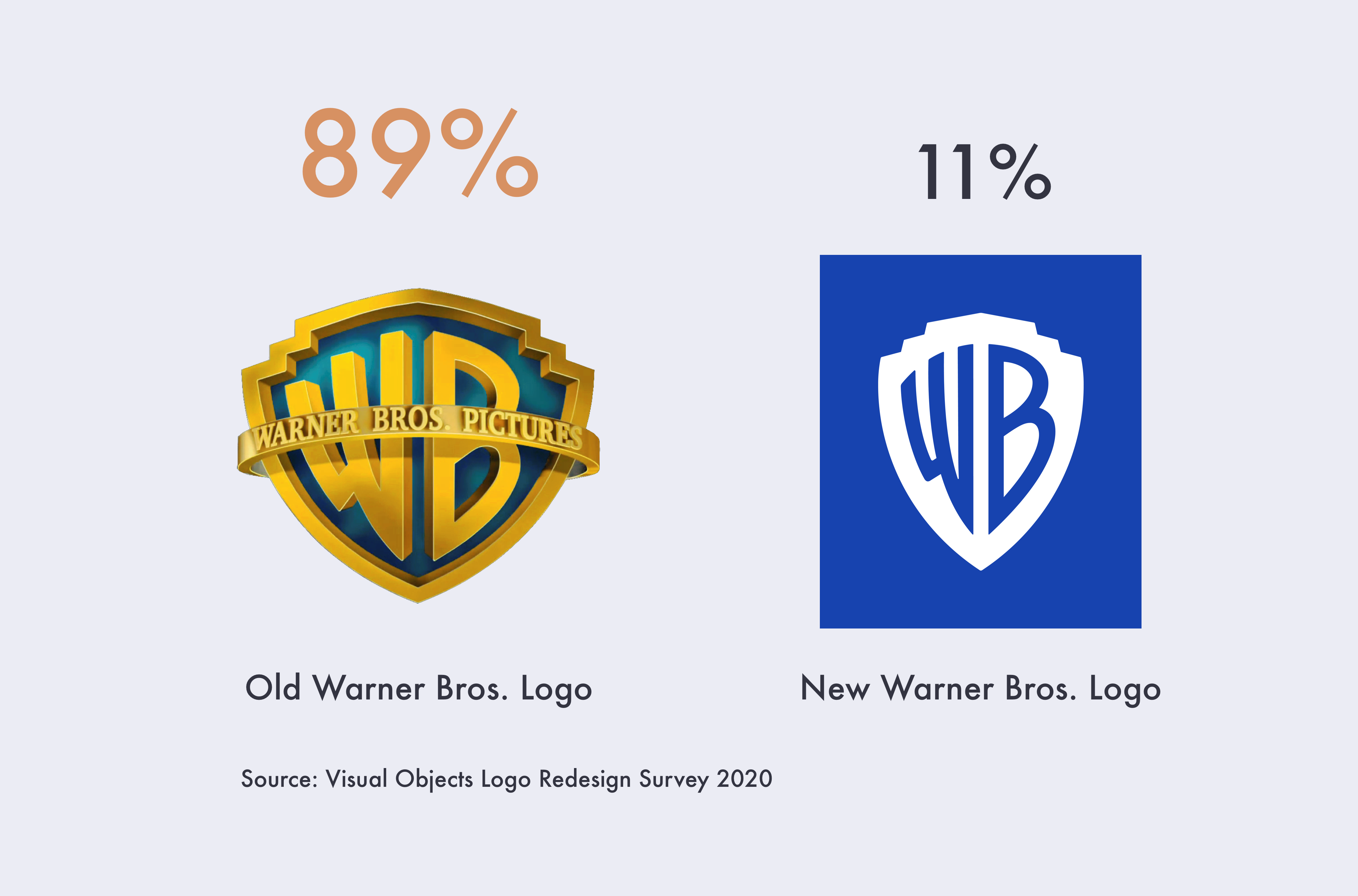
According to a survey published this week by portfolio website Visual Objects, the new Warner Bros. logo is “not a winner” with 89% of respondents saying they prefer the old to the new. The studio launched the redesigned logo in November, replacing the iconic 3D gold-and-blue shield design with a flat blue-and-white shield design, representing the company’s first major logo reworking since 1984. The shield design itself first appeared in 1920s.

“By trading the dominant gold color for just a bland blue-and-white logo, Warner Bros. forfeits its heritage and the legacy of its past,” said film historian Mitch Goldstone.

It turns out that people do feel nostalgia for the former Warner Bros. logo, even though the new look is supposedly in line with current logo design trends. It seems that one of the objections in the research reveals that the new logo is too similar to others, and even reminiscent of the Facebook brand.
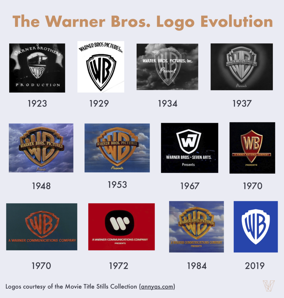
Warner Bros logos over the years

Among the respondents in the survey, writer Melanie Davis said, “Flat, one-dimensional designs seem to be considered more modern than their three-dimensional counterparts. [The new Warner Bros. logo] is boring and blends in with the sea of other flat logos now. The gold-and-blue shield caught your eye.”

The iconic WB shield design is synonymous with such films as Wizard of Oz and Casablanca, as well as Looney Tunes cartoons and the Harry Potter franchise, with one respondent suggesting that he would prefer the restoration of the old logo after the fond association with “watching Warner Bros. cartoons all my childhood.”

Visual Objects surveyed 1,001 consumers across the U.S. and you can read the full report here. Let us know your thoughts below.

Martin, a seasoned journalist and AV expert, has written for several notable print magazines. He’s served in key roles at Lucasfilm’s THX Division, NEC’s digital cinema division, and has even consulted for DreamWorks. Despite his illustrious career, Martin remains rooted in his passion for cinema and acting, with notable appearances in several Spielberg films, Doctor Who, and Star Wars: The Empire Strikes Back. He currently resides in San Francisco.

Post Disclaimer

Some of our content may contain marketing links, which means we will receive a commission for purchases made via those links. In our editorial content, these affiliate links appear automatically, and our editorial teams are not influenced by our affiliate partnerships. We work with several providers (currently Skimlinks and Amazon) to manage our affiliate relationships. You can find out more about their services by visiting their sites.

Share this post:

View thread (82 replies)

Ronald Epstein

Founder
Owner
Moderator
Senior HTF Member
Joined
Jul 3, 1997
Messages
66,759
Real Name
Ronald Epstein
I'll add to the controversy

I actually like this logo, though not as much as the original.

Screen Shot 2020-02-08 at 6.23.27 AM.png
 

DVBRD

Second Unit
Joined
Oct 27, 2011
Messages
398
Real Name
Andy
When I first heard that Warner Bros. was changing its logo, I thought, "They're bringing the Saul Bass logo back?" Because it seems like nearly every other important filmmaker who made a movie for the studio in the past 10 years prefer using that logo over the recent one.
 

Ronald Epstein

Founder
Owner
Moderator
Senior HTF Member
Joined
Jul 3, 1997
Messages
66,759
Real Name
Ronald Epstein
I don't really care, but if I had my choice, I would not have changed the logo.


I would not have either. The Warner logo is iconic. The one they had been using was the optimal one.

But, as always, everyone feels the need to re-invent themselves. An important part of history often goes with that.

Now we have to contend with evil Disney pulling the FOX name off its 20th Century and Searchlight logos. Now that's what I call a travesty!
 

Robert Crawford

Crawdaddy
Moderator
Patron
Senior HTF Member
Joined
Dec 9, 1998
Messages
67,841
Location
Michigan
Real Name
Robert
I would not have either. The Warner logo is iconic. The one they had been using was the optimal one.

But, as always, everyone feels the need to re-invent themselves. An important part of history often goes with that.

Now we have to contend with evil Disney pulling the FOX name off its 20th Century and Searchlight logos. Now that's what I call a travesty!
It might be a travesty, but I can understand why they did it.
 

bmasters9

Senior HTF Member
Joined
Jan 8, 2008
Messages
6,513
Real Name
Ben Masters
Though I must admit I have a certain amount of nostalgia for the '72 version having seen it often in my youth.

I think you have the same amount of nostalgia for that as I have for both the Sunburst/Abstract Torch and 80s Torch Lady of Columbia Pictures.
 

Ronald Epstein

Founder
Owner
Moderator
Senior HTF Member
Joined
Jul 3, 1997
Messages
66,759
Real Name
Ronald Epstein
Man, Warner needs some real leadership desperately. That new logo is something for an imprint, like an animated subdivision or an indie films unit, not for the whole company.


What makes me think there was a big "logo unveiling" ceremony at the studio and everyone there nervously clapped?
 

Alan Tully

Senior HTF Member
Joined
Feb 19, 2008
Messages
4,648
Location
London
Real Name
Alan
I like the long badge that used to be on the old b/w Warner movies. I'd agree that the best one is the yellow & blue one, I suppose you could say it looks a bit old fashioned, but so does the new blue one, as it still has the Warner badge, at least the red & black one looked modern. As long as they leave the logo alone on their catalogue releases, I'm not bothered.
 

Jake Lipson

Premium
Senior HTF Member
Joined
Dec 21, 2002
Messages
24,641
Real Name
Jake Lipson
Hang on, when did Warner start using the new logo?

I saw Just Mercy last month, which is a Warner Bros. film, and it had the traditional one on there.
 

Sean Bryan

Sean Bryan
Senior HTF Member
Joined
Jun 30, 1997
Messages
5,945
Real Name
Sean
I’m really not a fan of the trend to make logos and icons “flat and simple” as some misguided interpretation of “modern”. I hated when Apple decided to make their iPhone icons “flat”. Just couldn’t fathom why Apple thought this looked better than the “etched/3D” look they originally had. This WB decision kind of evokes the same response from me, “bleh”.
 
Most Popular