What's new

Dick

Senior HTF Member
Joined
May 22, 1999
Messages
9,937
Real Name
Rick

Yeah, I know. This argument over color grading is pretty boring if you haven't purchased a bunch of terrible-looking Blu-rays, most of them directly from Fox. Sorry. In fact, after I do a final check of WSSRH, I will cease and desist from any further bluing-related commentary unless the same problem recurs with a future release. I simply felt compelled to respond in this case, because to me (and a bunch of others here), the Blu-ray is appalling . I do not hold this against TT, but rather to Fox and their colorists. As for the contention from "the other side" that there is nothing wrong with the transfer, I cannot let that go unchallenged. But, all in good fun (I hope), among friends. :)
 

Dick

Senior HTF Member
Joined
May 22, 1999
Messages
9,937
Real Name
Rick
Well, then respond to my post and the examples I gave, which are very specific. It will be interesting.

I put the disc on and watched from the beginning, specifically the scenes you point out. Truthfully, it looked pretty good. There were whites...real whites. The blue objects such as paintings on the wall were obviously supposed to be that color. I began thinking, Oh my God! Bruce is right. How will I ever save face? Then, I hit the sequence in Henry Jones' office at 6:16, and I began to see the blue. Look at the wall behind the reclining Jones. Toward the top, I can see it heading toward blue. I skipped over some chapters and it just seemed to get worse.

Chapter 10, 34:00: The NBC insignia on the bus is clearly not the solid white it is meant to be to match the roof. I would direct your attention to the sequence with Henry Jones at 38:40. Is it likely that the paint trim on the bookshelves would be a light blue, or that the curtains behind the window outside that says "Cooper" would be light blue? Or that the paint job over the mantle would be bluish? Or that even the framed photo of Mansfield on the table would have a bluish cast? Or that, in the scene in the car with Jayne Mansfield at 41:12, virtually every car and building shown going by through the windows has a blue tint? Tinted windows, you say? Nay, I say. Or that Mansfield's poodle, which admittedly has blue (intentionally) on the top of its head and on the bottoms of its ears, has a blue tint even on the fur that in earlier scenes was white? Plus, the flesh tones are brownish and pasty probably from this bizarre color grading.

The examples of this are rampant throughout the disc after that opening sequence you cite. There are still some solid whites, but an awful lot of what should be white just isn't. Sorry, man, it's not my eyes or my color calibration, since it, along with some other Fox titles already mentioned, are very much the exception in my embarrassingly large collection. Why would I choose to single out this or KING AND I or CAROUSEL and others, as I really like these movies and have absolutely no intrinsic reason to find fault with their transfers?

Bruce, we must part company on this issue, which has dragged on for years on this forum and others (meaning, if I'm wrong, there are many people on Blu-ray.com and DVD Talk who are as color blind as I am). I totally consider you an authority on many, many things and hold you in high esteem, but on this business, we just aren't going to connect.

As I mentioned a few posts back, I am done posting about this blue stuff and just have to end by saying I'm damned puzzled and pissed off that some person or people at Fox have so degraded these fine movies for reasons unknown.
 

haineshisway

Senior HTF Member
Joined
Oct 26, 2011
Messages
5,570
Location
Los Angeles
Real Name
Bruce
I can look at those scenes but suspect it's pointless and would only point out to you that there is a LOT of blue lighting in this film - it's Tashlin - it's what he LOVES - big, bold, cartoonish visuals. The lighting is very obvious, which is why some scenes that have white frames on paintings in the outer office and ones that have a bluish hue is because in those scenes there is blue lighting on the walls. Again, and I hope my point is a simple one - they do not go into a transfer and only pick certain portions of the frame to color correct - and if blue was being pushed it would effect every other color on the screen and to my eyes every other color on the screen is completely accurate. No one seems to understand gels on lights and what they do. A blue gel on a light aimed at a wall and what's on that wall will result in a bluish hue to the wall. Funnily, where it's easiest to tell this is when there are blue highlights in dark hair, and as that person moves about in the frame those highlights will go away as soon as they move out of that light.
 

Dick

Senior HTF Member
Joined
May 22, 1999
Messages
9,937
Real Name
Rick
I can look at those scenes but suspect it's pointless and would only point out to you that there is a LOT of blue lighting in this film - it's Tashlin - it's what he LOVES - big, bold, cartoonish visuals. The lighting is very obvious, which is why some scenes that have white frames on paintings in the outer office and ones that have a bluish hue is because in those scenes there is blue lighting on the walls. Again, and I hope my point is a simple one - they do not go into a transfer and only pick certain portions of the frame to color correct - and if blue was being pushed it would effect every other color on the screen and to my eyes every other color on the screen is completely accurate. No one seems to understand gels on lights and what they do. A blue gel on a light aimed at a wall and what's on that wall will result in a bluish hue to the wall. Funnily, where it's easiest to tell this is when there are blue highlights in dark hair, and as that person moves about in the frame those highlights will go away as soon as they move out of that light.
Anyway, you have made your points, and I respect them. Have a safe and productive summer! :cheers:
 

lark144

Senior HTF Member
Joined
Feb 22, 2012
Messages
2,108
Real Name
mark gross
I can look at those scenes but suspect it's pointless and would only point out to you that there is a LOT of blue lighting in this film - it's Tashlin - it's what he LOVES - big, bold, cartoonish visuals. The lighting is very obvious, which is why some scenes that have white frames on paintings in the outer office and ones that have a bluish hue is because in those scenes there is blue lighting on the walls. Again, and I hope my point is a simple one - they do not go into a transfer and only pick certain portions of the frame to color correct - and if blue was being pushed it would effect every other color on the screen and to my eyes every other color on the screen is completely accurate. No one seems to understand gels on lights and what they do. A blue gel on a light aimed at a wall and what's on that wall will result in a bluish hue to the wall. Funnily, where it's easiest to tell this is when there are blue highlights in dark hair, and as that person moves about in the frame those highlights will go away as soon as they move out of that light.
It wasn't only Tashlin that liked blue gels. It was a house style at Fox that goes back to the 1940's. If one listens to the commentary for THE BLACK SWAN, Maureen O' Hara talks about how that was her first film in Technicolor, and she was very concerned, as she heard most cinematographers used lots of lights in order to obtain a well-balanced image when shooting in color, and as Ms. O 'Hara had very fair skin, she really didn't wish to be exposed to those bright lights all day, so she was very happy when she appeared on the set for the first day of shooting and Leon Shamroy instead of subjecting the set to an inordinate amount of overly bright lights, used colored gels, in particular blue gels, to achieve the same effect. And of course Mr. Shamroy won an Oscar for his cinematography in THE BLACK SWAN, and while it wasn't only the use of colored gels, that did have something to do with it, and that became part of Fox's house style which one can see in innumerable color films from the 1940's until the early 1960's.

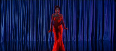
But yes, Bruce is correct in that Frank Tashlin did love to use colored gels to create pools of artificial color, since he came from cartoons. If one looks at the credit sequence in THE GIRL CAN'T HELP IT, for instance, it's filled with weird colored highlights in the corners of the set and on the walls that often clash with the main color scheme. In fact, during the opening credits of ROCK-A-BYE BABY, a film Tashlin directed with Jerry Lewis, it takes place in a studio on the Paramount lot and one can see arc lights covered with blue, red and yellow gels. In other words, it's not some crazy digital effect the colorists at Fox are doing; but these overly blue highlights that pop up in strange places (like in the frame behind Henry Jones' head) are part of the original photography.
 

lark144

Senior HTF Member
Joined
Feb 22, 2012
Messages
2,108
Real Name
mark gross
So was Joshua Logan ripping off Tashlin's filming method when he made "Bus Stop"? I just find the whole thing odd.
I don't know about BUS STOP, but I think maybe Josh Logan had seen too many of Frank Tashlin's cartoons, and those overripe colors kind of got stuck someplace in his cranium, so in SOUTH PACIFIC he figured suffusing the screen with purple and orange when Mitizi Gaynor sang about being lonely was normal..
 

haineshisway

Senior HTF Member
Joined
Oct 26, 2011
Messages
5,570
Location
Los Angeles
Real Name
Bruce
So was Joshua Logan ripping off Tashlin's filming method when he made "Bus Stop"?

I just find the whole thing odd.

No, Joshua Logan didn't photograph Bus Stop, he directed it. The cameraman was Milton Krasner, a house DP at Fox. Another Fox house DP, as Lark points out, was Leon Shamroy - he always used blue gels - it's very obvious. I think the problem, as has been stated so many times, is that so many people are used to older transfers that were off fading internegatives and too orange and brown and with the blue severely compromised, and that's what they think these films looked like - and they really didn't.
 

ThadK

Second Unit
Joined
Oct 25, 2003
Messages
306
And ... a real digresson ... when is The Girl Can't Help It being released on Blu?

Hopefully never, if these conditions continue to prevail. I've seen it in Technicolor, and had a print for several years. There's no "blue gel" in it.
 

haineshisway

Senior HTF Member
Joined
Oct 26, 2011
Messages
5,570
Location
Los Angeles
Real Name
Bruce
Hopefully never, if these conditions continue to prevail. I've seen it in Technicolor, and had a print for several years. There's no "blue gel" in it.

Well, I had an IB Tech print, too. Just a little question: What do you think is on the curtain and aimed at the floor. Think that's paint? That's blue gels. 1342583664.jpg
 

ThadK

Second Unit
Joined
Oct 25, 2003
Messages
306
OK, just to spell it out, I meant "blue gel" as a label for how ROCK HUNTER, THE KING AND I, etc. look on the TT releases. THE GIRL CAN'T HELP IT doesn't look like that on Technicolor film - maybe for that one scene, and that frame does rather resemble how it looks in Tech, but not for the entire movie.
 

haineshisway

Senior HTF Member
Joined
Oct 26, 2011
Messages
5,570
Location
Los Angeles
Real Name
Bruce
OK, just to spell it out, I meant "blue gel" as a label for how ROCK HUNTER, THE KING AND I, etc. look on the TT releases. THE GIRL CAN'T HELP IT doesn't look like that on Technicolor film - maybe for that one scene, and that frame does rather resemble how it looks in Tech, but not for the entire movie.

And I spell it out to you again: It is not possible to have what I presume you mean as a blue tint to an entire transfer and have every other color on the screen rendered perfectly. Not possible. I know what The Girl Can't Help it looks like in dye transfer. It is filled with garish lighting in scenes that require it - just like every other Tashlin film of its ilk.
 

OliverK

Senior HTF Member
Joined
Feb 1, 2000
Messages
5,760
There seems to be an understanding that colors that are moved towards another color by tinting a complete picture would disappear or look very strange, but a blue tint does not mean that yellow and red would suddenly look blue as an example even with considerable, it is tinting after all and not replacement of other colors.

If you look at an RGB color triangle and move for example yellow and red towards blue they still look yellow and red, they just have a higher percentage of blue added but still look perfectly fine unless you knew that before they looked more red and yellow. Only for previously neutral white and grey parts of the picture will you easily see a shift towards whatever color you choose with a shift towards green being the most objectionable for most people.

As for the gel filters that will make for some interesting reading, but a common denominator for movies that are considered to look more bluish or teal as some say seems to be that they are very often 50ies Fox movies shot on Eastman stock that is known for heavy fading.

So is it the style from Fox from the 50ies that is responsible for what we see or is it the fading combined with what certain modern colorists at Fox seem to think is a good look for these movies? I would guess that it is not 100% of one or the other and that not every film would look the same anyway. And surely it makes for some spirited discussions :)
 

Alan Tully

Senior HTF Member
Joined
Feb 19, 2008
Messages
4,652
Location
London
Real Name
Alan
I think it's the Fox "house look" now, & the word I'd use is cyan. Of course in the old film grading days, if a scene was too yellow you'd add blue, & too blue, you'd add yellow. You can see it on some desert scenes where they add a lot of yellow to make it look more golden & the blue sky suffers, with the blue looking very pale. These days with digital grading tools & choice of LUT, you can make a picture very cool & still have good flesh tones & yellows.
 

OliverK

Senior HTF Member
Joined
Feb 1, 2000
Messages
5,760
Yes, that is the problem with today's tools - they are very powerful and in the wrong hands...

I would strongly prefer if they avoided a look that could not have been achieved in the analog days.
 
Last edited:

rsmithjr

Screenwriter
Joined
Oct 22, 2011
Messages
1,228
Location
Palo Alto, CA
Real Name
Robert Smith
I was very fond of Fox CinemaScope and tried to see movies when they first opened in the best theatre I could get. Later I was a theatre projectionist through college.

I have tried to collect many of these films. Unfortunately, many of the recent Blu-rays are just too blue! So, I made up a list of projector adjustments that try to fix the problem, in some cases successfully.

Not all films have a problem. Peyton Place (on of my favorites) is fine, The Blue Max may be ok, but my only experience was watching it at a drive-in where I was the projectionist, so that is hard to use as a reference. But many others just don't work for me.

My erudition is certainly not at the level of many people on this board who spent their lives in film, so I have to bow to them.

The one film whose color balance I can never accept is The King and I on Blu-ray. Just too blue, and unfortunately beyond the adjustments on any of my displays. A lost film for me. (Except for the new-looking 35mm print that the Stanford Theatre plays periodically, which is on the money.)
 

Users who are viewing this thread

Sign up for our newsletter

and receive essential news, curated deals, and much more


You will only receive emails from us. We will never sell or distribute your email address to third party companies at any time.

Latest Articles

Forum statistics

Threads
357,053
Messages
5,129,694
Members
144,282
Latest member
NenaSiddall
Recent bookmarks
0
Top