So is Fox and those other studios still using that lab and the person responsible for messing up those titles?Not going to speak for Schawn (whose quality track record at Fox speaks for itself) or his workflow, but I'll speak from experience on Bob and my behalf that on some projects, there simply isn't enough time to go back and fix problems, and if your problem happens to be someone mistimed a whole feature, sometimes you just have to let it go.
This happened on one of our early 3DFA projects at another lab where we just had to let it go, which is why after that one project, we decided to take all the color grading in-house (most recently, SANGAREE, which Greg did, and JIVARO, which Greg and I both worked on.) I've got to judge it based on what I see, and that's why, for the most part, we get good reviews in regards to color and levels.
Bob and I also have the inside scoop on the lab that's been handing Fox's work, and without being professionally uncouth and naming them publicly here, there have been a number of QC complaints of the same symptoms there by other studios.
Looking at SUCCESS with the same critical eye as any of our own projects, I would have rejected this timing immediately. I think TT should have done the same, or at least brought someone in to try to undo some of the messy choices this person made.
Home Theater
Entertainment & Streaming Content
Physical Media
Home Theater Equipment and Hardware
Other Diversions
Bargains and Classifieds
Home Theater Forum
You are using an out of date browser. It may not display this or other websites correctly.
You should upgrade or use an alternative browser.
You should upgrade or use an alternative browser.
Blu-ray Review Will Success Spoil Rock Hunter? Blu-ray Review (Twilight Time) (1 Viewer)
- Thread starter Josh Steinberg
- Start date
More options
Who Replied?I just hope that someone in authority takes a second look and gives us a 'Carousel' without that awful blue bias. And I know lovers of 'The King and I' would enjoy an appropriate transfer of that too. Rodgers and Hammerstein deserved better.
At least 'Oklahoma' and 'South Pacific' both stand as sterling examples of how these films should look. Although I'm still a youngster, I was fortunate enough to have seen all these movies on their first widescreen releases, including in Todd-AO for 'Oklahoma and 'South Pacific' and I'm grateful to all the people who made those two releases shine with such beauty on transfer to Blu ray.
At least 'Oklahoma' and 'South Pacific' both stand as sterling examples of how these films should look. Although I'm still a youngster, I was fortunate enough to have seen all these movies on their first widescreen releases, including in Todd-AO for 'Oklahoma and 'South Pacific' and I'm grateful to all the people who made those two releases shine with such beauty on transfer to Blu ray.
Yeah, we have a firestorm here as has been the case with other Fox titles. Thank you for your review as I look forward to purchasing this disc and comparing it to my Region "B" Blu-ray.This was an enormously difficult title to review as the high quality of the movie itself didn’t seem to be completely matched by the quality of the transfer.
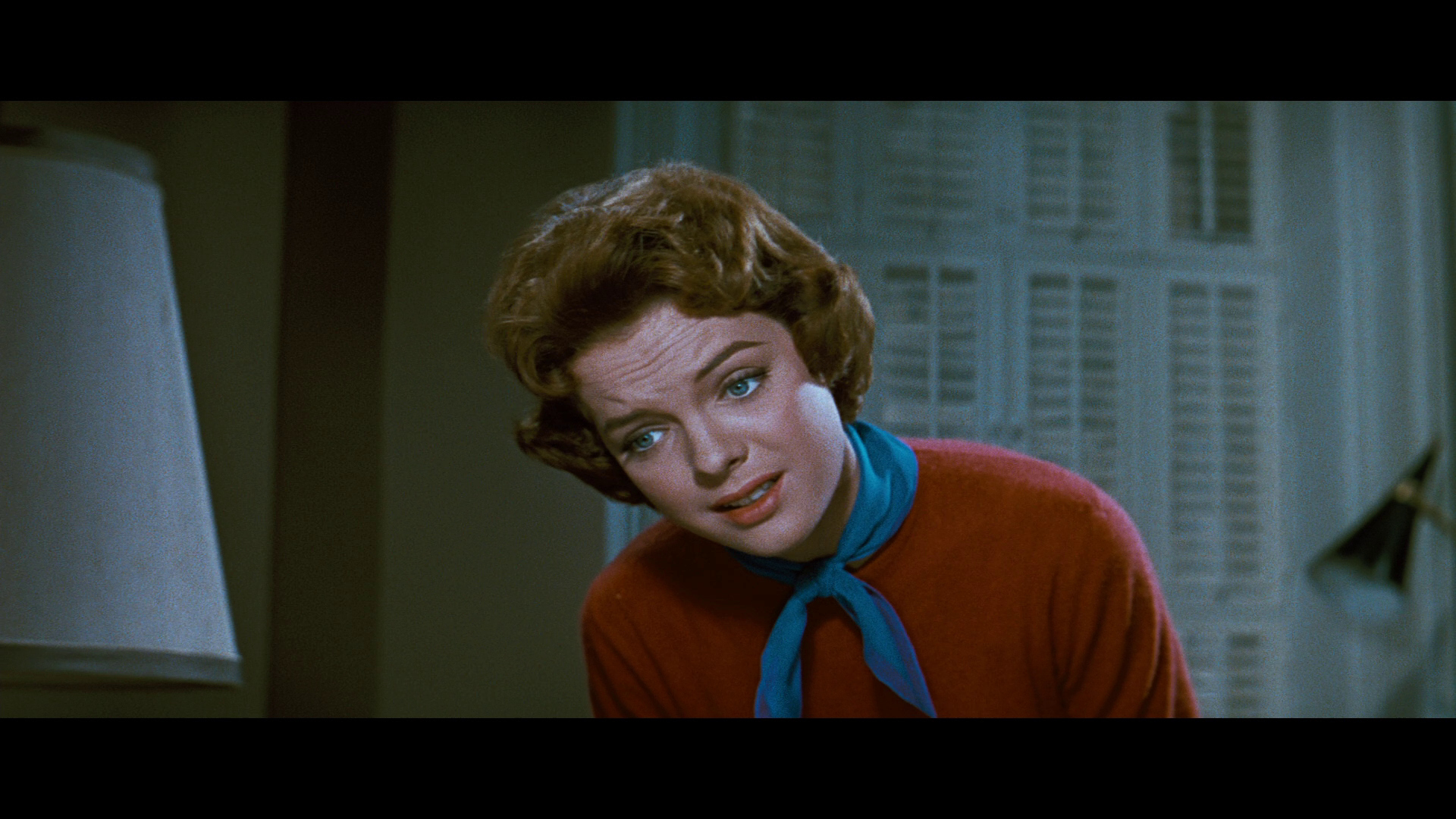
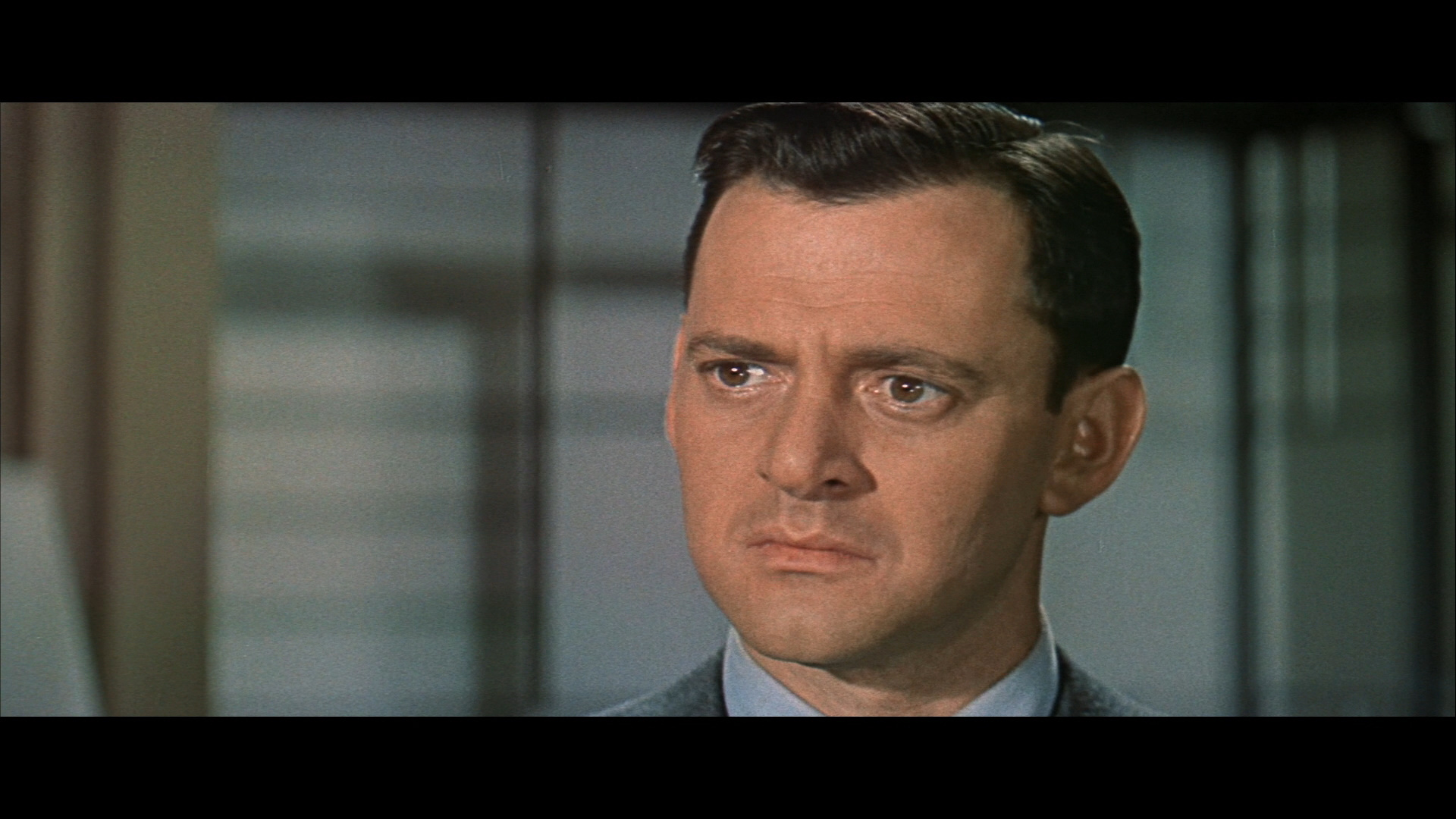
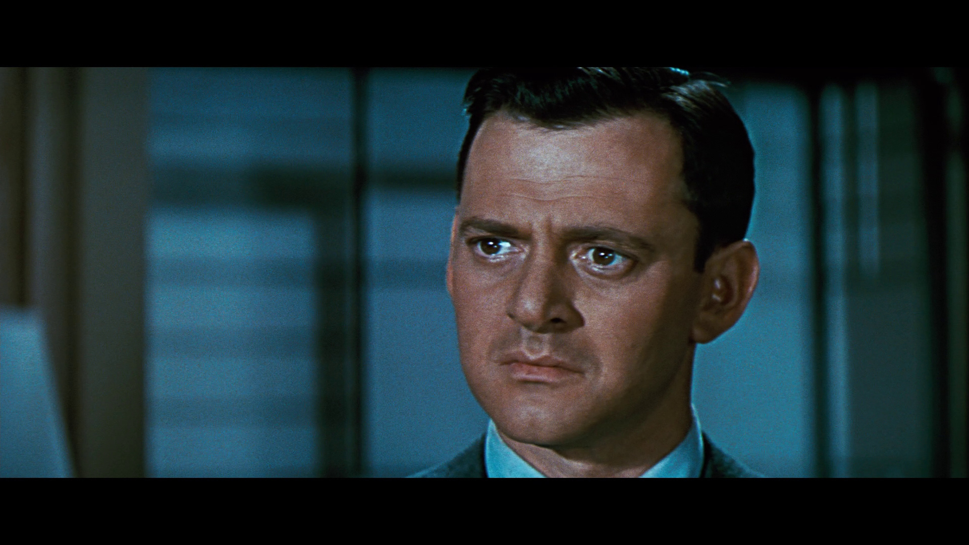
If I had to make an educated guess for what exactly went wrong, and this is purely conjecture, is that the film naturally has a lot of blue in it, due to things like costume design (Rock’s shifts) and blue gels being used for a lot of indoor and nighttime scenes. But it also seems that perhaps the colorist took this to mean that the entire film should be consistently blue, and it seems like parts of it might have been made to match that look when that wasn’t the intent for the entire picture.
It’s tough when something sends off a little “this doesn’t seem entirely right” flare and when you don’t have access to original prints, and when previous home video releases can’t be used as evidence as anything other than that they looked different.
I’ll say this about color comments on the commentary track - the commentary track was from the older disc, which used an older master from what appears to be a faded element, and the commentator was almost certainly basing his comments on that older transfer. It doesn’t mean he’s wrong, but it doesn’t automatically make him right. Film professors aren’t infalliable. I once had a professor show a film and then give a lecture on how the director’s choice to pan between two actors rather than using two shots and/or cuts was a stylistic choice that symbolized a certain theme and intent. The problem was, it was a pan and scan copy of a widescreen film, and in the original film, the scene was an unbroken two-shot! So my professor delivered an entire lecture on artistic intent, based on observations that had nothing to do with anything the original filmmakers actually did. I’m not saying that’s what happened on this commentary, but simply trying to make the point that reflections on an older video master may not be the end all, be all in the discussion.
The trailer on the disc, at first glance, seems warmer, but upon closer inspection appears faded and whites have started to take on a yellowish-brown look.
It’s a great movie. If you’ve never seen it before, you’ll probably be okay with the disc. If you have seen it and are intimately familiar with it, there might be some stuff that makes you scratch your head. As someone less familiar with the film, I’ve tried to do as much research as possible with the limited resources at my disposal and I hope I’ve been able to convey what I’ve been seeing on the disc without anyone feeling misled.
But I can honestly say that this was the hardest review I’ve had to write.
- Joined
- Jun 10, 2003
- Messages
- 26,359
- Real Name
- Josh Steinberg
I didn’t see the region B version; I’d be very curious to hear your thoughts on how they compare.
Jack Theakston
Supporting Actor
So is Fox and those other studios still using that lab and the person responsible for messing up those titles?
They’re not the only color timer there, but yes, the same lab is being used as far as I know.
lark144
Senior HTF Member
- Joined
- Feb 22, 2012
- Messages
- 2,103
- Real Name
- mark gross
I know one shouldn't rely on 40+ year old memories, but I went to see a new wet gate print of BUS STOP at MOMA sometime in the 70's that was being given to MOMA by the film's director, Josh Logan. Apparently he approved the color timing in the print, as he spoke before the film about the wretched pink and brown versions one saw on television. Anyway, I know this was a long time ago, but that "bluish tinge" that you're complaining about was not only in this print approved by the director, but that print appeared (as far as my memory will permit) exactly the same in terms of the color timing as the Blu-Ray. The reason I remember the color of this particular print so vividly is that I was used to seeing pink and yellowish color schemes in 16mm prints and on television, and from the first shot, was really taken aback a bit by the way everything seemed too blue, though of course the flesh tones were spot on."I thought a lot of "Bus Stop" watching WSSRH. I remember that having a blue tinge throughout also. But again the transfer was fantastic.

lark144
Senior HTF Member
- Joined
- Feb 22, 2012
- Messages
- 2,103
- Real Name
- mark gross
I can't speak for whether the color timing is correct in WILL SUCCESS SPOIL ROCK HUNTER, as I haven't seen the Blu; also all the prints I ever saw were 16mm & faded.
However, I can say that two Fox Blus that have been criticized for being "too blue': BUS STOP and WILD RIVER, look exactly the same as newly struck prints from Deluxe in the 70's that were given to MOMA by the respective directors--Josh Logan and Elia Kazan--and both gentlemen stated that the color timing was correct before the films were screened, and from what I can recall, both prints were very blue and match the Blu-rays in their color timing.
However, I can say that two Fox Blus that have been criticized for being "too blue': BUS STOP and WILD RIVER, look exactly the same as newly struck prints from Deluxe in the 70's that were given to MOMA by the respective directors--Josh Logan and Elia Kazan--and both gentlemen stated that the color timing was correct before the films were screened, and from what I can recall, both prints were very blue and match the Blu-rays in their color timing.
Thomas T
Senior HTF Member
- Joined
- Sep 30, 2001
- Messages
- 10,298
However, I can say that two Fox Blus that have been criticized for being "too blue': BUS STOP and WILD RIVER, look exactly the same as newly struck prints from Deluxe in the 70's that were given to MOMA by the respective directors--Josh Logan and Elia Kazan--and both gentlemen stated that the color timing was correct before the films were screened, and from what I can recall, both prints were very blue and match the Blu-rays in their color timing.
"How dare they presume to know what those films should like! Just because they directed them, it doesn't mean they have any inkling as to how those films should look! If we say they are too blue based on our previous experiences with these films, that should be the final word!" The Official HTF Fox Anti-Blues Brigade
Bryan^H
Senior HTF Member
- Joined
- Jul 3, 2005
- Messages
- 9,538
I know one shouldn't rely on 40+ year old memories, but I went to see a new wet gate print of BUS STOP at MOMA sometime in the 70's that was being given to MOMA by the film's director, Josh Logan. Apparently he approved the color timing in the print, as he spoke before the film about the wretched pink and brown versions one saw on television. Anyway, I know this was a long time ago, but that "bluish tinge" that you're complaining about was not only in this print approved by the director, but that print appeared (as far as my memory will permit) exactly the same in terms of the color timing as the Blu-Ray. The reason I remember the color of this particular print so vividly is that I was used to seeing pink and yellowish color schemes in 16mm prints and on television, and from the first shot, was really taken aback a bit by the way everything seemed too blue, though of course the flesh tones were spot on."
That is interesting. I said the transfer is fantastic, that isn't complaining.
Just stating an observation about the look of the film.

Last edited:
Mark B
Screenwriter
Mark B
Screenwriter
ThadK
Second Unit
- Joined
- Oct 25, 2003
- Messages
- 306
Why are all these white dress shirts blue now, too?
Mark B
Screenwriter
And the red sweater with blue scarf is a burgundy sweater with turquoise scarf and a gray suit a blue suit and blonde hair white with a blue wash and red lips brown and..........Why are all these white dress shirts blue now, too?
lark144
Senior HTF Member
- Joined
- Feb 22, 2012
- Messages
- 2,103
- Real Name
- mark gross
Please excuse me if I misunderstood your post. I simply wanted to share my experience, and my thoughts about the color timing of BUS STOP, and all those glorious blues.That is interesting. I said the transfer is fantastic, that isn't complaining.
Just stating an observation about the look of the film.

Yes, the Blu is fantastic. It reproduces the experience of watching BUS STOP at MOMA with Josh Logan present. And he talked about making the film afterwards. A great raconteur. He told some funny MM stories that unfortunately I no longer remember. But I do remember the look of that print.
I never really liked BUS STOP until I saw it at MOMA. Then I fell in love with the film, as well as with Ms. Monroe's performance. And I can go back to that first experience of seeing the film simply by popping in a disc. Pretty incredible, when you think about it.
haineshisway
Senior HTF Member
Are we really posting caps now? I give up. And anyone who thinks that brown mess resembles what this film ever looked like, well, I don't know what to tell you. I really am bowing out now but really - caps? And Beaver caps at that? And BTW, Groucho's shirt isn't white in that cap you so love to think is right - it's pink. It's white on the Blu-ray, that is the actual Blu-ray. I have the UK Blu - it's brown and I encourage all those who think that's correct to purchase it immediately.
Last edited:
Dick
Senior HTF Member
- Joined
- May 22, 1999
- Messages
- 9,929
- Real Name
- Rick
I know this was a long time ago, but that "bluish tinge" that you're complaining about [on BUS STOP] was...in this print approved by the director...
But, directors are not DOP's or camera operators. How many people relied on Andre deToth for his opinion of the 3D on HOUSE OF WAX? Just sayin'.
Adam Lenhardt
Senior HTF Member
This might all be a moot point soon anyway, since Disney is decimating TCFHE. Instead of debating about the color timing of these newly restored old classics on Blu-Ray, we probably just won't get them on Blu-Ray at all.
lark144
Senior HTF Member
- Joined
- Feb 22, 2012
- Messages
- 2,103
- Real Name
- mark gross
The directors were working with the color timers at Deluxe, the lab which originally printed those films in the 1950's, so they had the original timing information, and quite possibly he spoke to the same timers that had originally supervised the printing process. As I recall, Mr. Logan said that print was taken from the original negative, not an inter positive.But, directors are not DOP's or camera operators. How many people relied on Andre deToth for his opinion of the 3D on HOUSE OF WAX? Just sayin'.
btw, Andre deToth did supervise the 3D process on HOUSE OF WAX, even though he only had one eye. According to an interview he gave, he worked with a designer who put together storyboards with a great deal of depth for every set-up, so unlike most 3D films, HOUSE OF WAX looks 3D even in a flat Blu-ray, as both the depth of field and color contrast makes everything seem like it's popping out of the screen.
Last edited:
ThadK
Second Unit
- Joined
- Oct 25, 2003
- Messages
- 306
The screen caps accurately reflect how these two releases look. This isn't up for debate.
Bryan^H
Senior HTF Member
- Joined
- Jul 3, 2005
- Messages
- 9,538
I really am bowing out now but really - caps? And Beaver caps at that?
But why are the screen caps a bad thing? The Twilight Time caps are far superior to the other release, and the screen captures prove that.
Users who are viewing this thread
Total: 1 (members: 0, guests: 1)
Sign up for our newsletter
and receive essential news, curated deals, and much more
Latest Articles
-
 You Never Can Tell Blu-ray Review
- Started by: Matt Hough
-
 A few words about…™ – 3 Godfathers — in Blu-ray
- Started by: Robert Harris
-
 Money Talks Blu-ray Review
- Started by: Matt Hough
-
 Stand and Deliver Blu-ray Review
- Started by: Matt Hough
-
 The Little Drummer Girl Blu-ray Review
- Started by: Matt Hough
Staff online
-
Mike FrezonStudio Mogul
Members online
- Bob Furmanek
- Cineman
- Angelo Colombus
- jcroy
- MaconBacon
- Midnight Mike
- Jeff Whitford
- DeanHarris
- Robert13
- Wiseguy
- mikael
- JohnRice
- MartinP.
- Mark Mayes
- aPhil
- mark brown
- Tino
- TJPC
- laserphile 1
- t1g3r5fan
- PMF
- BobO'Link
- DP 70
- Jonathan Perregaux
- GlennC
- Alan Tully
- Felix Martinez
- rjd0309
- Bryan^H
- Konstantinos
- sbjork
- Morgan Jolley
- Dale MA
- Skoobooz
- Jay*W
- Drjoel65
- Mike Frezon
- Walter Kittel
- ronr22
- David Norman
- SD_Brian
- JimJasper
- Tony Bensley
- Jeff*H
- JoshZ
Total: 948 (members: 51, guests: 897)
Forum statistics
- Threads
- 357,014
- Messages
- 5,128,382
- Members
- 144,237
- Latest member
- acinstallation821
- Recent bookmarks
- 0


