What's new

Vintage Television Typeface Corner (1 Viewer)

bmasters9

Senior HTF Member
Joined
Jan 8, 2008
Messages
6,513
Real Name
Ben Masters
Isn't Murder, She Wrote's special font called "Lansbury"? I read that somewhere--don't know if it's accurate.

It certainly is-- confirmation from a site called Famous Fonts:
https://famfonts.com/murder-she-wrote/

And from that same site, the discovery that the Knight Rider title font (from that 1982-86 NBC adventure series w/David Hasselhoff, and not its abortive 2008 remake) is Ruben:
https://famfonts.com/knight-rider/

Examples from Universal's first-season (1982-83) DVD:

--Title in Ruben
knightrideropening1.jpg

--David Hasselhoff's title credit (Slicker for "Starring," and Ruben for his name)

knightrideropening2.jpg
 

bmasters9

Senior HTF Member
Joined
Jan 8, 2008
Messages
6,513
Real Name
Ben Masters
I could never find this font for 12 o'clock HIGH:

115741985.jpg


It's a stencil font of some kind. Anyone know?

That's a good question-- I'm stumped too; you're as much wanting to know about that as I've been about the font on the 1981-87 titles of Another World on NBC (title card of that posted earlier in this thread)!
 

JohnHopper

Senior HTF Member
Joined
Oct 31, 2010
Messages
3,467
Real Name
John Hopper
While the base for THE PRISONER is Albertus, the actual font had a variation where the lower case "e" had an open top end. (See the title screen above.) Online I've found a specialized font called "Village.ttf" that has the open-ended "e" along with a special capital "P" for the titling.

Indeed. They modify the design of Albertus and add some special letters to fit in Patrick McGoohan's medieval leaning:
see the capital G which is a reference to the Uncial Script of the early Middle Age.

Opening-McGoohan.jpg
 

JohnHopper

Senior HTF Member
Joined
Oct 31, 2010
Messages
3,467
Real Name
John Hopper
TV Shows set in Slab Serif Typefaces

Western
Gunsmoke
Have Gun - Will Travel
Rawhide
(Clarendon: ends credits)
The Rebel
Wagon Train
The Wild Wild West


Film Noir
The Fugitive
Mannix
(City)
 
Last edited:

ClassicTVMan1981X

Screenwriter
Joined
Jul 30, 2013
Messages
1,622
Location
Milwaukie, OR, US
Real Name
Benjamin
The first episodes of S1 of Star Trek (The Original Series) (Desilu/Paramount) used the Folio (light) font, while all the rest used the Eurostile Bold font. For seasons 2-3, it used the signature Star Trek font.

S1 episodes of ST:TOS that used the Folio (?) font:
The Man Trap
Charlie X
Where No Man Has Gone Before
The Naked Time
The Enemy Within
Miri (also italicized)
The Corbomite Maneuver
The Menagerie (parts I and II)
Balance of Terror
The Galileo Seven
Court Martial

~Ben
 

JohnHopper

Senior HTF Member
Joined
Oct 31, 2010
Messages
3,467
Real Name
John Hopper
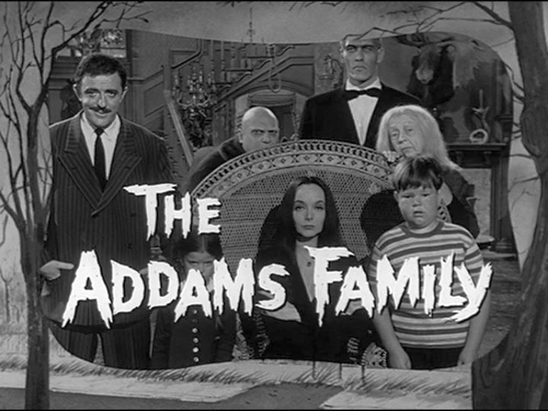
What font belong to this creepy, kooky bunch?
Addams-Family-Tv-Show-Opening-Credits-addams-family-5705039-768-576.jpg


I double-checked that series and featured three typefaces:
the logo which looks like a customized decorative typeface made for that series
the title credits which had two typefaces: Dom Bold combined with Alternate Gothic.

PS: Dom Bold was used for Green Acres.
 

bmasters9

Senior HTF Member
Joined
Jan 8, 2008
Messages
6,513
Real Name
Ben Masters
If I may take this off on a tangent as Flashgear did w/the Mounties on that Novak thread: I'd like to bring up a couple of typefaces that are not from actual series (but are from television as it was when I was a boy)-- first, the NBC Sports font as it was w/the Proud N; that one was ITC Serif Gothic (here captured from a YouTube clip of a 1984 NFL broadcast between the Cincinnati Bengals and San Francisco 49ers from the old Candlestick Park in San Francisco [NBC Sports banner in the background])...

nbcsports1984nflstadiumbanner.jpg


And another, this from CBS Sports in 1986: Jim Nantz on The Prudential College Football Report from Studio 43 at the CBS Broadcast Center in New York (Jim's ID credit and the game score on the background monitor are in Radiant EF, but the College Football titling is in an unknown font; that one captured from YouTube clip of Arizona/UCLA 1986 broadcast from former user Stephen Barnett)...
jimnantzprudential1986.jpg
 

oldtvshowbuff

Supporting Actor
Joined
Mar 26, 2010
Messages
841
Real Name
James Beer
Futura was the common typeface at Revue from The Adventures of Kit Carson to Leave it To Beaver!
 

JohnHopper

Senior HTF Member
Joined
Oct 31, 2010
Messages
3,467
Real Name
John Hopper
Three Revue/Universal westerns had their end credits in Clarendon.
Cimarron City
Overland Trail
Frontier Circus


Cimarron City (Italian Slab Serif)
Overland Trail (Tuscanian Slab Serif for the opening and Clarendon for the ending)
 

JohnHopper

Senior HTF Member
Joined
Oct 31, 2010
Messages
3,467
Real Name
John Hopper
The first slab serif fonts appeared at the beginning of industrialization in Great Britain. Clarendon and Ionic became the names for this new development in England, known as English Egyptienne elsewhere in Europe. Clarendon is also the name of a particular font of this style, which, thanks to its clear, objective and timeless forms, never lost its contemporary feel. In small point sizes Clarendon is still a legible font and in larger print, its individual style attracts attention.

The classical Clarendon form originating in England in 1845 by Robert Bersley as polished by Edouard Hoffmann and Hermann Eidenbenz at Haas a little over a century later. Haas’ revival of this typeface in 1953 precipitated the revivals that follow.


198846.png
 

JohnHopper

Senior HTF Member
Joined
Oct 31, 2010
Messages
3,467
Real Name
John Hopper
The Universal series Kolchak: The Night Stalker was set in a typewriting machine typeface.

kolchak_type.png
 

Users who are viewing this thread

Sign up for our newsletter

and receive essential news, curated deals, and much more


You will only receive emails from us. We will never sell or distribute your email address to third party companies at any time.

Latest Articles

Forum statistics

Threads
357,059
Messages
5,129,823
Members
144,280
Latest member
papill6n
Recent bookmarks
0
Top