What's new

The Art of The Movie Poster (1 Viewer)

John Sparks

Senior HTF Member
Joined
Sep 12, 2001
Messages
4,144
Location
Menifee, CA
Real Name
John Sparks
The scarcity was caused by everything was to be returned, so they could be used again. One of the reasons we even have the stuff is some didn't want to return it. Some people collected it from the very beginning, like coins...they knew they would go up in value.

Yes, some people got lucky and were able to buy warehouses full of posters!
 

Blu Eye

Second Unit
Joined
Jan 17, 2020
Messages
397
Real Name
Carl
Star Wars posters are certainly more valuable than many other titles from the same years but they are unlikely to get to the $50,000 level of something like a Son of Frankenstein mentioned in post # 57. Why ? Scarcity. Posters from the early part of the century to the 1970's were used and thrown away, and seldom saved. Hard-core collectors have to pay the big bucks when they're bidding on pre-1950's titles that probably have fewer than a dozen original copies in existence ( and most have much fewer than that! ) By the time Star Wars came out, the collector / nostalgia craze was in full swing and collectors learned what might be valuable and grabbed and held on to those materials with an eye on the future. ( I have three original Star Wars posters I obtained in 1977 that never saw the inside of a theatre frame. ) I don't think a week goes by when Heritage Auctions or Bruce Hershensen don't have Star Wars material up for auction.

Yes.

I agree completely.

Also, Star Wars posters must have been produced on a mass scale for many reasons like most major studio films in the modern era.
 

rdimucci

Second Unit
Joined
Oct 6, 2007
Messages
255
Real Name
Robert DiMucci
Five Reasons Why Old Movie Posters Are Better Than Current Movie Posters

1. Old Posters Are Brighter Looking – Most illustrators drawing a poster begin with a white canvas. Consequently, the parts of the poster not covered by artwork or credits are often left white, or shaded in some other light/bright color. Many modern movie posters start with a black background, so as to better highlight the photography that is used (generally consisting of actors’ faces). Even if the photos are placed against some realistic background, it more often than not is relatively dark (such as a building), or against a color wash, which is usually dark blue or gray.

2. Older Posters Are More Colorful – Illustrators are not limited to colors that appear naturally, and can use whatever colors are most striking and eye-catching for the subject at hand. For example, the color yellow often appears in posters as part of the background to the illustration. Yellow is not a color that appears naturally very often in photographs.

3. Credits Are Easier To Read On Older Posters – Because older posters often have white backgrounds, while new posters have dark backgrounds, the black-on-white older credits are much easier to read than the white-on-dark modern credits. Also, older posters use a variety of type styles and font sizes for their credits, while modern posters, by general agreement, all tend to use the same tall, skinny, unreadable font for theirs, so as to cram the contractually required credits into as small a space as possible

4. Composite Illustrations Are More Convincing Than Photo Collages – By the skillful use of color and perspective, an artist can put multiple elements of a film together in one illustration (actors, action scenes, locations) without them looking jumbled or out of place. This is much harder to accomplish with photographs, and is rarely attempted.

5. Illustrations Are More Exciting Than Photos - The artist can often take poetic license with the elements of the illustration, for example, by changing the proximity of characters in a scene, heightening the power of explosions, using size and perspective to emphasize a particular character or element of a scene, or providing a dramatic angle to action that actually wasn’t captured in that exact way by the cinematographer. Photo arrays can only work with what was actually shot or filmed.

The posters below illustrate these principles.

1970
1674422131689.jpeg

2009
1674422193156.jpeg

1973
1674422467647.jpeg
 

jbirdp

Stunt Coordinator
Joined
Jan 30, 2011
Messages
50
Real Name
Jay Pascucci
Thanks rdimucci. The posters I uploaded are also great examples of beautiful and sometimes dramatic artwork used to sell tickets.
 

Blu Eye

Second Unit
Joined
Jan 17, 2020
Messages
397
Real Name
Carl
Five Reasons Why Old Movie Posters Are Better Than Current Movie Posters

1. Old Posters Are Brighter Looking – Most illustrators drawing a poster begin with a white canvas. Consequently, the parts of the poster not covered by artwork or credits are often left white, or shaded in some other light/bright color. Many modern movie posters start with a black background, so as to better highlight the photography that is used (generally consisting of actors’ faces). Even if the photos are placed against some realistic background, it more often than not is relatively dark (such as a building), or against a color wash, which is usually dark blue or gray.

2. Older Posters Are More Colorful – Illustrators are not limited to colors that appear naturally, and can use whatever colors are most striking and eye-catching for the subject at hand. For example, the color yellow often appears in posters as part of the background to the illustration. Yellow is not a color that appears naturally very often in photographs.

3. Credits Are Easier To Read On Older Posters – Because older posters often have white backgrounds, while new posters have dark backgrounds, the black-on-white older credits are much easier to read than the white-on-dark modern credits. Also, older posters use a variety of type styles and font sizes for their credits, while modern posters, by general agreement, all tend to use the same tall, skinny, unreadable font for theirs, so as to cram the contractually required credits into as small a space as possible

4. Composite Illustrations Are More Convincing Than Photo Collages – By the skillful use of color and perspective, an artist can put multiple elements of a film together in one illustration (actors, action scenes, locations) without them looking jumbled or out of place. This is much harder to accomplish with photographs, and is rarely attempted.

5. Illustrations Are More Exciting Than Photos - The artist can often take poetic license with the elements of the illustration, for example, by changing the proximity of characters in a scene, heightening the power of explosions, using size and perspective to emphasize a particular character or element of a scene, or providing a dramatic angle to action that actually wasn’t captured in that exact way by the cinematographer. Photo arrays can only work with what was actually shot or filmed.

The posters below illustrate these principles.

1970
View attachment 173049
2009
View attachment 173050
1973
View attachment 173055

Brilliant description rdimucci.

I have actually noticed yellow and red is used often in 1970s movie posters and it looks pleasing to the eye as a colour coordination. A combination not ignored by Mcdonald's.​

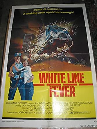
I actually have a poster in my collection that meets your descriptions succinctly.

White Line Fever.

I actually have not seen Dillinger but it's on my to watch-list. The poster design is interesting.
 

Attachments

  • WLF 2.jpg
    WLF 2.jpg
    32.4 KB · Views: 6

Stephen_J_H

All Things Film Junkie
Senior HTF Member
Joined
Jul 30, 2003
Messages
7,424
Location
North of the 49th
Real Name
Stephen J. Hill
Five Reasons Why Old Movie Posters Are Better Than Current Movie Posters

1. Old Posters Are Brighter Looking – Most illustrators drawing a poster begin with a white canvas. Consequently, the parts of the poster not covered by artwork or credits are often left white, or shaded in some other light/bright color. Many modern movie posters start with a black background, so as to better highlight the photography that is used (generally consisting of actors’ faces). Even if the photos are placed against some realistic background, it more often than not is relatively dark (such as a building), or against a color wash, which is usually dark blue or gray.

2. Older Posters Are More Colorful – Illustrators are not limited to colors that appear naturally, and can use whatever colors are most striking and eye-catching for the subject at hand. For example, the color yellow often appears in posters as part of the background to the illustration. Yellow is not a color that appears naturally very often in photographs.

3. Credits Are Easier To Read On Older Posters – Because older posters often have white backgrounds, while new posters have dark backgrounds, the black-on-white older credits are much easier to read than the white-on-dark modern credits. Also, older posters use a variety of type styles and font sizes for their credits, while modern posters, by general agreement, all tend to use the same tall, skinny, unreadable font for theirs, so as to cram the contractually required credits into as small a space as possible

4. Composite Illustrations Are More Convincing Than Photo Collages – By the skillful use of color and perspective, an artist can put multiple elements of a film together in one illustration (actors, action scenes, locations) without them looking jumbled or out of place. This is much harder to accomplish with photographs, and is rarely attempted.

5. Illustrations Are More Exciting Than Photos - The artist can often take poetic license with the elements of the illustration, for example, by changing the proximity of characters in a scene, heightening the power of explosions, using size and perspective to emphasize a particular character or element of a scene, or providing a dramatic angle to action that actually wasn’t captured in that exact way by the cinematographer. Photo arrays can only work with what was actually shot or filmed.

The posters below illustrate these principles.

1970
View attachment 173049
2009
View attachment 173050
1973
View attachment 173055
One other thing I've noticed about posters from the 70s is when they use photos, they tend to have added contrast [likely part of the screen-printing process at the time], making them look "gritty" or "grimy". A few examples:
bluebeard.jpg
girly.jpg
french_connection.jpg

I have two framed posters in my office. One is a reporduction of the one-sheet for Army of Darkness; the other is a limited edition foil print from the theatrical release of Alien: The Director's Cut. I also have several others [like Alien] that I acquired from my time working at a movie theatre while going to law school. They are unframes, and some hang in the stairway going down to my basement where my primary home theatre setup is.
 

Blu Eye

Second Unit
Joined
Jan 17, 2020
Messages
397
Real Name
Carl
One other thing I've noticed about posters from the 70s is when they use photos, they tend to have added contrast [likely part of the screen-printing process at the time], making them look "gritty" or "grimy". A few examples: View attachment 176404 View attachment 176405 View attachment 176406
I have two framed posters in my office. One is a reporduction of the one-sheet for Army of Darkness; the other is a limited edition foil print from the theatrical release of Alien: The Director's Cut. I also have several others [like Alien] that I acquired from my time working at a movie theatre while going to law school. They are unframes, and some hang in the stairway going down to my basement where my primary home theatre setup is.

Nothing wrong with unframed posters.

Saves money and will make it easier to sell too.
 

Users who are viewing this thread

Forum Sponsors

Forum statistics

Threads
353,692
Messages
5,026,828
Members
143,548
Latest member
shooje
Recent bookmarks
0
Top