What's new

Matt Hough

Reviewer
Senior HTF Member
Joined
Apr 24, 2006
Messages
26,194
Location
Charlotte, NC
Real Name
Matt Hough
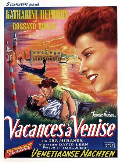
David Lean’s bittersweet romance Summertime offers up the glories of Venice and the charms of two wonderful leading performances in a single rapturous package.


Summertime (1955)


Released: 07 Nov 1955
Rated: Approved
Runtime: 100 min


Director: David Lean
Genre: Comedy, Drama, Romance


Cast: Katharine Hepburn, Rossano Brazzi, Isa Miranda
Writer(s): Arthur Laurents, H.E. Bates, David Lean


Plot: An American spinster's dream of romance finally becomes a bittersweet reality when she meets a handsome--but married--Italian man while vacationing in Venice.


IMDB rating: 7.1
MetaScore: N/A


Disc Information


Studio: Criterion
Distributed By: N/A
Video Resolution: 1080P/AVC


Aspect...


Continue reading...
 
Last edited by a moderator:

Lord Dalek

Senior HTF Member
Joined
Apr 4, 2005
Messages
7,107
Real Name
Joel Henderson
I literally have no idea why Criterion chooses to die on the 1.33:1 hill for this film. I mean the fact that there are VISIBLE GATE HAIRS in the transfer should have been enough of a clue.

1657395188860.png
 

Matt Hough

Reviewer
Senior HTF Member
Joined
Apr 24, 2006
Messages
26,194
Location
Charlotte, NC
Real Name
Matt Hough
I literally have no idea why Criterion chooses to die on the 1.33:1 hill for this film. I mean the fact that there are VISIBLE GATE HAIRS in the transfer should have been enough of a clue.

View attachment 144323
Correct. I meant to mention those in the review and forgot. Thanks for bringing them up.
 

John Hodson

Senior HTF Member
Joined
Apr 14, 2003
Messages
4,628
Location
Bolton, Lancashire
Real Name
John
It's not the first time Criterion have chosen to die on this particular hill, but it's numbscullery writ large. Framing is only one part of the narrative for any film, but nevertheless it *is* part of the narrative. It's hugely disappointing for such a prestigious label to inflict this on cineastes.
 
Last edited:

Robert Crawford

Crawdaddy
Moderator
Patron
Senior HTF Member
Joined
Dec 9, 1998
Messages
67,853
Location
Michigan
Real Name
Robert
It's not the first time Criterion have chosen to die on this particular hill, but it's numbscullery writ large. Framing is only one part of the narrative for any film, but nevertheless it *is* part of the narrative. It's hugely disappointing for such a prestigious label to inflict this on cineastes.
IMO, Criterion has come down a peg over the last several years.
 

RobertMG

Premium
Senior HTF Member
Deceased Member
Joined
Jun 23, 2006
Messages
4,671
Real Name
Robert M. Grippo
IMO, Criterion has come down a peg over the last several years.
my problem is the rumored films they are sitting on but never seem to happen --- do they have Gunga Din or not - any other Astaire - Rogers -- Gunga Din would be great!
 

Josh Steinberg

Premium
Reviewer
Senior HTF Member
Joined
Jun 10, 2003
Messages
26,383
Real Name
Josh Steinberg
I literally have no idea why Criterion chooses to die on the 1.33:1 hill for this film.

I mean I think it’s pretty simple - they believe they have made the correct choice. We can disagree with that choice and there’s certainly plenty of evidence that theirs is incorrect, but they believe they’re right. I don’t think it’s anything more complex than that.
 

Robert Crawford

Crawdaddy
Moderator
Patron
Senior HTF Member
Joined
Dec 9, 1998
Messages
67,853
Location
Michigan
Real Name
Robert
I mean I think it’s pretty simple - they believe they have made the correct choice. We can disagree with that choice and there’s certainly plenty of evidence that theirs is incorrect, but they believe they’re right. I don’t think it’s anything more complex than that.
Hell, obviously they felt that way without having to say it out loud. They're an arrogant company.
 

Robert Harris

Archivist
Reviewer
Senior HTF Member
Joined
Feb 8, 1999
Messages
18,420
Real Name
Robert Harris
Hell, obviously they felt that way without having to say it out loud. They're an arrogant company.
I’d not go that far.

Summertime is a problematic project - at least for me.

Agreed that there is, in some shots, too much headroom. In other shots the ratio works nicely with the height of the architecture.

What does not work for me, is 1.85.

I’m fine with 1.66, leaning toward the bottom of the frame, and 1.37 isn’t objectionable.

A double disc set?

Expense.
 

Robert Crawford

Crawdaddy
Moderator
Patron
Senior HTF Member
Joined
Dec 9, 1998
Messages
67,853
Location
Michigan
Real Name
Robert
I’d not go that far.

Summertime is a problematic project - at least for me.

Agreed that there is, in some shots, too much headroom. In other shots the ratio works nicely with the height of the architecture.

What does not work for me, is 1.85.

I’m fine with 1.66, leaning toward the bottom of the frame, and 1.37 isn’t objectionable.

A double disc set?

Expense.
There is a sense of arrogance with them and have demonstrated it over the years. I would have been fine with 1.66.
 

JoshZ

Senior HTF Member
Joined
May 26, 2012
Messages
2,295
Location
Boston
Real Name
Joshua Zyber
I'm by no means an expert on this film, but it seems that the main basis of Criterion's argument for 1.37:1 is that the opening credits text is visibly clipped when matted to any wider ratio.

Given that this movie was produced during the early years of the transition to widescreen, I suspect that the person who was commissioned to do the paintings for the opening titles may not have been told to do them in 1.66:1 or 1.85:1, even though the rest of the movie may have been composed for one of those ratios. That causes a conflict between the framing of the credits and the framing of the rest of the movie.

Perhaps the best compromise would have been to pillarbox the credits to 1.37:1 and matte the rest of the movie to 1.66:1?
 

RobertMG

Premium
Senior HTF Member
Deceased Member
Joined
Jun 23, 2006
Messages
4,671
Real Name
Robert M. Grippo
I'm by no means an expert on this film, but it seems that the main basis of Criterion's argument for 1.37:1 is that the opening credits text is visibly clipped when matted to any wider ratio.

Given that this movie was produced during the early years of the transition to widescreen, I suspect that the person who was commissioned to do the paintings for the opening titles may not have been told to do them in 1.66:1 or 1.85:1, even though the rest of the movie may have been composed for one of those ratios. That causes a conflict between the framing of the credits and the framing of the rest of the movie.

Perhaps the best compromise would have been to pillarbox the credits to 1.37:1 and matte the rest of the movie to 1.66:1?
I saw the film years ago on TCM if I eventually buy it I will wait till its on 50 off next time and I will buy the dvd just in case they surprise us and redo it
 

haineshisway

Senior HTF Member
Joined
Oct 26, 2011
Messages
5,569
Location
Los Angeles
Real Name
Bruce
I'm by no means an expert on this film, but it seems that the main basis of Criterion's argument for 1.37:1 is that the opening credits text is visibly clipped when matted to any wider ratio.

Given that this movie was produced during the early years of the transition to widescreen, I suspect that the person who was commissioned to do the paintings for the opening titles may not have been told to do them in 1.66:1 or 1.85:1, even though the rest of the movie may have been composed for one of those ratios. That causes a conflict between the framing of the credits and the framing of the rest of the movie.

Perhaps the best compromise would have been to pillarbox the credits to 1.37:1 and matte the rest of the movie to 1.66:1?
I think we're all being bamboozled on the opening credits. I would like someone who has the actual Blu-ray to show those credits at exactly 1.85, which is how they were projected here in the US, and then at 1.66. Then we'll know. I know someone earlier posted some caps off the Criterion channel but I'm not sold that that's this new transfer. The other information we need is whether this is off the camera negative and not some other negative.
 

Lord Dalek

Senior HTF Member
Joined
Apr 4, 2005
Messages
7,107
Real Name
Joel Henderson
I'm by no means an expert on this film, but it seems that the main basis of Criterion's argument for 1.37:1 is that the opening credits text is visibly clipped when matted to any wider ratio.

Given that this movie was produced during the early years of the transition to widescreen, I suspect that the person who was commissioned to do the paintings for the opening titles may not have been told to do them in 1.66:1 or 1.85:1, even though the rest of the movie may have been composed for one of those ratios. That causes a conflict between the framing of the credits and the framing of the rest of the movie.

Perhaps the best compromise would have been to pillarbox the credits to 1.37:1 and matte the rest of the movie to 1.66:1?

Some of them are tighter than others but the opening credits are perfectly fine in 1.66

EXAMPLE

1482x801 (1.85:1)

1657409180165.png


1657409260806.png


VS.

1482x893 (1.66:1)

1657409303464.png


1657409353266.png


FYI these are the only two credits that are somewhat illegible in 1.85:1 framing. As you said though it is possible that original prints were windowboxed for the titles in which case this wouldn't have been an issue.
 

Robert Harris

Archivist
Reviewer
Senior HTF Member
Joined
Feb 8, 1999
Messages
18,420
Real Name
Robert Harris
I'm by no means an expert on this film, but it seems that the main basis of Criterion's argument for 1.37:1 is that the opening credits text is visibly clipped when matted to any wider ratio.

Given that this movie was produced during the early years of the transition to widescreen, I suspect that the person who was commissioned to do the paintings for the opening titles may not have been told to do them in 1.66:1 or 1.85:1, even though the rest of the movie may have been composed for one of those ratios. That causes a conflict between the framing of the credits and the framing of the rest of the movie.

Perhaps the best compromise would have been to pillarbox the credits to 1.37:1 and matte the rest of the movie to 1.66:1?
BINGO!
 

Lord Dalek

Senior HTF Member
Joined
Apr 4, 2005
Messages
7,107
Real Name
Joel Henderson
I mean... what on earth makes Lee and Maria think this:

1657410111546.png


...is somehow more artistically composed than THIS!

1657410150650.png


The horizon line is all wrong on the open matte. I swear to god. And this is a film that features a lot of horizon line shots.
 

roxy1927

Senior HTF Member
Joined
Jul 10, 2018
Messages
2,028
Real Name
vincent parisi
Does anybody know how Summertime was first projected? I could find nothing which refers to how it was projected on the opening night at the Astor in Times Square. Here is Stalag 17 at the Astor in '53. Note it says On Giant Panoramic Screen. Can we assume another aperture was used rather than 1.37:1? This was shortly after Shane was being shown on the 'wide screen' at Radio City.
The marquee for Summertime two years later simply says Technicolor.
Would a film like this in '55 been shown in 137:1 when wide screen was still a very big selling point? What are the reasons for Criterion's decision? They could be right though I've never seen it projected as such in revival houses as I've mentioned.

1657410726234.png

1657411009478.png
 
Last edited:

RobertMG

Premium
Senior HTF Member
Deceased Member
Joined
Jun 23, 2006
Messages
4,671
Real Name
Robert M. Grippo
Does anybody know how Summertime was first projected? I could find nothing which refers to how it was projected on the opening night at the Astor in Times Square. Here is Stalag 17 at the Astor in '53. Note it says On Giant Panoramic Screen. Can we assume another aperture was used rather than 1.37:1? This was shortly after Shane was being shown on the 'wide screen' at Radio City.
The marquee for Summertime two years later simply says Technicolor.
Would a film like this in '55 been shown in 137:1? What are the reasons for Criterion's decision?


interesting now u have me looking at posters so far none say widescreen etc
 

Attachments

  • 14242845_max.jpg
    14242845_max.jpg
    158.2 KB · Views: 95

Users who are viewing this thread

Sign up for our newsletter

and receive essential news, curated deals, and much more


You will only receive emails from us. We will never sell or distribute your email address to third party companies at any time.

Latest Articles

Forum statistics

Threads
357,051
Messages
5,129,590
Members
144,285
Latest member
blitz
Recent bookmarks
0
Top