What's new

Pre-Order Paramount Presents: To Catch A Thief (Blu-ray) Available for Preorder (1 Viewer)

haineshisway

Senior HTF Member
Joined
Oct 26, 2011
Messages
5,564
Location
Los Angeles
Real Name
Bruce
Mine just arrived. Will check it out shortly. And the person who can't stop with the "dislike" button will be here in five, four, three, two... Said person has now done this on over twenty-three posts of mine, no matter WHAT they say. What a wonderful world. :)
 

Nelson Au

Senior HTF Member
Joined
Mar 16, 1999
Messages
19,103
My copy has arrived too. Once I sterilize the disc of the Covid 19 virus, I’ll open it and I want to see it with my own eyes as well. My plan is to just sit and enjoy the film this evening, I’m not going to watch the 2012 disc beforehand. I want to go in fresh. I have seen the 2012 disc at least 3 or 4 times. I’ll check out the 2012 disc after I see the 2020 disc.
 

Robert Crawford

Crawdaddy
Moderator
Patron
Senior HTF Member
Joined
Dec 9, 1998
Messages
67,753
Location
Michigan
Real Name
Robert
My copy has arrived too. Once I sterilize the disc of the Covid 19 virus, I’ll open it and I want to see it with my own eyes as well. My plan is to just sit and enjoy the film this evening, I’m not going to watch the 2012 disc beforehand. I want to go in fresh. I have seen the 2012 disc at least 3 or 4 times. I’ll check out the 2012 disc after I see the 2020 disc.
What are you going to sterilize the disc with?;)
 

Nelson Au

Senior HTF Member
Joined
Mar 16, 1999
Messages
19,103
Ha, ha! Good question Robert. I’ll wipe down the shrink wrap with a bleach mixture before I touch it with my bare hands and tear that off. Hopefully the cardboard and plastic case inside wasn’t handled by humans in the factory. But I figure if it was, the bugs won’t survive the time it’s been since it left the replication center to the time I handle the disc. which brings up a question for another thread, how the discs are made and inserted into the case. Sorry, this whole Covid 19 situation has made me a little more then crazy when new items enter my home.
 

haineshisway

Senior HTF Member
Joined
Oct 26, 2011
Messages
5,564
Location
Los Angeles
Real Name
Bruce
So, just finished watching the new Blu of To Catch a Thief and here are my thoughts for whatever they're worth. I think I'll give myself a thumbs down before my thumbs down person. :)

First, yes, too bright - I find it very weird that they'd have done this. Second, yes, little to no grain. Third, is it a "smeary" mess? No. Is it softer than the 2012 disc, absolutely. Should it be? Not really. But there IS detail and it's quite obvious in most shots. Of all the cliches that are used, perhaps waxy would come close, but I prefer Mr. Harris's velvety.

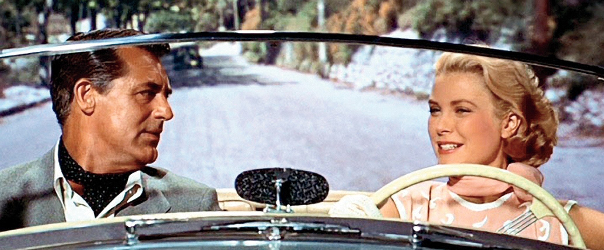
And then there's the color. I prefer the color on the new transfer, which is much more accurate to the IB Tech prints I owned (five over the years). It is never more obvious than Francie's car, which is BLUE, NOT silver as in the old transfer. The blues are not right in that transfer at all or the car would be BLUE as it is in the new transfer. ALL the blues in the new transfer are more vivid and correct as they should be. Which brings us to the contentious subject of GREEN for the night scenes. The GREEN of the 2012 Blu-ray was ridiculous, a complete wash that rendered all other colors in those scenes basically non-existent. The Tech prints of the night cat scenes that open the film were basically blue as they are in this new transfer, but with a hint of green, which is missing in those opening shots. But it was NEVER a green wash as in the older transfer. Watch the scene where Grant is on the balcony after the kissing scene. It's correct in the new transfer - blue with a hint of green. That is what all those scenes should look like. In the fireworks scene, old transfer too much green, new one is kind of a muddle, too - it should have both blue and green and there isn't enough of either really.

Then there's the day for night scene which, as Mr. Harris says, is not printed correctly and that's absolutely true and unforgivable, really. It's correct in the old transfer save that once again there's a green wash over it all and there shouldn't be. It should be blue in that scene not green - it makes no sense that it be green and it just looks silly. I found the costume ball colors more vivid and right in the new transfer, but the brightening of the image kind of negates the effectiveness of it.

So, I don't think we've had an ideal transfer of this film yet. As Mr. Harris suggested, they should go back to the VistaVision negative, do a new 4K scan, and start afresh. Bottom line, neither is optimal but if you had to choose one, the earlier blu is perhaps more pleasing to the eye, save for the overdone green. The new one is just too soft and too bright, which, along with the day for night sequence, for me is not acceptable, better color notwithstanding. Is it a five-star disaster? No. Is it a shame? Yes. If you're going to start a new line of supposedly great new transfers, you'd better damn well deliver and they certain have not.
 

Nelson Au

Senior HTF Member
Joined
Mar 16, 1999
Messages
19,103
(There’s three threads on this disc, hard to decide which to post my impressions on, so I picked this one as others have posted their impressions. I wanted to add my view.)

I watched the new 2020 Paramount Presents To Catch A Thief blu ray last night. I did not rewatch the 2012 disc beforehand so I could watch this disc with a clean set of eyes. I should preface this by saying I own the laserdisc, the two DVD’s (skipped the 3rd one) and the 2012 blu ray. I can say I’ve seen this movie a lot of times over a long span. Though I’m no expert and I’ve never seen the Ib prints being mentioned by others. Here are my thoughts.

I thought the opening titles looked almost 3D, as the titles and credits playing over the travel agency windows. The edges of the text was so sharp. Maybe it’s the same on the 2012 disc. At first I wasn’t accustomed to the new sound mix for the opening titles music, but as soon as it was over and the movie started, I left it as is and I never had a sense of surround sound, maybe it’s my ears.

The first night scenes did look very slightly blueish, but more like moonlight to me lighting the tiled roof. I saw a very faint hint of green on the stucco walls. Such as fill lights that were green throwing light to fill shadows. I’ll be curious if others can see this.

The next day, there is an establishing shot of the Hermitage building. (Hotel?) It appears very vivid as the coloring has a richness to it I never noticed before. The warm salmon colors of the stone and sharpness looked so fresh. It was like I mentioned when I saw the screen caps, like a layer of yellow varnish was cleaned off.

Back at the Robie villa, the initial shot of Grant’s shirt wasn’t shimmering. The shot from the cat and the newspaper that pans up to the frame of the window looking out at Robie in the garden looked like a process shot. I wanted to point that one out as another poster pointed out how bad this shot looked. Perhaps that poster didn’t realize it was an optical shot. So it might explain its lack of sharpness and increased grain. The window frame was sharp. The shot of Grant in the garden looked like an optical placed in the window. The next shot is a close-up of the back of Robie and it’s sharp as a tack.

Regarding the shot of Robie in his room looking out the window as the police arrive, it was hard to tell if it was soft, the shots are quick and there is movement. That might be one to compare to the 2012 disc. Is that the velvety texture being mentioned? His shirt was not shimmering!

In the shots of Grant in Bertani’s restaurant, his shirt would slightly shimmer here and there, but it was better controlled. Funny, the shots where the big guy in the kitchen approaches Robie, I can see green fill light light up the back edges of his neck and arms, and the counter tops. Again, green fill light.

In the shot under the restaurant when Robie is escaping the police and Danielle calls him the cat, you can see the rich turquoise color light from the water light the wall behind Danielle. This looked very vivid in the 2012 blu ray, here it looks slightly toned down as I recall the shot. It’s still very colorful and rich.

Later when Robie walks out of the Mediterranean and onto the beach at the Carlton Hotel beach at Cannes, Grace Kelly wasn’t as golden brown tanned. Maybe the 2012 disc had over boosted that?

The colors at the flower market I thought looked good.

During the driving sequence as Francie is taking John out for the picnic lunch, I never noticed before the Alpine logo on the car! And I always notice those. I’ll have to compare that to the other discs some day.

During the scene in Francie’s room as they watched the fireworks, I could see what looked like a greenish fill light. (Again) In those shots I can see the green light coming from the windows just bounce and fill in the side of Grace Kelly’s arm. I thought the colors and sharpness of the fireworks looked very vivid. I liked it.

The day for night scene was bright, but not too distracting. I could see the movement of the bushes easier. I don’t know what to make of that. If it’s wrong or not. Only Hitch and Robert Burks knows. It was interesting to see the person’s silhouette better who tries to hit Robie with the wrench. Then later the close up of the dead Foussard in the water wasn’t bathed in green, if my memory of the 2012 blu ray is right.

At the funeral, on the initial shot of Grant, there’s a very sharp focus, his tie and suit is very detailed. I can see the dots in his tie from my chair some 8 feet away. Later when Bertani goes over to Robie, Grant is out of focus while the focus was on Bertani. So it wasn’t DNR smearing I thought. The shot focuses on Bertani.

The night shot of the roof at the party also has the light green-ish light fill in the shadows. And that green light lit up the tiles and shadows such as on Grant’s hand while the key light was white on his face. It looked like Star Trek The Original Series when they used colored gels on the lights to accent the backgrounds in colors.

I kept seeing green in the night shots, but it was very much toned down and subtle compared to the 2012 disc, so perhaps this was the real color and the effect that Hitchcock was trying to avoid by using the filter to get the night color to look the way he wanted as pointed out in other posts?

The party sequence I thought looked OK as well. It didn’t seem out of whack as the guests were all entering and passing the camera. I thought colors were pleasing and there was plenty of detail on the costumes and I could see freckles on the skin of the actors.

I didn’t think the whole film looked over bright. The colors were cooler, not as warm as I recall the 2012 disc. But it seemed ok. That might explain others reactions that it’s brighter?

There are so many processed shots and back projection, such as the view from Robie’s house when he has lunch with Hughson and outside the funeral when Francie apologizes to John. And the scenes in the Sunbeam Alpine when Francie drives John out for a picnic lunch is all rear projection. Those shots, so typical of Hitchcock’s films tended to look obvious and I wondered if people expected those to look better? They didn’t bother me.

My system consists of an Oppo 205 blu ray player. The display is a Panasonic plasma VT30 65”. I had calibrated the color settings when I first bought it back in 2011 using settings from a TV calibrator on the AVS forum. He posted general settings he created after calibrating several of these sets. So I watch all content with those custom settings. I am assuming my display is producing fairly good colors if those settings are good.

I may not rewatch the 2012 disc for a while so I get more accustomed to this 2020 version, then watch the 2012 and see how I react to it. I think those of us who own the 2012 disc is used to that version. Overall, and I’m not trying to defend this release, to my eyes, I thought it looked OK. Not the disaster others are calling it. If the day for night sequence is wrong, then maybe that’s the only flaw. ( And mAnne this disc will get recalled for that) For now, I may make it my primary version to watch. I’d suggest to anyone interested, pick it up and have a relaxing evening and enjoy it and forget the nitpicks. It’s not overly expensive and if you’re a big fan of this film, I think it’s worth owning, whether it’s the definitive version or not. My opinion of course.

I thought this was like all the remastered versions of Dark Side Of the Moon. There is the hard to get magical Japanese version that was pressed with the original tapes without any tinkering back in the early days of CDs that people say sounds great. There is the gold disc CD from Mobile Fidelity that others say sounds pretty great, then the later 30th anniversary remaster that other people may like. Fans of the album will like the versions they like. And it’s up to the fans who like to collect each version to find things they enjoy in each version. That’s part of the fun! But it seems for films, there is the elusive definitive version film fans strive for that meets the directors intent and reproduces the theatrical version. Seems like a difficult thing to achieve with the older films. Sometimes we get lucky like with North By Northwest. There is now two versions of To Catch a Thief in high definition to enjoy and find aspects we like in each. Having slept on it overnight, I thought this 2020 edition is a pretty good release maybe except that one flaw.

I recall a line from the TV series Frasier where Frasier and Niles discuss a wonderful french dining experience they just had, with that one flaw that they were bemoaning, and Daphne comments, “oh, just the way you like it.”
 

Josh Steinberg

Premium
Reviewer
Senior HTF Member
Joined
Jun 10, 2003
Messages
26,335
Real Name
Josh Steinberg
Those are great points Nelson particular the comparison to music album remasters.

The truth is that when the world was film only, there wasn’t one perfect look and if a print didn’t match it perfectly, it got trashed. There was a lot of variety to how prints came out and studios and filmmakers managed this by sending the best prints to the biggest and most prestigious venues in the most popular cities, and sent the ones that were less perfect to places where they wouldn’t be as widely seen.

That doesn’t mean there isn’t a right and a wrong way to do a new transfer. But it does mean that the difference between “right” and “wrong” in many cases was less of a binary choice and more of a matter of degrees, judgment and practical considerations.

In a way, when you take something analog like film or order Pink Floyd master tapes and create a digital version, it’s not really a 1:1 perfect copy. It’s almost like a translation of a novel from one language to another, as you’re trying to find a way to convey something mechanical that was determined by physical characteristics in how it was made to something digital that isn’t made up of the same building blocks and doesn’t have the same limitations (but does have different ones of its own).
 

Nelson Au

Senior HTF Member
Joined
Mar 16, 1999
Messages
19,103
Thanks Josh. Yes, this is an analog to digital translation we’re seeing, good point! And agreed about the chemical process of film development of the years past. In my line of work, trying to get a color to match a standard chip I provide to a shop that’s making the parts I design always involves a range of acceptable variance from the Golden sample.

I think the 2012 disc is overly green now. After thinking about the early DVDs, I remember the last DVD version I picked up I was amazed at how green the night shots are compared to the first DVD and I wondered if this was how it was supposed to look. The new disc has very much toned down the green.

In the end, this is a very entertaining film. I hope more people will try to ignore all the criticisms and add it to your collection if you’re a fan of it. I always enjoy watching and I came away with another view of it, what was Danielle thinking? May you find your way as pleasing.
 

Robert Harris

Archivist
Reviewer
Senior HTF Member
Joined
Feb 8, 1999
Messages
18,374
Real Name
Robert Harris
Those are great points Nelson particular the comparison to music album remasters.

The truth is that when the world was film only, there wasn’t one perfect look and if a print didn’t match it perfectly, it got trashed. There was a lot of variety to how prints came out and studios and filmmakers managed this by sending the best prints to the biggest and most prestigious venues in the most popular cities, and sent the ones that were less perfect to places where they wouldn’t be as widely seen.

That doesn’t mean there isn’t a right and a wrong way to do a new transfer. But it does mean that the difference between “right” and “wrong” in many cases was less of a binary choice and more of a matter of degrees, judgment and practical considerations.

In a way, when you take something analog like film or order Pink Floyd master tapes and create a digital version, it’s not really a 1:1 perfect copy. It’s almost like a translation of a novel from one language to another, as you’re trying to find a way to convey something mechanical that was determined by physical characteristics in how it was made to something digital that isn’t made up of the same building blocks and doesn’t have the same limitations (but does have different ones of its own).

Josh,

While your points regarding the ”translation” of an analogue to a digital entity are correct, when a film that originated in a analogue form is properly and professionally converted to digital, even if not a restoration, it still takes the film (aside from cutting and fx) through the entire post-production process.

Further, if everything is properly done, a quality digital presentation should (and can be) transparent to the original with the exception of bob & weave, wear, reel changes and cue marks, if a print is set up for cues.

A member of an audience should not be able to discern the difference, unless they have a trained eye.

I‘m suggesting virtually one-to-one.

In the case of true restorations, and prints of older non-restored films, digital performances vs analogue can be more color accurate, and more highly resolved than the originals.
 

RolandL

Senior HTF Member
Joined
Dec 11, 2001
Messages
6,626
Location
Florida
Real Name
Roland Lataille
Did Caps-a-holic screw up? The older Blu-ray looks better in their screencaps. Plus the newer is cropped.

old
1590675821146.png


new
1590675900023.png
 

dpippel

Yoyodyne Propulsion Systems
Supporter
Senior HTF Member
Joined
Feb 24, 2000
Messages
12,314
Location
Sonora Norte
Real Name
Doug

dpippel

Yoyodyne Propulsion Systems
Supporter
Senior HTF Member
Joined
Feb 24, 2000
Messages
12,314
Location
Sonora Norte
Real Name
Doug
Too much contrast in the new one. Grey suit is now blue.

old
View attachment 73324

new
View attachment 73325


Nelson Au

Senior HTF Member
Joined
Mar 16, 1999
Messages
19,103
Color perception can be very subjective. Each person‘s eyes are different and each monitor will have some variations.

I work in the design field, so I’ve had some color education. So it always surprises me when people say Cary Grant’s suit looks blue. And the Sunbeam looks silver. To my eyes, the suit on the 2020 remaster looks gray. And it’s a cool gray, so it is blue-ish. The screen cap from the 2012 disc looks like it has a dirty layer over it. And the Sunbeam Alpine never looked silver to me, it looks blue in both discs. :)
 

AlexNH

Supporting Actor
Joined
Dec 15, 2010
Messages
595
Real Name
Alex Koutroubas
Some members of this forum claim the 2020 disc is not really cropped and we are supposed to see less. I don't know if that is true but it sure doesn't look right in many shots.
 

Mark-P

Senior HTF Member
Joined
Sep 26, 2005
Messages
6,499
Location
Camas, WA
Real Name
Mark Probst
I kind of want to give Paramount the benefit of the doubt on the framing, but I have this niggling suspicion that they may have prepared a 4K master in 1.85:1 at 3996 X 2160 pixels and rather than scaling it down to 3840 X 2075 for home video like you are supposed to, they just trimmed the sides making it 3840 X 2160 and 16:9 again. That would account for all 4 sides being equally cropped.
 

dpippel

Yoyodyne Propulsion Systems
Supporter
Senior HTF Member
Joined
Feb 24, 2000
Messages
12,314
Location
Sonora Norte
Real Name
Doug
I kind of want to give Paramount the benefit of the doubt on the framing, but I have this niggling suspicion that they may have prepared a 4K master in 1.85:1 at 3996 X 2160 pixels and rather than scaling it down to 3840 X 2075 for home video like you are supposed to, they just trimmed the sides making it 3840 X 2160 and 16:9 again. That would account for all 4 sides being equally cropped.

Given the other problems with this release, it wouldn't surprise me if this is the case.
 

RolandL

Senior HTF Member
Joined
Dec 11, 2001
Messages
6,626
Location
Florida
Real Name
Roland Lataille
35mm extraction from VistaVision negative. Obviously there would be more image above and below the 35mm frame but, it was cut to give an idea to what should be shown on the screen. This is what was given out to exhibitors to promote VistaVision. I don't see any cropping on the sides.

35mm.jpg


VistaVision negative.
vv.jpg
 

AlexNH

Supporting Actor
Joined
Dec 15, 2010
Messages
595
Real Name
Alex Koutroubas
Roland, so does this mean you believe that the 2020 disc is incorrectly framed or cropped?
 

Users who are viewing this thread

Sign up for our newsletter

and receive essential news, curated deals, and much more


You will only receive emails from us. We will never sell or distribute your email address to third party companies at any time.

Latest Articles

Forum statistics

Threads
356,968
Messages
5,127,406
Members
144,218
Latest member
AlohaTiger
Recent bookmarks
1
Top