What's new

Color Restoration Issues (1 Viewer)

Robert Harris

Archivist
Reviewer
Senior HTF Member
Joined
Feb 8, 1999
Messages
18,393
Real Name
Robert Harris
Bob Furmanek said:
All very good points and I'm curious to get RAH's input on this matter. Would he go with blue or green for the hat?

Will, you're killing me. Always remember: Boxy IS Beautiful!

If you don't find your book, I still have some extra copies available.
Couple of points. Your personal abilities with Photoshop don't really come into play here, as once you leave the world of higher bit depths, everyone would lose any real correction ability. When I scan original negs for stills, I always begin with a full resolution TIFF.

The masters would hold all of the information, and should be suitable.

Much like aspect ratios, I'd go two ways. One, replicating the original look of prints, and two, a correct photographic look.

RAH
 

Bob Furmanek

Insider
Senior HTF Member
Joined
Dec 10, 2001
Messages
6,718
Real Name
Bob
My 2013 Photoshop image was done from a high resolution TIFF scan off a postive 35mm print of the restoration.
If you were in charge of the restoration, you would go with the 1952 SCC palette?
 

Mark Oates

Supporting Actor
Joined
Mar 12, 2004
Messages
875
I think it's another issue where context is everything. You have a still image with a choice of colour palettes and any of them could be the right one. In the context of the movie, I'd expect it would be easier to judge the correct look.
 

seangood79

Stunt Coordinator
Joined
Mar 5, 2009
Messages
202
Real Name
Sean
One thing I'd like to know is were they aware of how the final print would look, did they know the green hat would be blue?
I remember reading during the 80's colorization fad that they would research the actual color of costumes and sets so they could be replicated, ignoring the fact that color schemes were chosen for how they photographed in B&W.
So if this is a similar situation, if they chose a green hat because they knew the theatrical prints would be blue, then I choose the blue hat.
 

kinzoels

Stunt Coordinator
Joined
Oct 25, 2012
Messages
67
Real Name
bill lettang
hello BOB: I would like to add my humble opinion here, and use CASABLANCA as a basis. As you know, WB released 2 blu ray versions of this film, and both recieved 5 star ratings at the time of release. The first was a cleaned up version with a "made yeasterday" quality while the later release strived for a more original theatrical release look (more grain, darker). I prefer the former, but many of my film fan friends prefer the "this is how it should look" version. The beauty here is that BOTH EXIST for BOTH CAMPS. Granted,we can't always have it both ways, and I aplaud WB for giving us both. When we are dealing with a color film, that's opens up a whole different can of worms, but the bottom line here is (and I have no way of knowing for sure), if Lou Costellos hat was green, then it Should be Green on the print. I also wanted to ask you a question about the Blu Ray Dracula...Is it very grainy when compared to your 35MM print? (I also own a 35MMIB original but have no way to project it). I have to sit quite a ways back on my callibrated 32" monitor not to notice all the "movement", which I find somewhat annoying. By the way, if you haven't seen it yet, and being a New Yorker myself (originally College Point, now Springfield MA)) I'd be more than happy to meet up with you with my region free player and give it a spin for you.
 

kinzoels

Stunt Coordinator
Joined
Oct 25, 2012
Messages
67
Real Name
bill lettang
I'd like to put in my final spin on the DRACULA 58 blu ray...It is my contention that the film was NOT timed from a 35MM IB print. Ben Thompson stated it was his intention to "emulate what I saw on that check print from the camera negative". Now we all know the OCN is in negative form and the first copy made from it is the IP (inter positive) which would be untimed. My gripe is with the light-timing between and IN BETWEEN scenes. I'll just use a few examples: In the library battle between Harker and Dracula, the room lightens up after Harker hits the floor. When we return to Harkers room, the room is so lit up it jumps off the screen. When we see Dracula standing in Lucy's doorway to the next shot of him entering, a very inconsistant timing between these two shots. The last scene of Holmwood looking down at Lucy is much brighter than the scence with him approaching the coffin, and of course, the Inn and finale is too dark. I can understand some lighting differences between scenes but NOT to this degree in the same scene. I believe what we're are seeing here (as ludicrous as it may sound) is a film not timed from a final print but merely a reproduction of the IP, or in other words as the film was shot not printed, and to some, this may have its own charm. I would hope Robert Harris has had achance to view the disc and what his highly respected views are on it. It's frustrating trying to adjust for a completely smooth viewing of this disc!
 

Vincent_P

Senior HTF Member
Joined
Sep 13, 2003
Messages
2,147
kinzoels said:
I'd like to put in my final spin on the DRACULA 58 blu ray...It is my contention that the film was NOT timed from a 35MM IB print. Ben Thompson stated it was his intention to "emulate what I saw on that check print from the camera negative". Now we all know the OCN is in negative form and the first copy made from it is the IP (inter positive) which would be untimed...
Actually when it comes to "traditional" photochemical finishing, the InterPositive WOULD BE graded/color timed. The traditional process consisted of making a series of prints directly off the negative which would be tweaked from print-to-print until they arrived at an approved answer print with the intended grading and color timing, then an IP would be struck adhering to the color timing of said answer print.Vincent
 

Richard--W

BANNED
Senior HTF Member
Joined
Jun 20, 2004
Messages
3,527
Real Name
Richard W

Capt D McMars

Bernuli Tech Vet
Premium
Senior HTF Member
Joined
Aug 2, 2011
Messages
4,929
Location
Colorado
Real Name
Todd Doc Sigmier
The whole debate over the look of Hammer's DRACULA has got me thinking about the archivists approach to color restoration. I'm curious to get your opinions on this issue.

In March 1952, ABBOTT AND COSTELLO MEET CAPTAIN KIDD was photographed by Stanley Cortez on standard Eastman color negative. The release prints were made later that year in the new SuperCinecolor three color process consisting of red, blue and yellow. It was basically an extension of their two color system with the addition of a yellow record.

Cinecolor_zpsd487040d.jpg


As you can see in the image below, the initial SuperCinecolor palette did not faithfully replicate certain colors. For instance, note the green hat that Lou is wearing. In the original 35mm prints, the hat is blue.

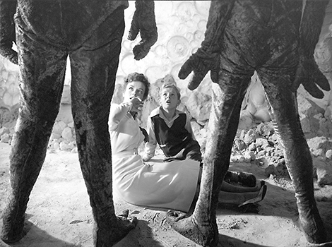
This film was one of the first three color releases by Cinecolor and they quickly refined the system. By the time INVADERS FROM MARS was printed for release in April 1953, green was well represented in the martian costumes.

The original color camera negative for KIDD is long gone. About twenty years ago, I found the three color separation masters in England. I was able to acquire them and they were donated to the UCLA Film Archive. In 2002, Bob Gitt and Cinetech did preservation work. Three color Cinecolor does not conform to standard YCM specifications as used by the Technicolor lab and Cinetech had a very difficult time replicating an accurate color palette from the separation elements.

The new element looked very good in the nighttime and exterior scenes which originally had a strong blue bias. However, the daytime exterior shots did not turn out as well and have a pastel look.

The UCLA restoration was finally released on DVD in the Warner Archive series in 2011. Unfortunately, it's a straight transfer from the 35mm preservation element with no further attempt at color correction.

Here are three frames as a comparison; the first is from a 1952 SuperCinecolor print; the second is from the UCLA restoration and the third is my humble attempt to color correct in Photoshop.

Which do you prefer?

Do you feel the film should be restored and seen exactly as it appeared theatrically in 1952, or should it look as close as possible to the actual color during principal photography?

Lou-color-comparison_zpsfa7679e1.jpg
Always side with the colors intended, and it seams someone has finally done a restored edition being showcased during the TCM Feastival 2022. There is a mention of a US premier showing of this restored copy of the film.
Bob, do you know who was involoved in its process? If anyone would know, I thought it might be you? If possible please help fill in the holes for me and the others out there getting excited about the news!!
 

Users who are viewing this thread

Sign up for our newsletter

and receive essential news, curated deals, and much more


You will only receive emails from us. We will never sell or distribute your email address to third party companies at any time.

Latest Articles

Forum statistics

Threads
356,998
Messages
5,128,054
Members
144,228
Latest member
CoolMovies
Recent bookmarks
0
Top