What's new

PCineArchitect

Auditioning
Joined
May 3, 2012
Messages
13
Real Name
john bishop
Artists can create controversy alright. Scope is so impressive its a shame to see it cut, but when its the creator who does it?
Makes it perfect for my Note 8 and its 18x9 screen though:)
 

Mike Frezon

Moderator
Premium
Senior HTF Member
Joined
Oct 9, 2001
Messages
60,773
Location
Rexford, NY
Destroyed Last Emperor

A fair amount of this discussion is above my paygrade (especially some of the acronyms :D )

But I know some things...and this is one of them (what Robert said).

I usually don't let a lot of things like this bother me. But the cropped Criterion of The Last Emperor is one of those few things that really irks my sensibilities...because it was such a beautiful widescreen image. I fell in love with it the first time I saw it.

I don't want to re-open that conversation here, but I've been beating that well-worn drum for years on this forum.
 

bobclampett

Stunt Coordinator
Joined
Apr 24, 2013
Messages
69
Location
Canada
Real Name
Mike Banks
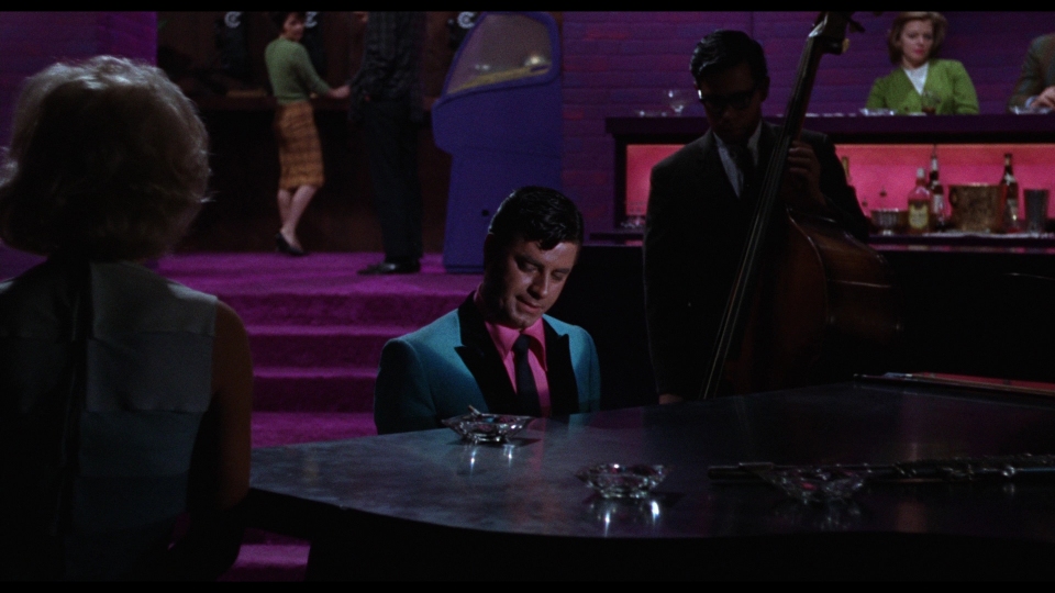
I know changing the aspect ratio from 1.85 to 1.78 can seem insignificant but it can wreck a scene. Case in point the Jerry Lewis film The Nutty Professor. When Warner Brothers released the Blu ray the aspect ratio changed from the original 1.85 to 1.78 which revealed Mr Lewis stand in during the title sequence before the laboratory explodes. The real Jerry Lewis is discovered in the next shot in the rubble of his chemistry class. If the film was masked properly you would not see the stand ins face at the top of the frame. The original Paramount Anamorphic DVD was masked correctly at 1.85 to 1. The stand ins face was not revealed. It's not just the aspect ratio as Mr Harris has pointed out but the safety around the rectangle in the camera view finder that took into account projector gates and screen masking.

Yeah this sounds like a simple production gaffe, not a case like A Fish Called Wanda where the 1.33:1 open matte ruins a joke.

I know that this isn't the scene mentioned in the example, but I've taken a couple of screenshots from the Nutty Professor Blu-ray (lifted from here) and added 1.85:1 letterbox bars to them. I made it a point to pick shots with people's faces near the extreme top edge. There's simply no way that this smidge of letterboxing could be enough to hide a production flub as big as the wrong actor's face appearing on screen.

nutty-professor-16x9.jpg


nutty-professor-185x1.jpg


nutty-professor-16x9b.jpg


nutty-professor-185x1b.jpg
Thanks for everyone's input on the Nutty Professor aspect ratio. And you are right! both the 50th Anniversary Blu Ray and Paramounts "Enhanced for Wide Screen TV" DVD from 2000 are in fact the incorrect 1.78 to 1 ratio. But here's where it gets interesting, the change in aspect ratios is not the reason Mr Lewis stand-in is briefly revealed and goes back to Mr. Harris original post on aspect ratio vs framing choices. It appears that the opticals for the title sequence have been redone prior to or specifically for the 50th Anniversary Blu-Ray. Unfortuneltly my IPad does not seem to allow me include photos of the screen shots I took so I will do my best to explain the differences. When you compare the location of the students in relation to the titles they are different. Look at all 4 edges of the frame. Very different. Much more information on the top and right on the Blu Ray. Compare the size of the title opticals, larger on the Blu Ray, smaller on the DVD. Optical of titles are also shifted up and to the left on the Blu Ray. Note Mr. Lewis stand-in has a black shirt, no bow tie, no glasses. Clearly not professor Julius Kelp (AKA Jerry Lewis). On the Paramount DVD the framing never goes higher than chest height on the stand-in. The other major difference on the title sequence is Warner's penchant for Picture-Boxing title sequences. The wonderful title sequence is much more dynamic on the 2000 DVD when those bold technicolor hues fill the entire frame. The DVD of the film, included in the Warner deluxe box set has different label graphics but it is exactly the same transfer used on the 2000 Paramount DVD. The title sequence mistakes on the Warner Blu Ray aside, they did a superb job on the packaging of the deluxe set. I own the deluxe set and the 2000 DVD. I saw the movie in the theatre in 63 and 64 and again in the late 70's at a repertory theatre where to my displeasure it was shown open matt.
 

Bob Furmanek

Insider
Senior HTF Member
Joined
Dec 10, 2001
Messages
6,722
Real Name
Bob
The original 35mm dye-transfer Technicolor prints are hard-matted to 1.66:1 for safety. The film is composed for 1.85:1.
 

bobclampett

Stunt Coordinator
Joined
Apr 24, 2013
Messages
69
Location
Canada
Real Name
Mike Banks
I just checked out the entire opening credit sequence of The Nutty Professor and the professor's face is nowhere in the frame at all. You are obviously confusing this with a 1.33:1 open matte version of the film as the 1.78:1 version reveals nothing that wasn't meant to be seen.
Yeah. I just checked the Blu-Ray credit sequence as well. There is one long shot where the professor looks possibly a bit taller than Jerry Lewis, but you can only see his mouth and chin, and it's only on the screen for maybe 15 seconds.
The stand-in reveal shot is when he throws a match to light a Bunsen Burner. Note his shirt is black, no tie, no glasses. Professor is wearing a white shirt and polka dot bow tie and black reading glasses when discovered in the aftermath of of lab explosion. See above for analyses of what t think went wrong.
 

Brian Kidd

Senior HTF Member
Joined
Nov 14, 2000
Messages
2,555
Sadly, I don't exactly live in an area where we even still have projectionists. In most cases, it becomes obvious that the projectors are not calibrated nor even aimed correctly at the screen. Things are usually off-center and so dark that my aging eyes have trouble making out details, even in scenes that ostensibly don't take place in a darkened room.

The most egregious example of throwing AR out the window and having it ruin a film was when I went to see Lang's METROPOLIS during it's 2002 release. I had expected more of the theater that was screening it, as it was the local Art House in Cincinnati, the Esquire. Nope. They screened it matted. Not only did it cut off vital image information, at times it cut off portions of the intertitles. Apparently, the theater didn't have the capability to project it in the correct AR. The worst was that I was seeing the film with a buddy of mine who works in film preservation and had made the trip down from Dayton just for the screening. We were both incredibly excited to be able to see METROPOLIS in a theater. When it started and I saw that it was matted, there may have been some colorful language that escaped my lips.
 

Vincent_P

Senior HTF Member
Joined
Sep 13, 2003
Messages
2,147
Last night I watched Forrest Gump. It was letter boxed, so I felt like I was at least seeing the full top and bottom of the frame. Today I am watching The Silence of the Lambs (Criterion Collection BD) and it coincidentally fits my 16x9 TV like it was shot for it.

Why can't I shake the feeling that the image was either reshaped for my TV or cropped?

Criterion's THE SILENCE OF THE LAMBS has small black bars top and bottom maintaining the 1.85:1 aspect ratio, so if you're not seeing them, then your TV is overscanning the image.

EDIT: I see that Josh beat me to this up above :)

Vincent
 

Cees Alons

Senior HTF Member
Joined
Jul 31, 1997
Messages
19,789
Real Name
Cees Alons
Jasper,

Yes.
Your post contained an unpleasant attack on the person of a member of this forum.

Read our rules again.

......
Conduct
10. No personal attacks. We expect all members to treat each other with consideration and respect. While we encourage lively debate, we do not allow personal attacks. This includes direct attacks, such as name-calling, as well as indirect attacks, such as repeated baiting of a member in a provocative or belittling manner. If you believe that you have been subjected to a personal attack, or have witnessed one on another member, please see the section on Dealing with Problems for instructions on how to proceed.
....


We won't accept another instance of such an attack.


Cees
 

MUFC

Stunt Coordinator
Joined
Apr 5, 2015
Messages
60
Real Name
Dan
I rarely read the follow-on conversation. Didn’t read this one, however I do enjoy reading Mr Harris’ posts. Sometimes I understand some of the words - yet every time I agree.
 

DVDvision

Screenwriter
Joined
Nov 11, 2007
Messages
1,235
Location
Paris, France
Real Name
David
Opticals are often redone for HD transfers so that the title sequence can match the quality of the rest of the scan. They often match it perfectly with only the sight difference being modern versions of the fonts being used. Some times the font is so approximative it looks totally fake.

When they do this, they also in some instances, miss any reframing that could have been done for the sequence hence the Nutty Professor gaffe.

I myself prefer when they locate the transparent title sequences elements, scan them and use the titles only onscreen, layered over the negative of the credit sequence image.
 

Users who are viewing this thread

Sign up for our newsletter

and receive essential news, curated deals, and much more


You will only receive emails from us. We will never sell or distribute your email address to third party companies at any time.

Latest Articles

Forum statistics

Threads
357,051
Messages
5,129,543
Members
144,285
Latest member
blitz
Recent bookmarks
0
Top