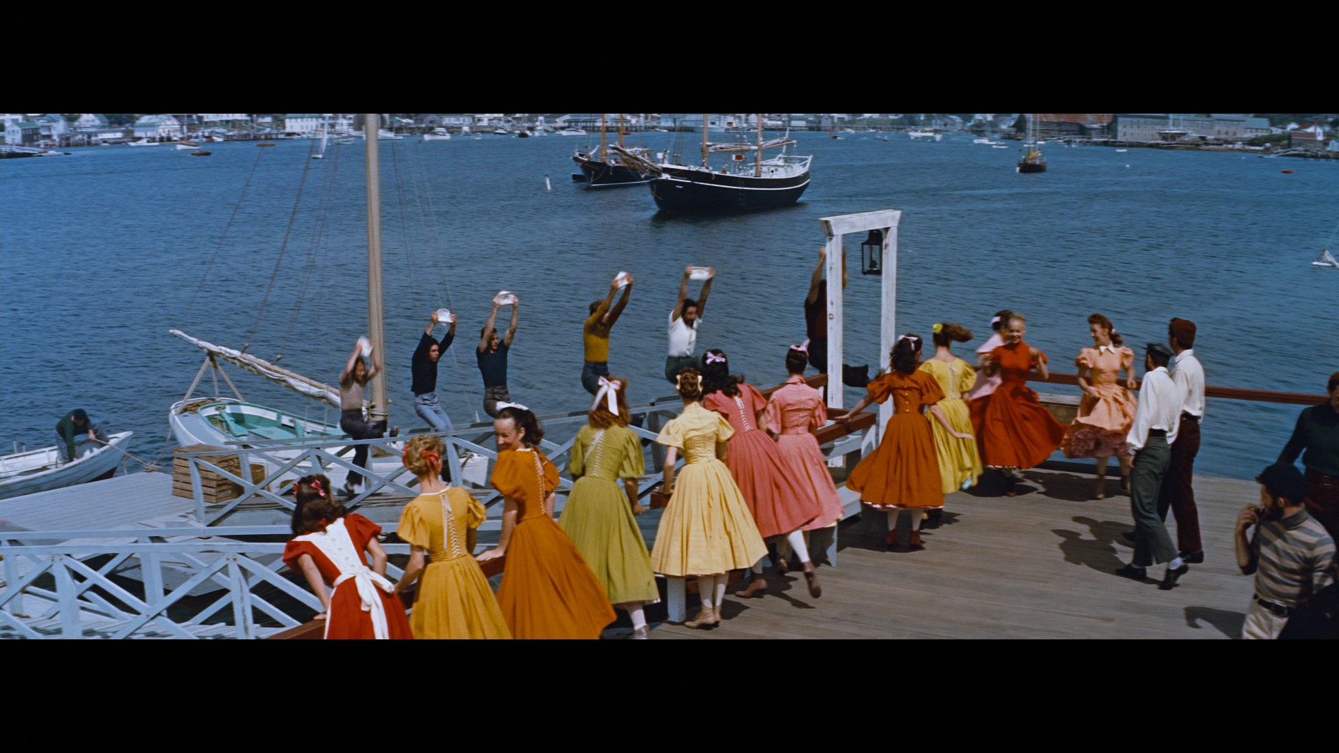
I'm with you, Mark ... I love Carousel every bit as much as I do Oklahoma and South Pacific. They're my top three......
Home Theater
Entertainment & Streaming Content
Physical Media
Home Theater Equipment and Hardware
Other Diversions
Bargains and Classifieds
Home Theater Forum
A Few Words About While we wait for A few words about...™ The Rodgers & Hammerstein Collection -- in Blu-ray (2 Viewers)
- Thread starter Robert Harris
- Start date
-
- Tags
- a few words about blu-ray fox
")


Users who are viewing this thread
Sign up for our newsletter
and receive essential news, curated deals, and much more
Latest Articles
-
 Star Trek: Lower Decks – Season 4 Blu-ray Review
- Started by: Josh Steinberg
-
 You Never Can Tell Blu-ray Review
- Started by: Matt Hough
-
 A few words about…™ – 3 Godfathers — in Blu-ray
- Started by: Robert Harris
-
 Money Talks Blu-ray Review
- Started by: Matt Hough
-
 Stand and Deliver Blu-ray Review
- Started by: Matt Hough
Members online
- Kevin Hewell
- Douglas R
- Neil S. Bulk
- njcap2003
- The Obsolete Man
- lark144
- nara
- Jeff Cooper
- Will Krupp
- Osato
- Wiseguy
- DigniT@DigniT!
- JohnHopper
- ManW_TheUncool
- waltodonnell
- mylan
- Timothy E
- Yeoman007
- iamhopkat
- mop
- Doug Wallen
- rkirk
- laserphile 1
- Kas Quatermain
- Tommy R
- Steve Berger
- BobO'Link
- Dan McW
- compson
- mskaye
- Todd Erwin
- MaconBacon
- Jim*Tod
- Konstantinos
- Josh Steinberg
- Keith Cobby
- Jeffrey Allen Rydell
- pjones
- JohnRice