What's new

Star Trek: Deep Space Nine Alternate Cover Art (1 Viewer)

Ric Easton

Senior HTF Member
Joined
Feb 6, 2001
Messages
2,834
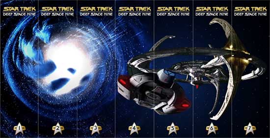
I have done a few tweaks on the spine design that I had previewed earlier. Hopefully now it looks a little less like a cut and paste job.


Click here for larger image

I had to rebuild part of the back of the ring, hopefully it isn't too shabby. I really couldn't move the Defiant over any more to the left because it covers up where a runabout appeared in the original shot. (Some of you might have preferred that it start on the season 3 spine)

Now for the hardest decision... What to do about the combadges?! DS9 didn't use the "modern badge" until season 3, but I wanted it to be uniform all the way across. When and if I do Voyager they would most likely have the same combadge. I know some of you probably want something unique for each set. So I dabbled with a few different designs. I already asked a a couple of you via email which you liked better, but there was no clear winner.

So I'm opening it up to the rest of you...
Here are the choices...

I'm not really happy with the Bajoran badges. At first I liked the red triangle (choice 2) but I printed them up and I think they are a little distracting. My preference would either be the first or seventh choice. I don't see any need for color coding like on the TNG set because the actual DVDs don't look like they hold to any particular color scheme. I also don't wish to do multiple versions of each! Personally, I like the regular DS9 combadges used in the picture above. That Delta symbol is really the only thing that says Trek to me. It doesn't really bother me that DS9 and Voyager would end up with the same combadge symbol.

Anyway, let me know what you guys think and I will (most likely) go with the version with the most votes.

I'll post a few of the actual cover designs soon...
That's a whole 'nother story!

Ric
 

Jonathan Perregaux

Senior HTF Member
Joined
Oct 10, 1999
Messages
2,043
Real Name
Jonathan Perregaux
I kinda like the wormhole badges.

Choice #1 reminds me too much of Voyager and we sure don't need that
#2 doesn't remind me much of anything, except maybe Starfleet Command minus the San Francisco Bridge symbology
#3 looks cool, but you can't make out the numbers
#4 same problem as #3, only a little worse
#5 :emoji_thumbsup: very nice; readable, distinctive, and evocative of DS9
#6 cold, sterile but a nice second choice
#7 hard to read the numbers again

Are there any Cardassian or Bajoran panel graphics that look useful? Like, perhaps, the Cardassian "shatter-frame" displays on the consoles?
 

Nathan*W

Screenwriter
Joined
Sep 9, 2001
Messages
1,085
Real Name
Nathan
Ric,

LOVE the overall design. If you'd like some suggestions:
My preference would either be the first or seventh choice.
I also like #7 for season indicators, but include some color to the numbers to add some contrast between them and the station ring.
 

Frank Anderson

Senior HTF Member
Joined
Jun 7, 1999
Messages
2,667
Personally, I like the regular DS9 combadges used in the picture above. That Delta symbol is really the only thing that says Trek to me. It doesn't really bother me that DS9 and Voyager would end up with the same combadge symbol.
Excellent points. Ya gotta have the Trek symbol. There is no reason DS9 and Voyager can't have the same since they both used them. Please don't consider the Bajor ones and the one that looks like Starfleet Command.

[url=http://members.aol.com/nightdog35/spidey_smiley.gif] [/url]
 

Jeff_HR

Senior HTF Member
Joined
Jun 15, 2001
Messages
3,593
Stick with number one Ric! And please do the covers for Voyager, if only for those of us in the minority who really do like Voyager. I know how much work is involved here, I for one really appreciate your continued efforts on these covers.
 

Dave Scarpa

Senior HTF Member
Joined
Apr 8, 1999
Messages
5,765
Real Name
David Scarpa
Great Work Ric I can't wait to see what you'll come up with. As for Voyager I'll Probably pick up the 1st Year because "Caretaker" the first show was really pretty Decent. Unfortunately the show never lived up to it's Pilot and the it went Downhill as the years wore on. Plus if I see Janeway's Mug on my Shelf I might actually have to shoot myself.
 

Ric Easton

Senior HTF Member
Joined
Feb 6, 2001
Messages
2,834
OK, Ive got it down to 3. I added one that looks like a Cardasian Shatter frame (#2) and I made the number a gold color on the station symbol (now appearing as choice 3!) Even though the wormhole one got a vote... it's outta here! It was just looking too busy for me.


I think I can live with either one of these, so let me know what you think. My first inclination is to still go with number one though.

As for moving the station and Defiant over (on the spines)a little bit, I kind of like them where they are. Besides, now the Defiant only cuts across 2 spines instead of 3. I think it will line up better.

Here's what I have for the first cover...

Clich here for larger version

The rest of the seasons will be groupings. I had originally done a pairing for the first one, Kira and Sisko, then I realized that Kira had the wrong hairdo!


That one will probably be season 2.

Besides, I have grown to like Sisko alone on the front with the wormhole. It kind of foreshadows his destiny.

The back covers might all be season cast shots if I can find one for every season. I do not think I am going to list all of the extras on the back as I have done in the past. They will be listed on an insert.

That's it for now...

Ric
 

David Lambert

Senior HTF Member
Joined
Aug 3, 2001
Messages
11,377
I think I will go ahead and bow out of this discussion.

I've looked at my newest credit card statements, and realized that I can NOT afford to spend $700-ish this year on DS9 sets, a show I only marginally liked.

I'll have to be thrilled with complete TOS and TNG sets. Good luck with those covers, Ric.
 

Greg S

Supporting Actor
Joined
Mar 13, 2000
Messages
976
While it appears that I am in the minority in liking the Bajoran badges, I will vote for choice #1 as it will give a nice CONTINUITY to the set(s) which I think will be quite nice.

Again thanks for all the HARD WORK!!!!

Greg


BTW I do have one question for you.... Will you also be doing the SUPPLEMENTAL Case as well?? I did not see it pictured in the "main" layout but wanted to see if you were doing it.
 

Dave Scarpa

Senior HTF Member
Joined
Apr 8, 1999
Messages
5,765
Real Name
David Scarpa
I'll try to find the best prices I can on DS9 if it means no extras disk so be it. I found $72.99 on the first set. David I think DS9 was the best Trek series did you see the entire run or did you quit on it sometime during it's run? DS9 from really Season 2 on in was excellent.
 

Ric Easton

Senior HTF Member
Joined
Feb 6, 2001
Messages
2,834
I imagine that I will be doing an extra supplemental disc for this as well. It will just be a continuation of the starfield on the spine. I obviously don't know yet what the front and back covers will look like.

DL... bowing out?!? How dare you! Your insight is always appreciated, even if you can't shell out the dough for the best Trek series ever! Jean-Luc is still the best Captain though!

Frank, I did not include the front and rear shots for the spine shot that is up on the covers page for TNG and had not planned it for this one either. Maybe I can email you a version of it, if you need to display all the cases before they are finished.

Ric
 

Jonathan Perregaux

Senior HTF Member
Joined
Oct 10, 1999
Messages
2,043
Real Name
Jonathan Perregaux
Picking a knit:

Your box cover for the second season features Deep Space Nine orbiting Bajor, a situation that only occurred during the pilot episode of the series (and during flashback episodes). Remember, they moved the space station at great risk to situate it next to the wormhole and never brought it back.

I am also partial to having boxes that do not feature large character portraits on them, like the TNG sets. Perhaps each season could be represented by such things as:

#1 DS9 orbiting Bajor
#2 The Wormhole behind the station
#3 The Defiant leaving the station
#4 Klingon ships surrounding the station
#5 Cardassian and Jem'Hadar ships threatening the station
#6 A fleet of Federation starships squaring off against fleets of Cardassian and Jem'Hadar ships (no DS9)
#7 Er... um... can't think of one suitable
 

Tony Whalen

Senior HTF Member
Joined
Jan 29, 2002
Messages
3,150
Real Name
Tony Whalen
Stick with number one, Ric!! :D The newer comm badges look great! :D

I like the previews of the first two seasons.. but I agree that the station was only seen in orbit in the pilot. (Also seen this way in the Mirror-universe episodes, I think.)

I like the idea of doing groupings on the covers. Although Sisko should most certainly get Season One to himself. Even if he doesn't have the goatee yet. ;)
 

Ric Easton

Senior HTF Member
Joined
Feb 6, 2001
Messages
2,834
Jonathan, I was originally thinking along those same lines. Take a look at the shot on the cover at the end of the spines on this version. That probably would have been the first shot for season one. It sure would have been alot simpler. although i don't know if I would have been able to find every scenario you described, I was sure that I could have comeup with sebven beauty type shots.

I know the camp is divided with scenic vs. noggins. Ultimately, I have tried to incorporate both, but I may have failed. I was even thinking of doing an all villains issue for season 6, ie: Dukat, Weyoon and maybe that female shapeshifter.

Once I start on the general theme of the sets... I want to stick with it though. As far as Bajor being in the shot for season 2... hmmm... How far away did they move from Bajor anyway? Now I see why Paramount came up with the simple design!

Ric
 

Dave Scarpa

Senior HTF Member
Joined
Apr 8, 1999
Messages
5,765
Real Name
David Scarpa
In the later seasons the emphesis definately changes from Bajoran Political Intrigue to the dominion war, so the covers can definately reflect that. It would be nice perhaps in season 2 to get a picture of one of the Orb's of the prophets on there somewhere, senes the orbs play a big part in the beginning.

For what it's worth I'm in the noggin' camp
 

David Lambert

Senior HTF Member
Joined
Aug 3, 2001
Messages
11,377
I'll try to find the best prices I can on DS9 if it means no extras disk so be it. I found $72.99 on the first set. David I think DS9 was the best Trek series did you see the entire run or did you quit on it sometime during it's run? DS9 from really Season 2 on in was excellent.
I don't have the money to spend even at $50 each ($350 overall). More to the point, I might have the money to spend months and months from now, but if TOS and TNG are any indication, the best prices will be week-of-release, and then they will creep up from there. Maybe if I win a lottery later on, and Best Buy still has copies with the bonus discs. We'll see, but it's unlikely.

Right now the best thing for my budget is to believe that I will never own these DVDs, and many others as well (I had to force myself to pass on The Shield, for instance).

As for when I lost interest...um, it was when the emphasis shifted toward war and away from Bajoran political intrigue (which I thought was VERY well done, mixing the Democratic ideas of the Federation with the Theocratic ways of Bajor, up against the Totalitarianistic (is that a word?) forces of the Cardassian Empire). I appreciated the Louise Fletcher episodes more than any of the others, in fact. :)


Ric, the reason I decided to bow out is this: my ideas seem to run counter to the popular majority here. If I have no intention of using the covers, it is very unfair of me to skew the vote away from the wishes of those who WILL be using them. So, I abstain. :D
 

Jonathan Perregaux

Senior HTF Member
Joined
Oct 10, 1999
Messages
2,043
Real Name
Jonathan Perregaux
Ric, your spine design is nothing short of spectacular. Maybe the Defiant should be shifted left a little, so that it (a) begins in season three and (b) appears as an independent spacecraft, and not a bauble that seems to be hanging off the space station. Apart from that, the spine is awesome.

Also, while looking at your art I spotted something that's always driven me nuts and made me adjust my TV set numerous times: the color of the science uniforms for the black jumpsuits. They aren't really deep blue, are they? They actually have a greenish tint to them. Did you color-adjust that group photo? You might want to check out the TNG episode "Birthright" when Dr. Bashir is seen standing next to Dr. Crusher to see the color difference.
 

Users who are viewing this thread

Sign up for our newsletter

and receive essential news, curated deals, and much more


You will only receive emails from us. We will never sell or distribute your email address to third party companies at any time.

Latest Articles

Forum statistics

Threads
357,037
Messages
5,129,295
Members
144,283
Latest member
acinstallation562
Recent bookmarks
0
Top